Top 15 LOD Expressions Cases Challenge
Top 15 LOD Expressions Cases Challenge
Tableau's Top 15 LOD Expression Cases Challenge
Note
The test data used in this article differs slightly from the data in Tableau. The focus is on the process of analysis and problem-solving.
0. Analyzing the Dataset
Superstore Sales Order Detail Table: Contains information about products, sales, and profits, which you can use to identify key areas for improvement in this fictional company.
- Row ID
- Order ID
- Order Date
- Ship Date
- Ship Mode
- Customer ID
- Customer Name
- Segment
- Country/Region
- City
- State/Province
- Postal Code
- Region
- Product ID
- Category
- Sub-Category
- Product Name
- Sales
- Quantity
- Discount
- Profit
1. Customer Order Frequency
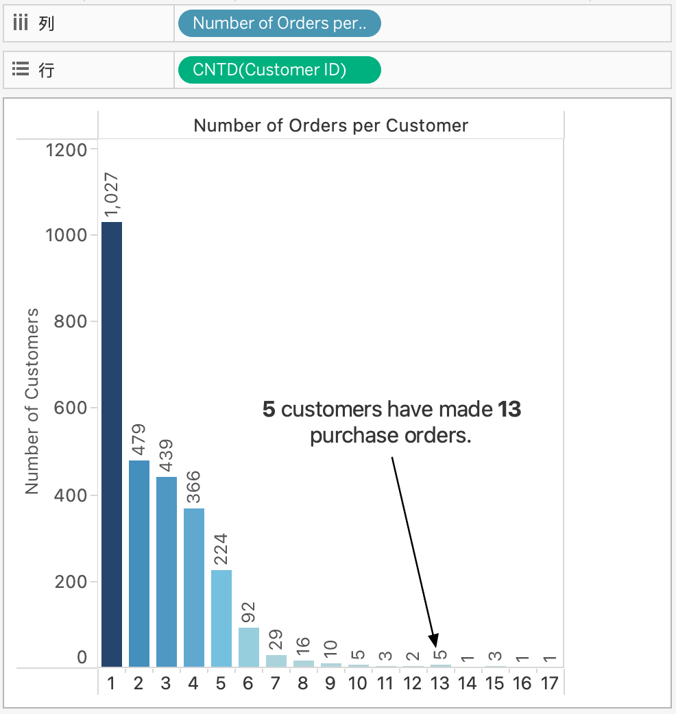
Finding the number of orders per customer is relatively simple, but what if we want to know how many customers placed one order, two orders, three orders, and so on?
To generate the corresponding view, we must segment the number of customers by the number of orders placed. This is a simple problem, but without Level of Detail expressions (Tableau LOD), segmenting one measure by another would be very difficult.
TABLEAU LOD Example
Number of purchases per customer: { FIXED [Customer ID]:COUNTD([Order ID])}
BI LOD
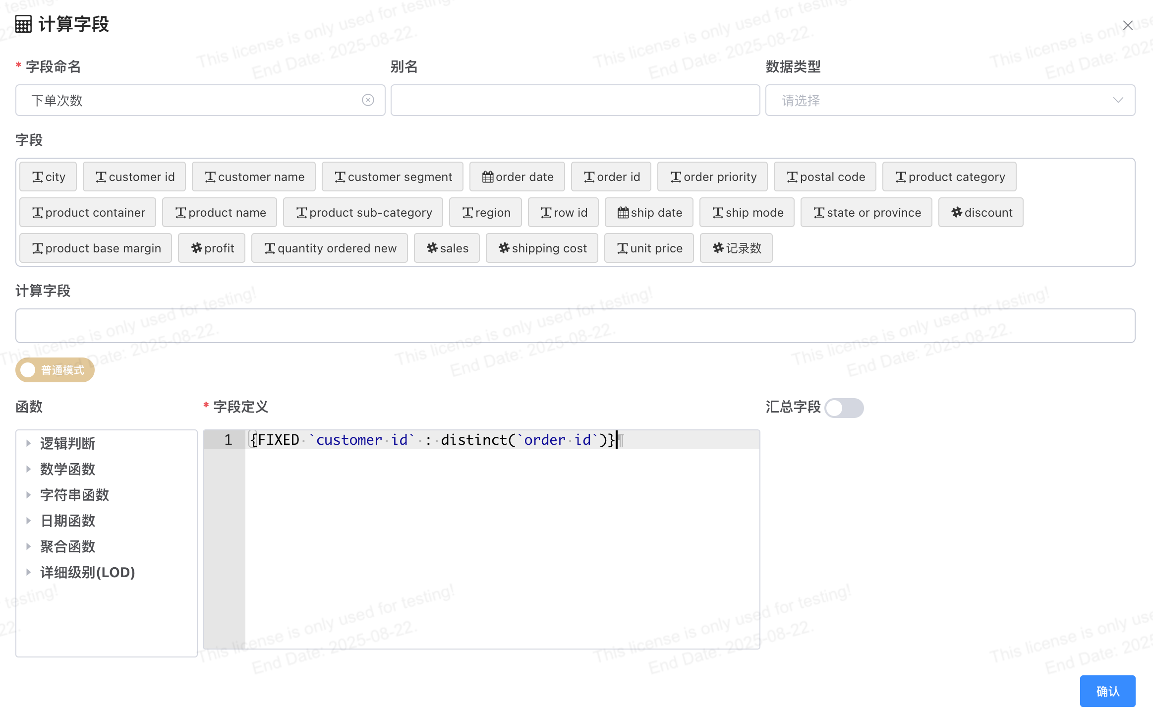
{FIXED `customer id` : DISTINCT(`order id`)}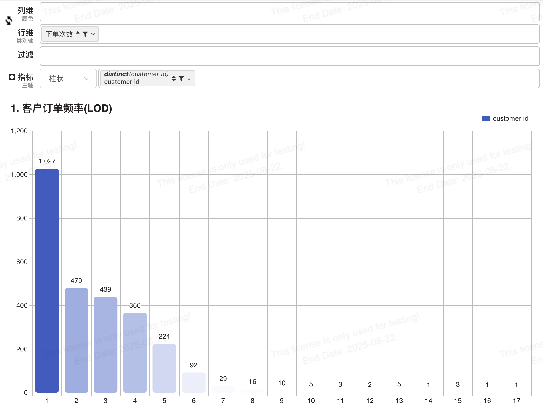
2. Cohort Analysis
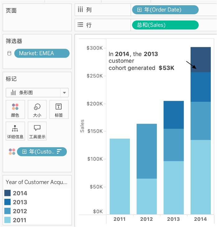
Do customers with longer relationships contribute more to sales?
The view below groups customers by the year of their first purchase to compare the annual sales contribution of each cohort.
The earliest order date for each customer indicates the first purchase date. However, since the data in the view is at the order detail level and lacks customer information, we need to add a First Order Date field per customer.
TABLEAU LOD Example
First purchase date per customer: { FIXED [Customer ID]:MIN([Order Date])}
BI LOD

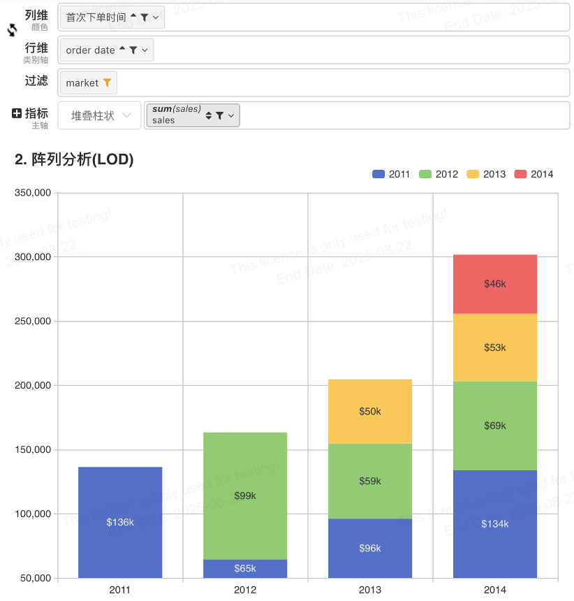
{FIXED `customer id` : MIN(`order date`)}- Drag 【Order Date】 to the row dimension and set the date granularity to Year.
- Drag 【First Order Date】 to the column dimension, set the original field type to
Date, and format it as Year.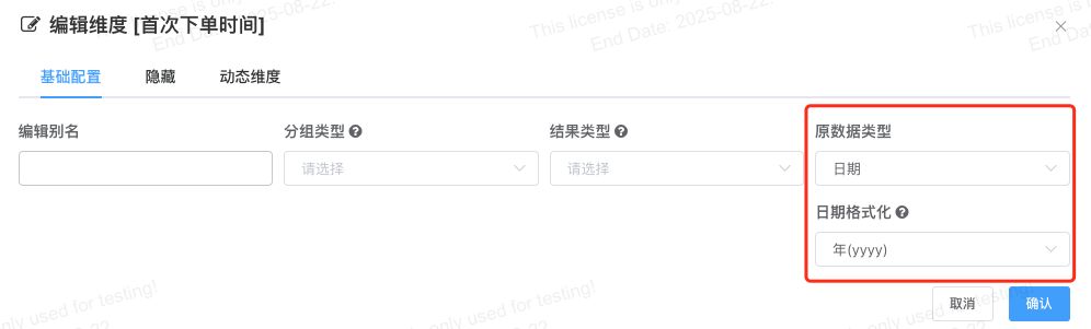
- Drag 【Sales】 to the measure and set the aggregation function to SUM.
- Chart type: Combo Chart, display style:
Stacked Column.
BI Calculated Field
Add a calculated field 【First Order Date】. Since we want to aggregate the number of orders per customer:
- First, turn on the Aggregated Field switch.
- Drag the 【Customer ID】 field to the Grouping Fields area.
- Drag the 【Order Date】 field to the Within-Group Sorting Fields area and set it to Ascending.
- In Field Definition, enter
first_value(order date), taking the first order date within the group as the field value.
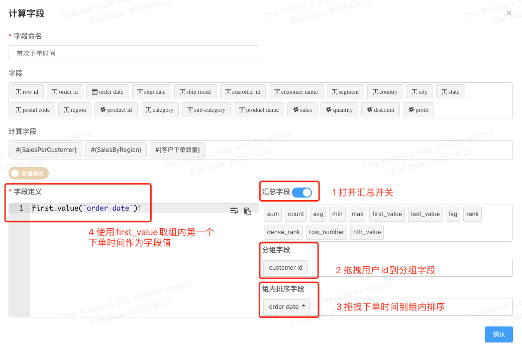
Chart design configuration as follows:
- Drag 【Order Date】 to the row dimension and set the date granularity to Year.
- Drag 【First Order Date】 to the column dimension, set the original field type to
Date, and format it as Year. - Drag 【Sales】 to the measure and set the aggregation function to SUM.
- Chart type: Combo Chart, display style:
Stacked Column.
3. Daily Profit KPI
We can look at profit trends over time, but what if we want to measure success by total profit per working day?
We might want to know the number of profitable days per month or year, especially if we want to understand seasonal impact.
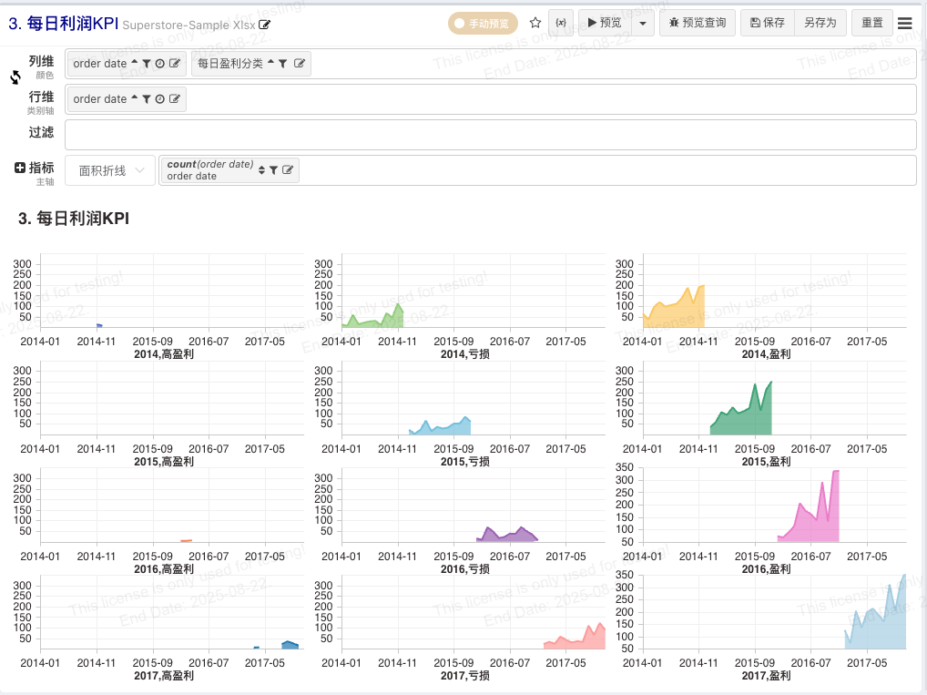
The view below shows how, with underlying data recorded at the transaction level, we can easily use LOD expressions to create tiers (e.g., Daily Profit) based on aggregated data.
Tableau LOD
When labeling each day, we need the profit for each day, which requires FIXED to return the daily profit.
Profit per Day = { FIXED [Order Date] : SUM([Profit]) }Based on the daily profit, assign a profit label per day according to the criteria: Daily Profit KPI.
IF [Profit per Day] > 2000 THEN “Highly Profitable”
ELSEIF [Profit per Day] <=0 THEN “Unprofitable”
ELSE “Profitable” END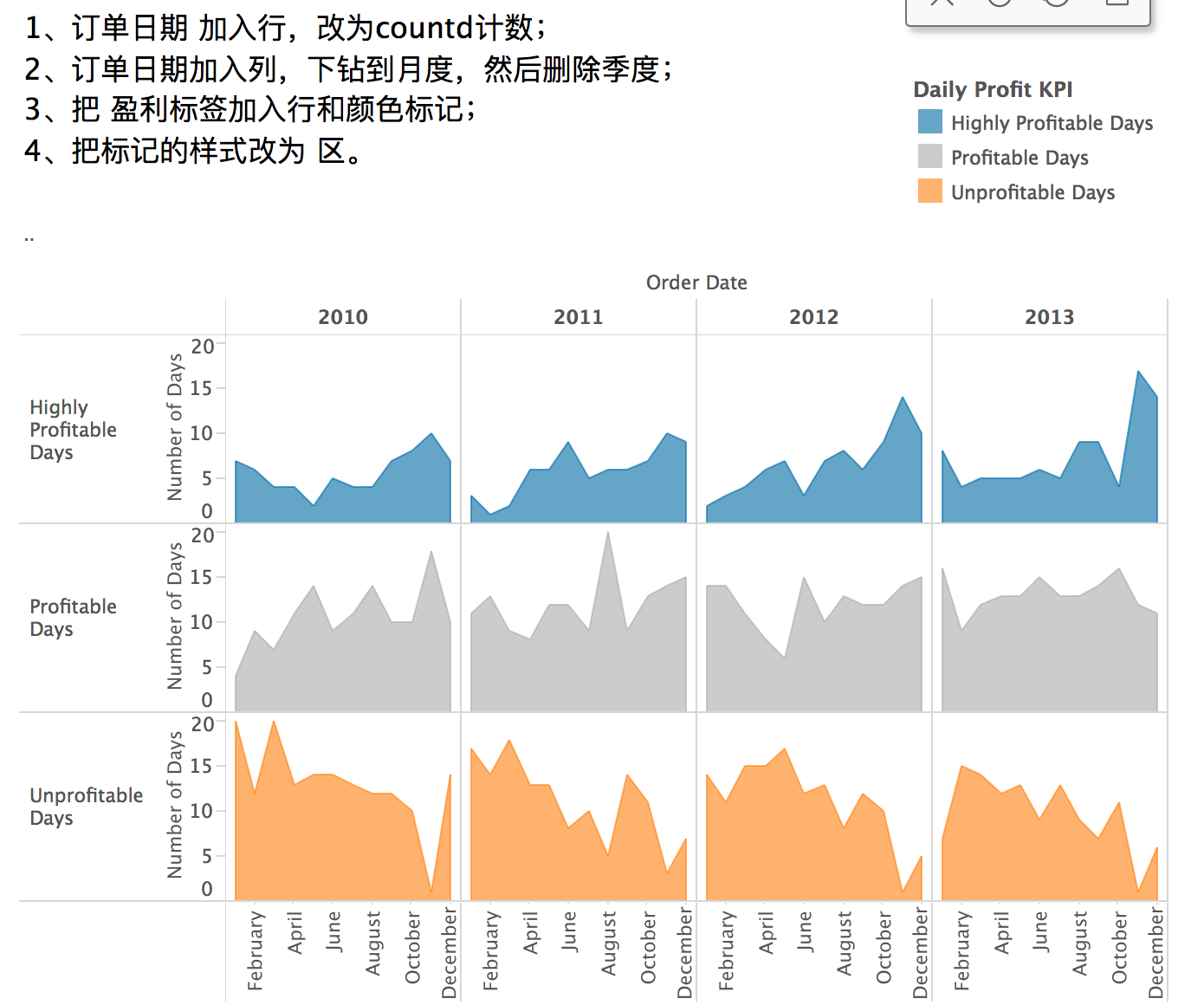
BI LOD
When labeling each day, we need the profit for each day, which requires FIXED to return the daily profit.
Profit per Day = {FIXED `order date` : SUM(`profit`)}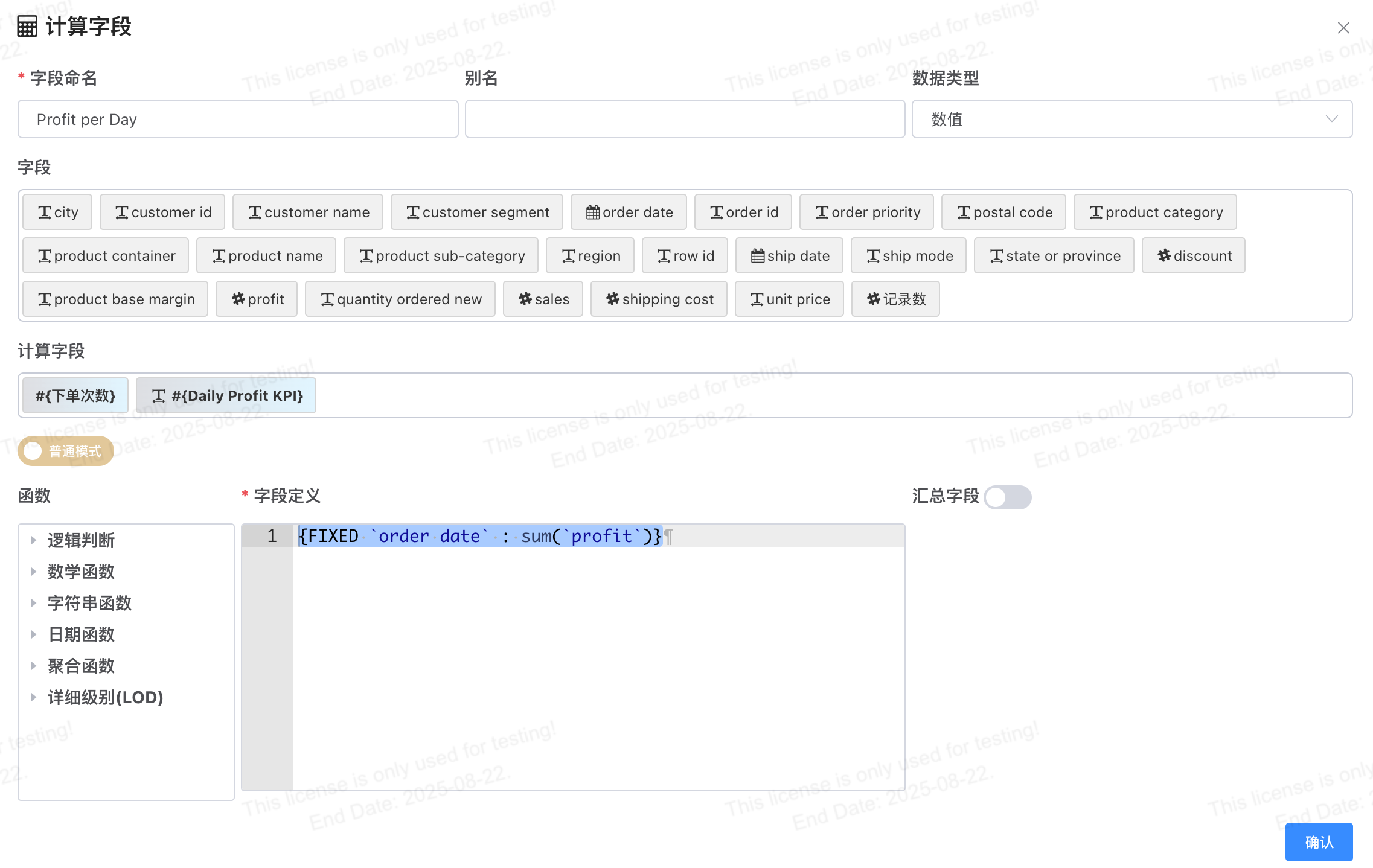
Based on the daily profit, assign a profit label per day according to the criteria: Daily Profit KPI.
CASE
    WHEN #{Profit per Day} > 2000 THEN "Highly Profitable"
    WHEN #{Profit per Day} > 0 THEN "Profitable"
    ELSE "Unprofitable"
END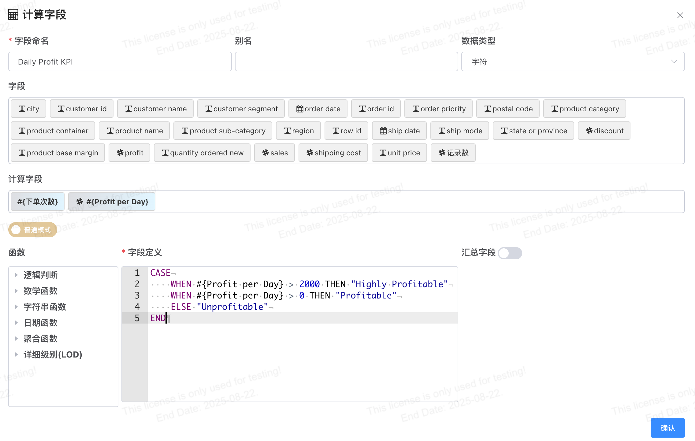
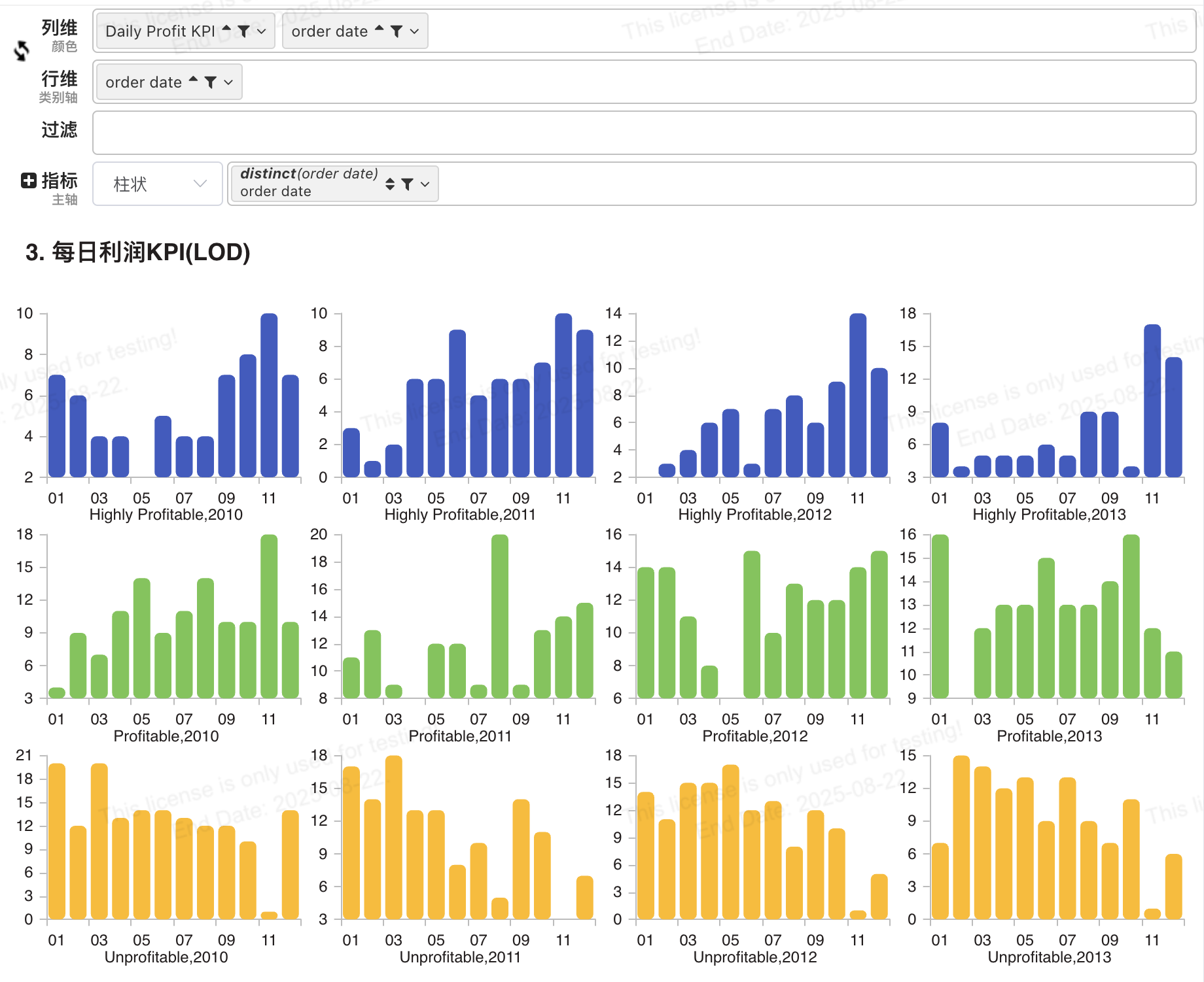
BI Calculated Field
Add a calculated field 【Daily Profit】. The configuration is relatively simple and will not be elaborated here.
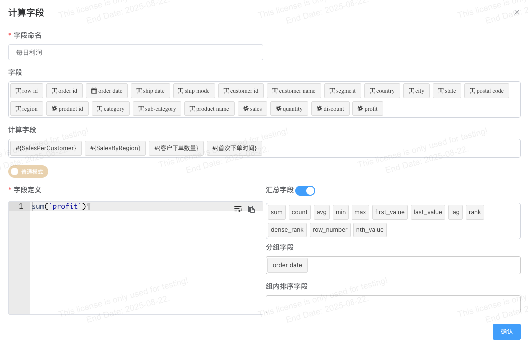
Chart configuration as follows:
- Row Dimension: 【Order Date】 set date granularity to Month.
- Column Dimension: 【Order Date】 set date granularity to Year, 【Daily Profit】 and set dimension grouping.
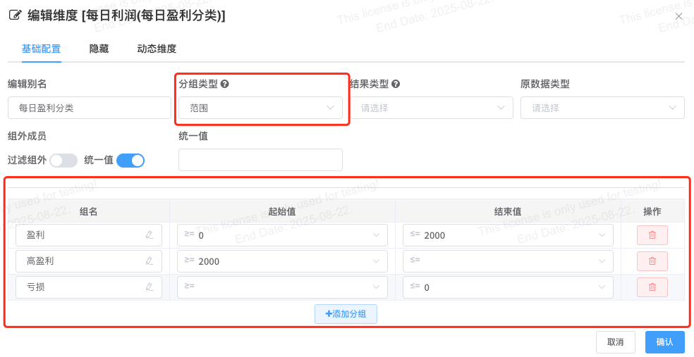
- Measure: 【Order Date】 aggregation function set to COUNT.
- Chart type: Combo Chart, Area Line.
- Style configuration: Layout -> Split Chart, disable legend display.
4. Percentage of Total
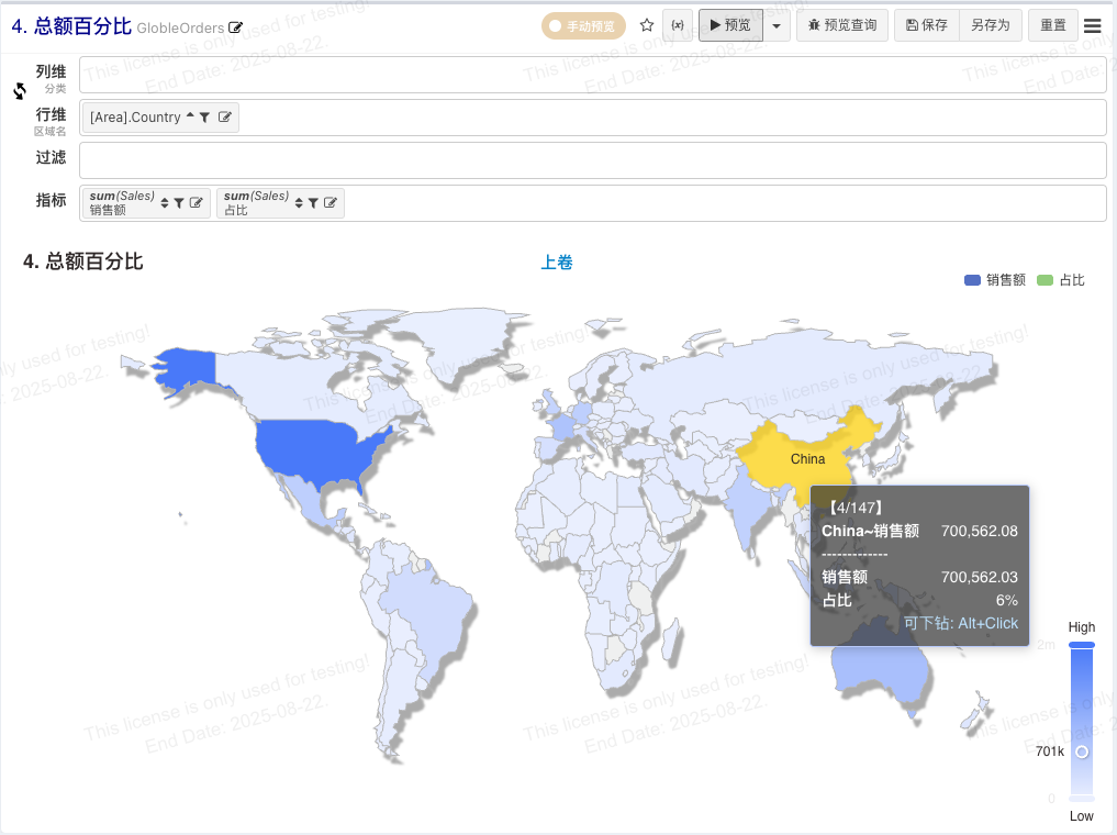
How does revenue from each country contribute to global sales?
If we color by contribution percentage, we can see that the United States contributes the most to global sales revenue.
Tableau LOD
SUM([Sales]) / SUM({SUM(Sales)})BI LOD
EXCLUDE Calculation
SUM(`sales`) / SUM({EXCLUDE `country` : `sales`})FIXED Calculation
- Add a calculated field for Total Sales:
{FIXED : SUM(`Sales`)}- Add an aggregation expression to calculate the proportion. Since the calculated field has the total sales value in each row, use MIN/MAX/AVG to get the value during aggregation.
SUM(`Sales`) / MAX(`Total Sales`)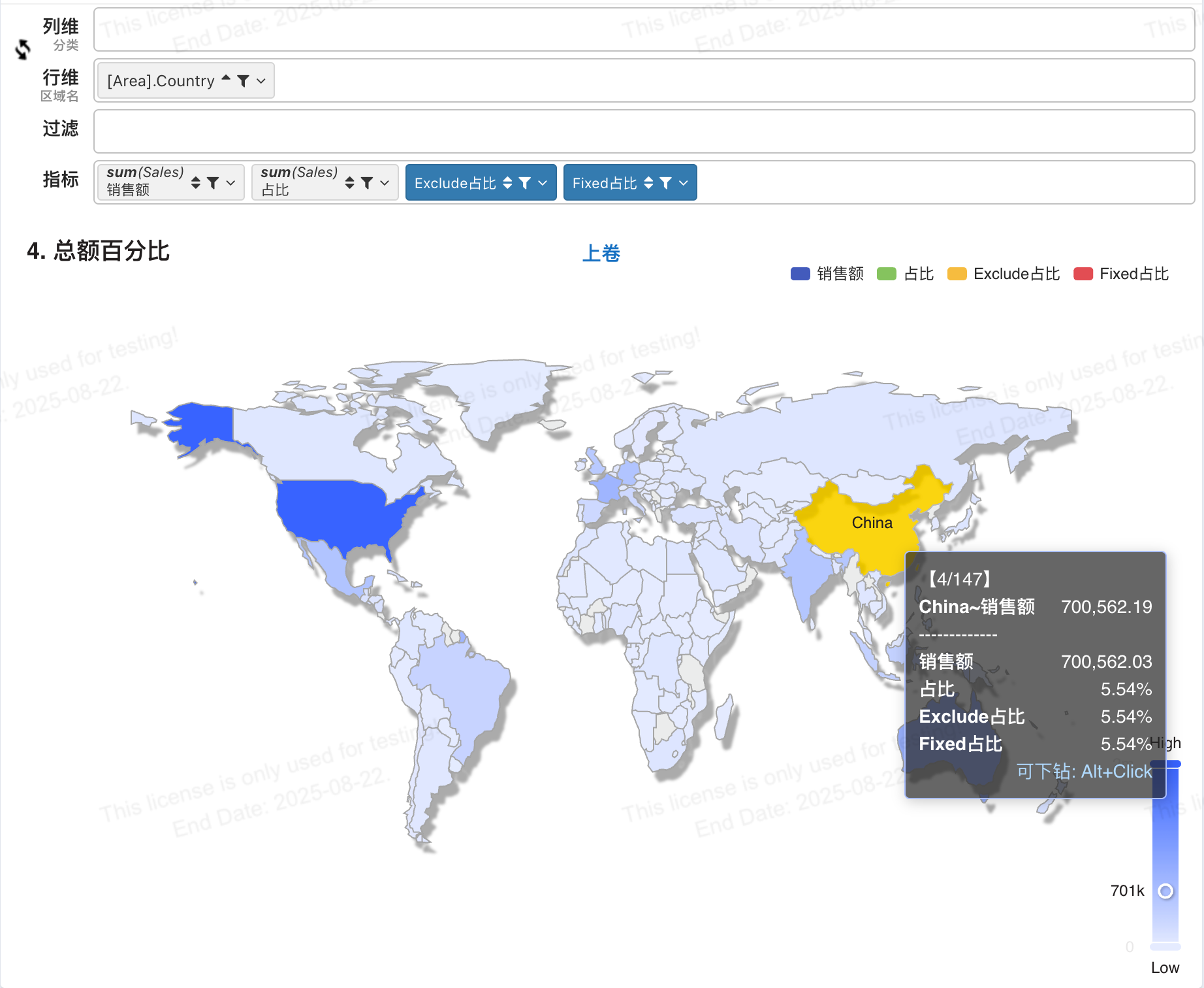
BI Quick Calculation
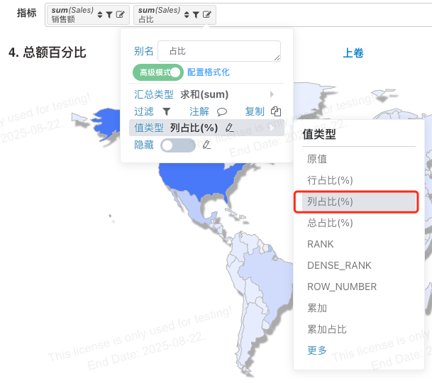
Chart configuration as follows:
- Row Dimension: Country
- Measures: [Sales], the second measure is also [Sales], set the value type to Column Percentage.
5. New Customer Acquisition Rate
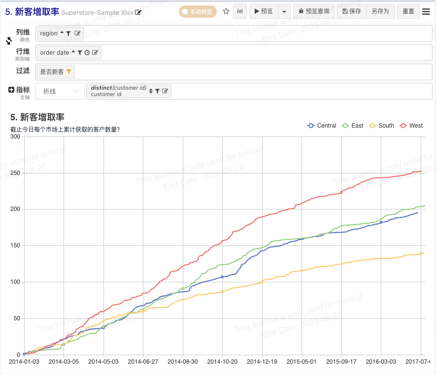
What is the daily trend of total new customer acquisition rate in each market?
Understanding this data trend helps us understand how regional marketing and sales organizations are performing in developing new business. A steeper line indicates a better acquisition trend. If the line flattens gradually, action must be taken to increase lead flow.
LOD expressions ensure repeat customers are not mistakenly counted as new, because although the data is visualized by market and day, the evaluation must be at the customer level.
Tableau
Label each customer based on their status relative to the current date.
First Purchase Date:
{FIXED [Customer ID]:MIN([Order Date])}Determine if the customer is new or existing based on whether the purchase date equals the first purchase date:
IF [Order Date] = [First Purchase Date] THEN “New Customer” ELSE “Existing Customer” ENDCalculate the cumulative number of customers using Quick Table Calculation.
BI LOD
Add calculated fields: First Order Date, Is New Customer.
First Order Date (1st order date):
{FIXED `customer id` : MIN(`order date`)}Is New Customer (New or Existing):
IF(`order date` = #{1st order date }, 'New', 'Existing')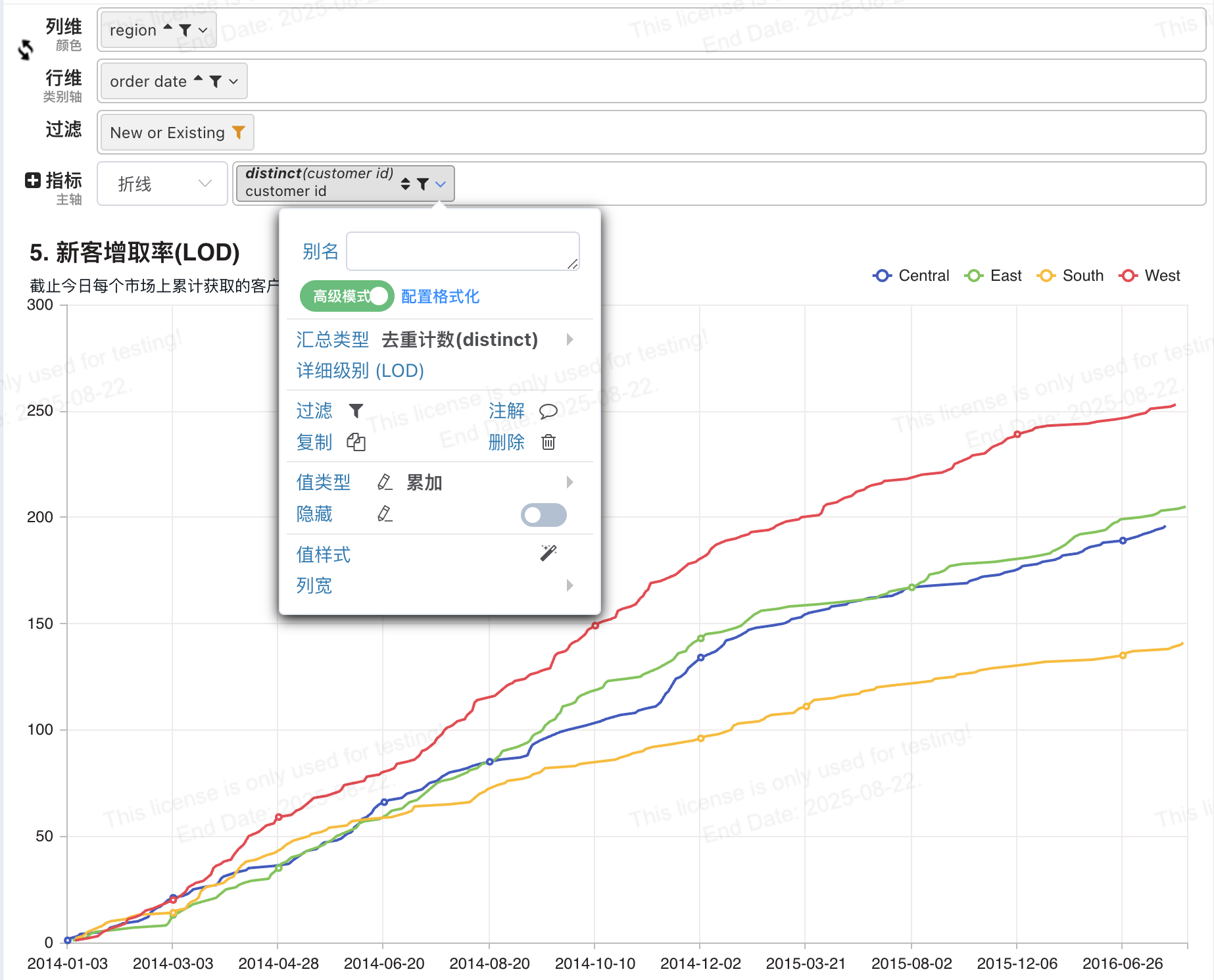
BI Calculated Field
Add a calculated field 【Is New Customer】, which uses the previously defined field 【First Order Date】.
CASE
    WHEN #{First Order Date} = `order date` THEN 'New Customer'
    ELSE 'Existing Customer'
END
Tip
There is a shortcut template for CASE WHEN input. Enter 'case' and select the 'case-when snippet'.
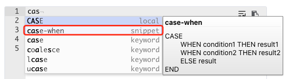
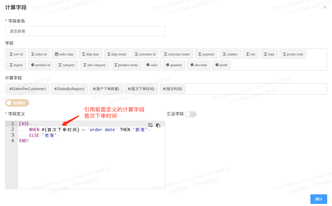
Chart configuration as follows:
- Row Dimension: 【Order Date】
- Column Dimension: 【Region】
- Filter: 【Is New Customer】 select New Customer.
- Measure: DISTINCT【Customer ID】, configure the value type to Cumulative.
- Chart type: Combo Chart, style configuration, Line Style -> Null Value Handling -> Connect.
6. Comparative Sales Analysis
Finding differences from the average is relatively simple, but what if you want to find differences from a selected category?
Tableau
- Calculated field for Selected Sales:
IF [Sub-Category] = [Parameters].[Sub-Category] THEN Sales ELSE 0 ENDBI LOD
- Calculated field for Selected Sales:
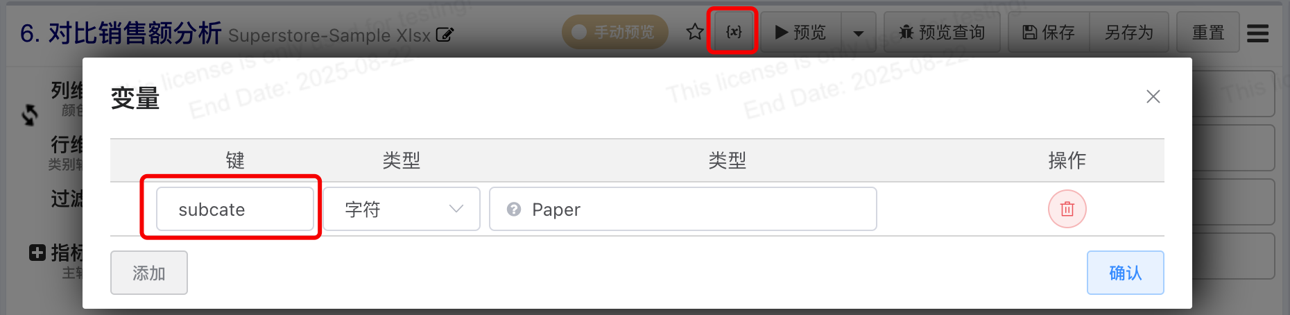
IF(`sub-category` = '${subcate!"Art"}', `sales`, 0)Add a column Selected Sales. When the category matches the selected type, the value is set to sales; otherwise, it's 0. The special part is that this calculated field uses an environment variable, meaning this column's value changes each time the variable changes.
- Aggregation expression to calculate Sales of Selected Category:

When we have a category configured on the row dimension, if we directly use SUM(Selected Sales), only the selected category will have a value. Therefore, to give all categories a value for the selected category's sales, we need to use EXCLUDE to remove the category.
{EXCLUDE `sub-category` : SUM(`Selected Sales`)}Consideration
The previous two steps can also be achieved with LOD FIXED in one step, making all rows have the selected category's sales:
{FIXED : SUM(IF(`sub-category` = '${subcate!"Art"}', `sales`, 0))}- Aggregation expression Difference From Selected, the difference between sales and selected sales:
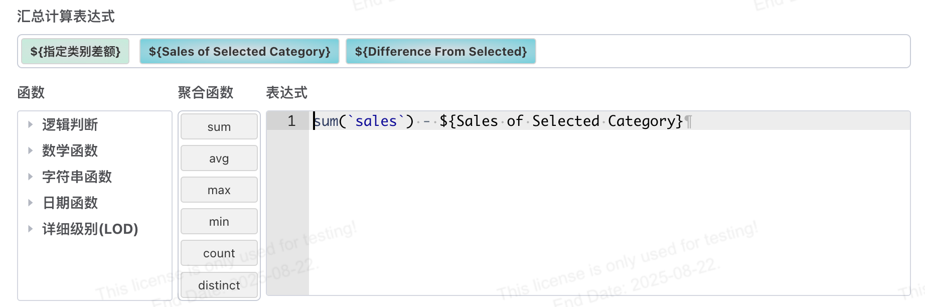
SUM(`sales`) - ${Sales of Selected Category}- Implementation effect as follows:
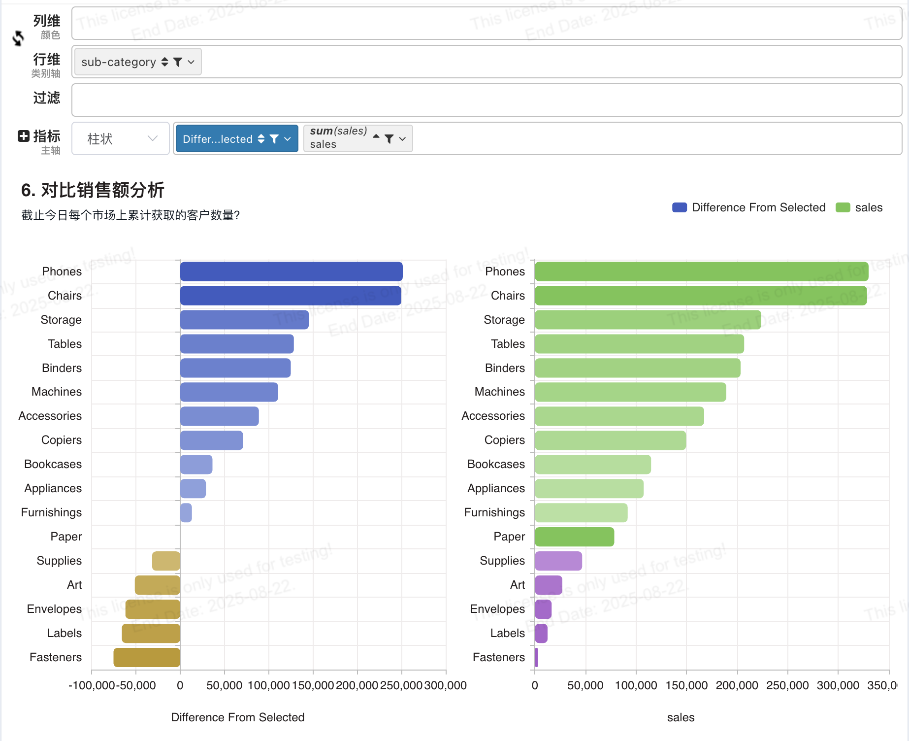
- Change the variable value:
BI Calculated Field
Add a calculated field 【Sales of Specified Category】. Enable aggregation but do not select grouping fields (i.e., aggregate over the entire dataset). The aggregation definition uses conditional aggregation, only including sales when 【Sub-Category】 equals the value passed by the environment variable ${subcate}.
SUM(CASE
    WHEN `sub-category` = '${subcate}' THEN `Sales`
    ELSE 0
END)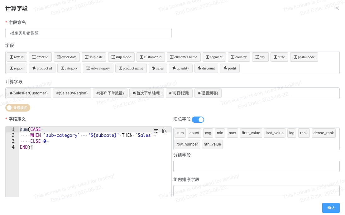
Add a dataset expression for the new field 【Difference from Specified Category】. Since this field aggregates over the entire dataset, all values will be the same, so choose MAX or MIN to maintain the original aggregated output.
SUM(`sales`) - MAX(`Sales of Specified Category`)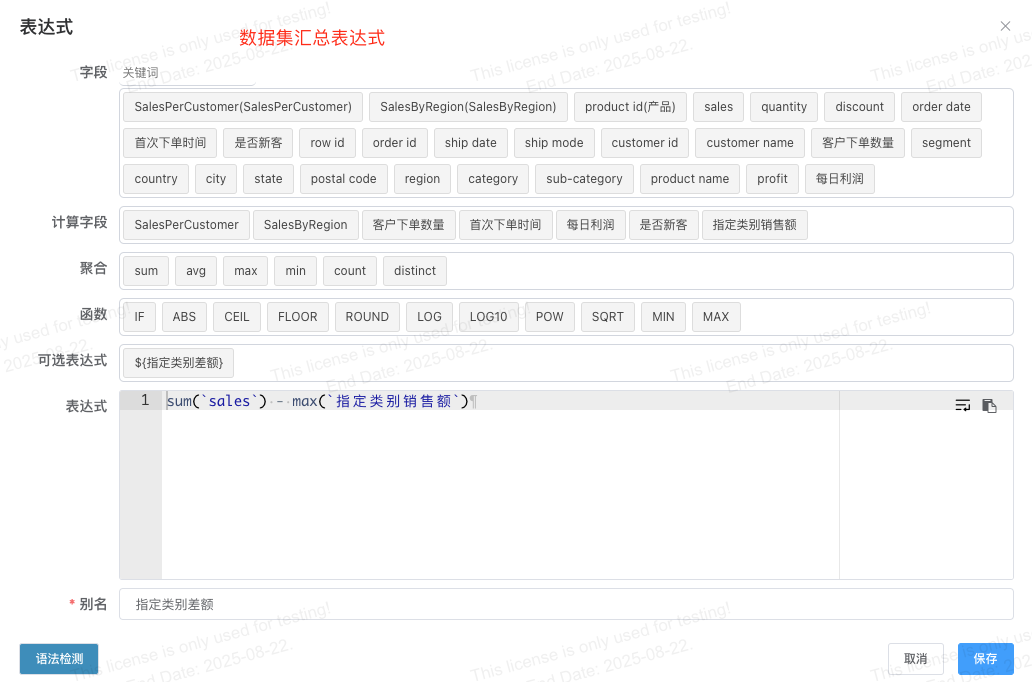
Create a new dashboard as follows:
The left chart is a combo chart sorted by category. Row dimension 【Sub-Category】 unsorted, measure selects 【Sales】 sum ascending.
Chart selection: Combo Chart - Primary Axis selects Column Chart, style fine-tuning -> Axis Style -> Value Axis selects Horizontal Axis.

The right chart is a combo chart sorted by category. Row dimension 【Sub-Category】 unsorted, measure selects 【Difference from Specified Category】. Chart selection: Combo Chart - Primary Axis selects Column Chart, style fine-tuning -> Axis Style -> Value Axis selects Horizontal Axis.

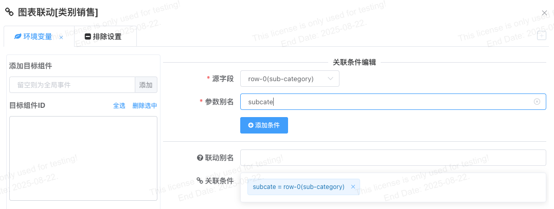
Add linkage in the left chart of the dashboard. Row dimension links to the environment variable subcate.

7. Average Largest Transaction per Sales Representative
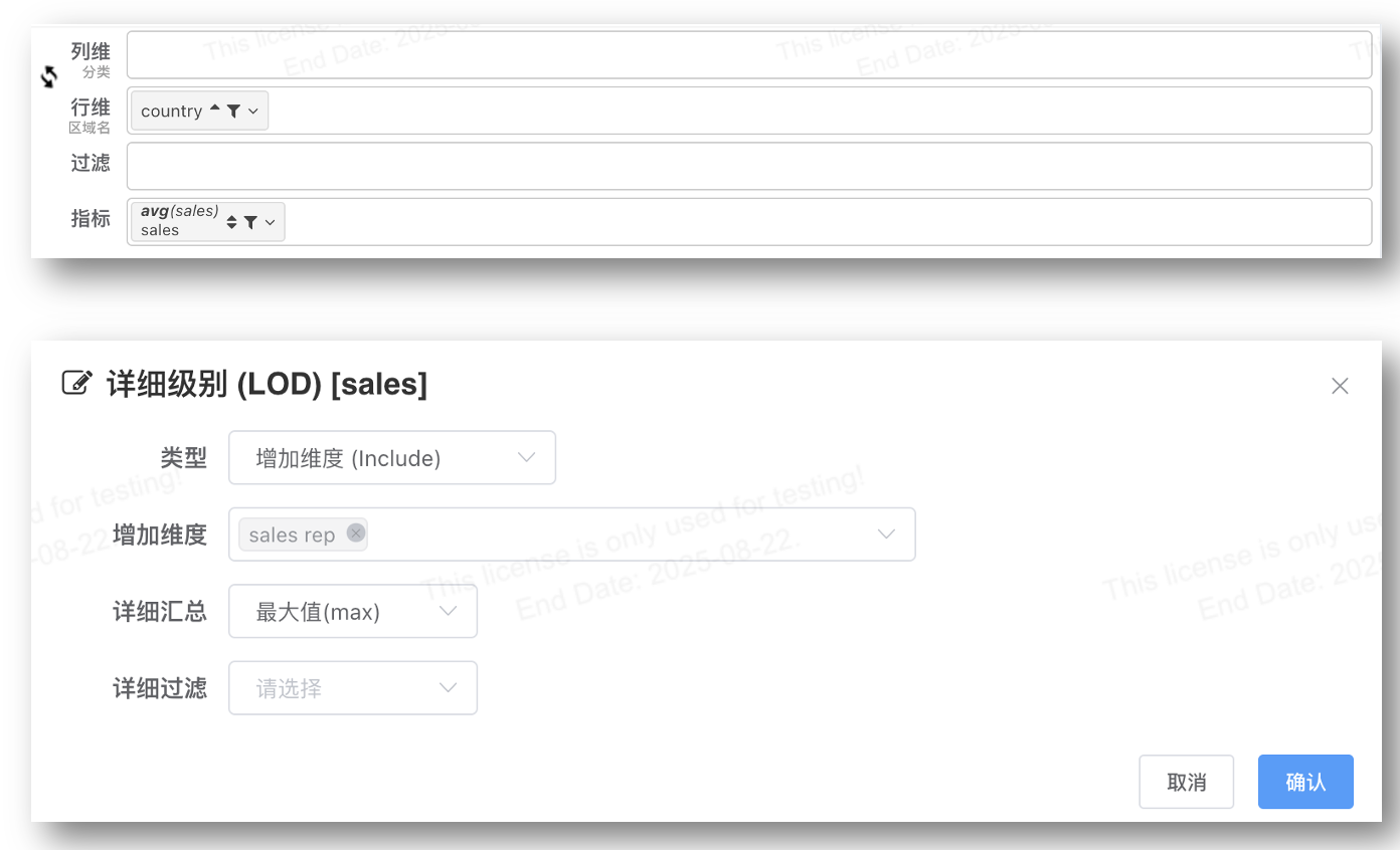
Scenario Description: What is the largest transaction amount achieved by each sales representative? Then think, what is the average of the largest transaction amounts achieved by each sales representative, calculated by country/region?
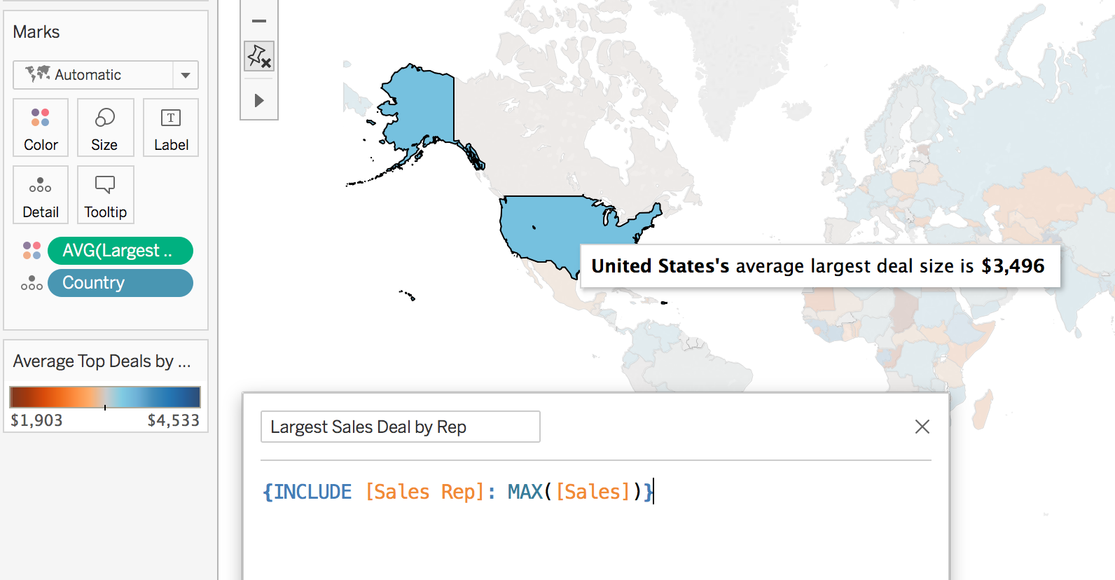
Using LOD expressions, we can drill down to the sales representative level even though the data is visualized at the country/region level. In the view below, the average largest transaction per sales representative is higher in countries colored blue and lower in countries colored orange. We can use this information to guide deeper analysis from country/region down to sales representative.
Visualization Key: Average of "Largest Order Amount" across different regions.
Tableau LOD
Calculate the largest order amount per sales representative: {INCLUDE [Sales Rep]:MAX([Sales])}
BI LOD
Use graphical configuration directly:
Or use aggregated LOD INCLUDE:
AVG({INCLUDE `sales rep` : MAX(`sales`)})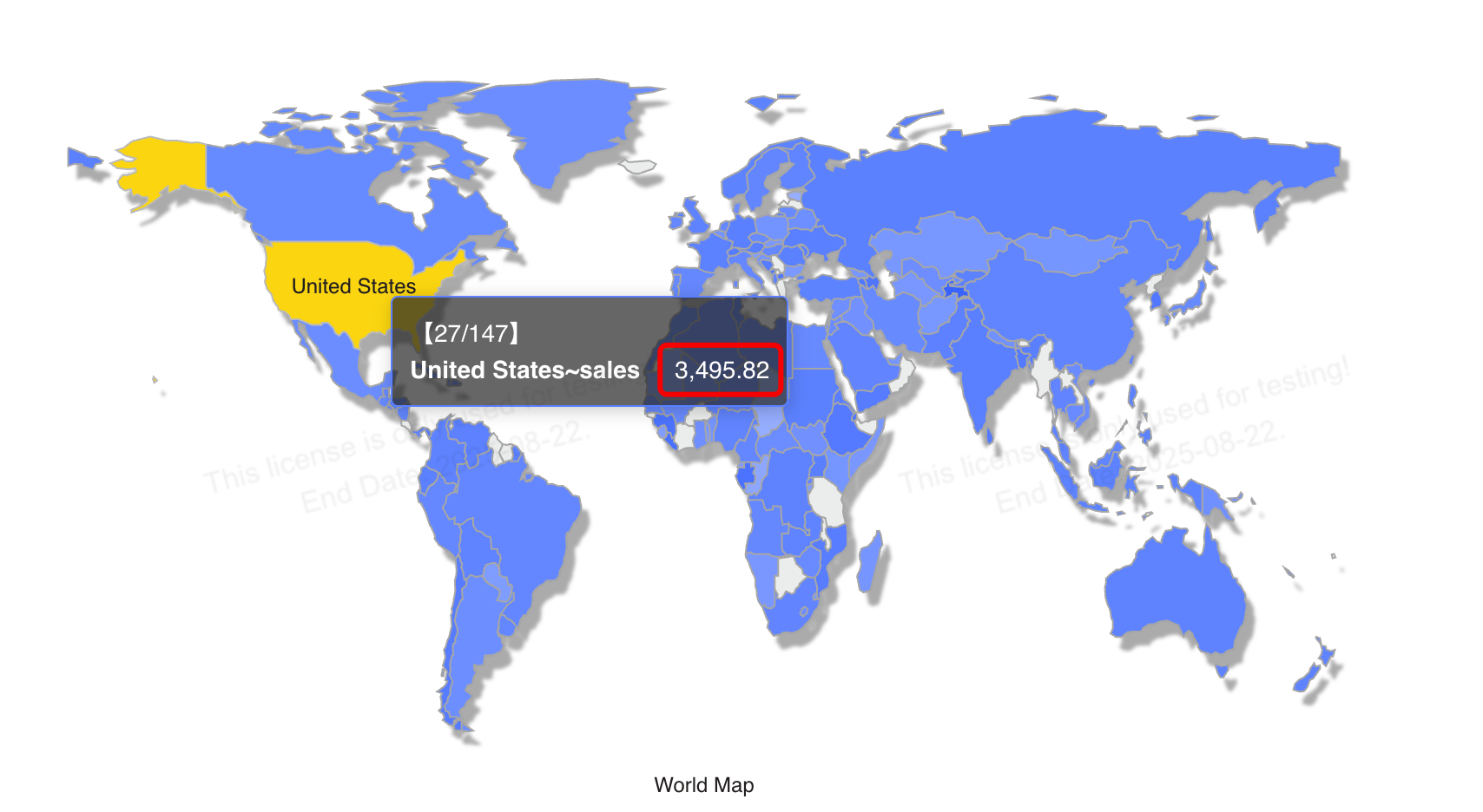
8. Actual vs. Target
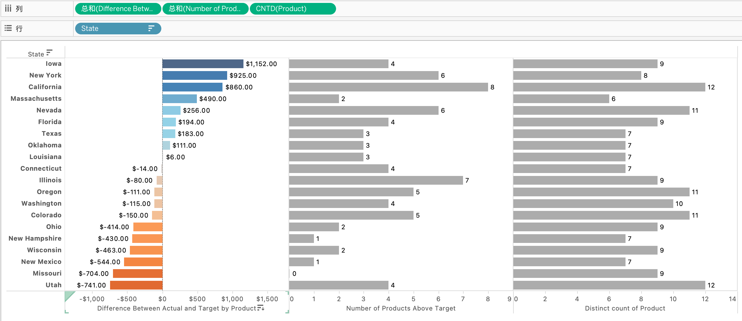
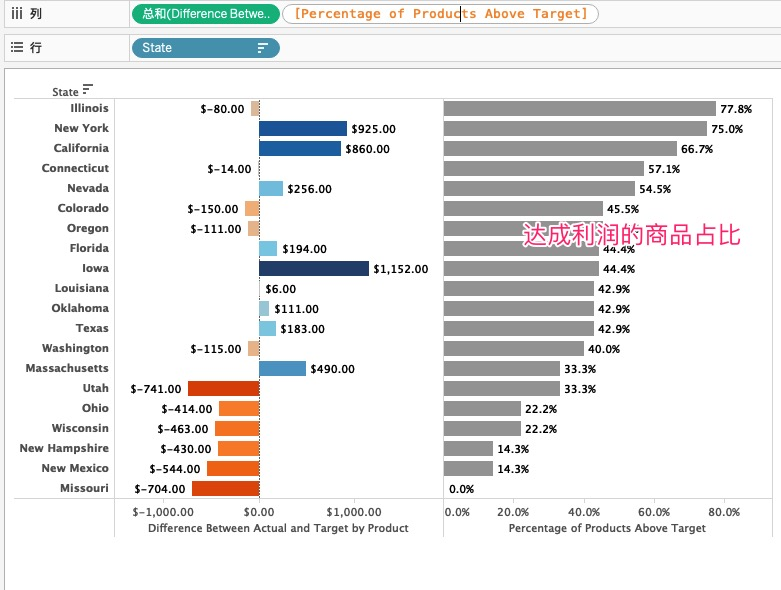
Scenario Description: In this visualization, we describe the difference between actual profit and target profit for a chain of coffee shops in each state. In the top view, we can clearly see which states exceeded their targets and which fell short. However, with this aggregation method, we miss important nuances. Some states exceeded targets because every product sold in that state exceeded its target, while others exceeded because a single product overachieved enough to compensate for all other products that missed their targets. We can use LOD expressions to determine the percentage of products sold in a state that exceeded their targets.
Visualization Key: For each state, the percentage of products whose sales exceeded the target plan.
LOD is done in several steps:
- Row-level calculation of profit difference:
Custom field Difference Between Actual and Target Profit
[Profit] - [Target Profit]
- At the product level, determine the profit vs. target difference:
Custom field: Difference Between Actual and Target by Product
{ INCLUDE [Product] : SUM( [Difference Between Actual and Target Profit] ) }
// Each product has many days of sales, calculate the total profit difference per product.- If difference > 0, mark 1; otherwise 0. Summing gives the count.
Custom field: Number of Products Above Target
IIF([Difference Between Actual and Target by Product] > 0, 1, 0)
- Calculate the number of products meeting the target. The above returns 1/0; summing gives the count.
Custom field: Percentage of Products Above Target
SUM([Number of Products Above Target]) / COUNTD([Product])
BI LOD
- Row-level calculation of profit difference:
Custom field Difference Between Actual and Target Profit:
`Profit` - `Target_profit`- Create a new LOD INCLUDE aggregated field. Aggregate profit difference at the Product level. If difference > 0, mark 1; otherwise 0. Summing gives the count.
Custom field: Number of Products Above Target:
SUM({INCLUDE `Product` :
    IF(SUM(`Difference Between Actual and Target Profit`) > 0, 1, 0)
})
Note
In BI, LOD INCLUDE cannot exist alone. It directly implements the two steps of calculation in Tableau. Tableau first defines a LOD INCLUDE calculated field and drags it into the view, automatically adding SUM aggregation.
Whereas in BI, aggregated calculated fields come with aggregation built-in and cannot be dragged into the view and then combined or modified with additional aggregation.
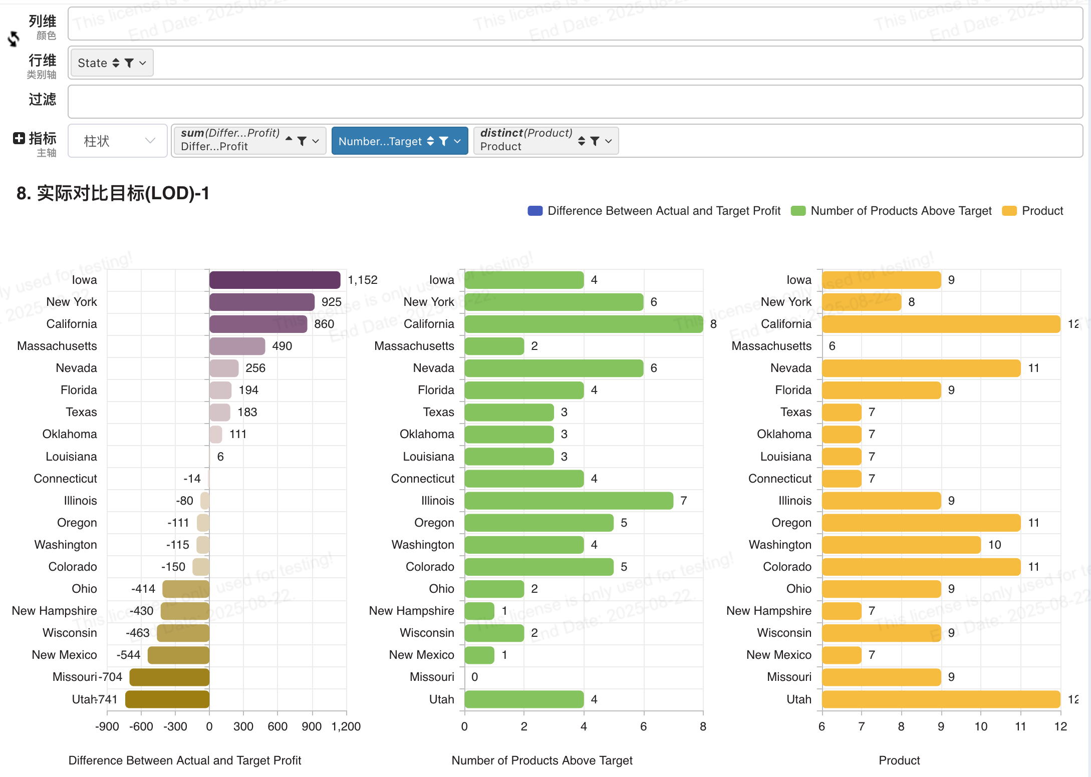
- Calculate the number of products meeting the target. The above returns 1/0; summing gives the count.
Custom field: Percentage of Products Above Target:
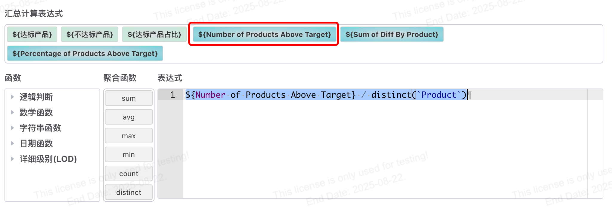
${Number of Products Above Target} / DISTINCT(`Product`)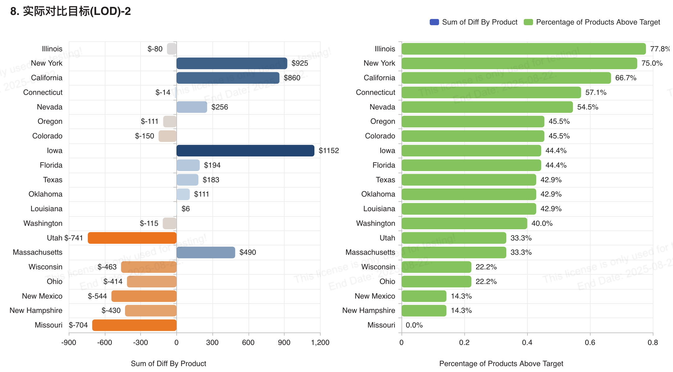
9. Period End Value
Scenario Description: Data representing the status on a specific day (such as inventory count, actual headcount, or daily closing value of holdings) needs to be treated differently from aggregatable metrics (like sales or profit). When dealing with such data, you might want to show the value on the last day of the calendar month. Additionally, when drilling down from month to week, we might want the view to update to show the value at the end of each week.
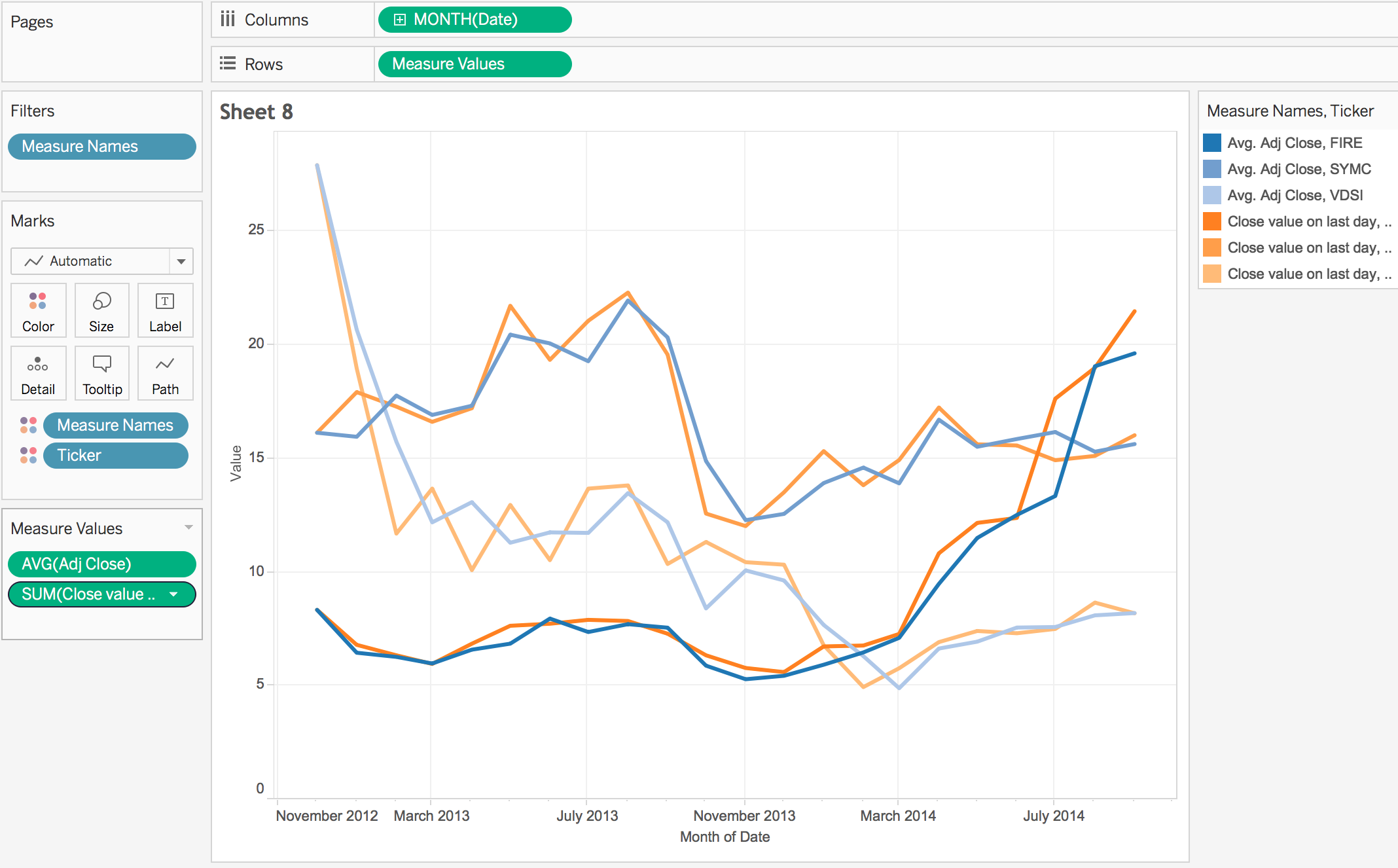
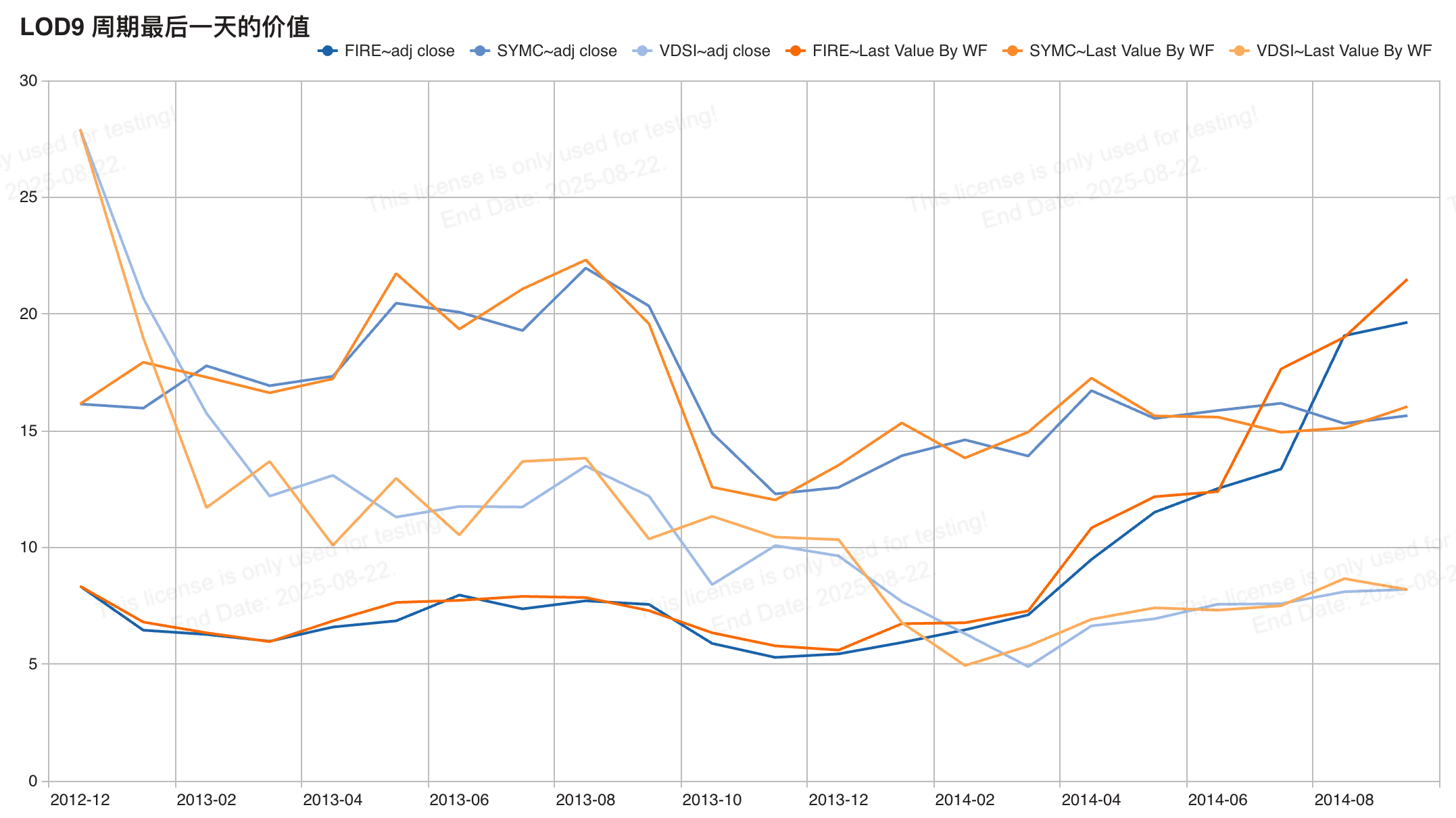
In the example below, we recorded inventory data at multiple times each day. The view compares the average daily closing value with the closing value at the end of the period. Using a simple LOD expression, we can drill down to the daily level, even though the data is visualized at a higher level.
Visualization Key: The closing price (close value) on the last day within the visualization's date granularity (month in the above case).
Tableau LOD
The closing price on the last day within the visualization's date granularity.
Last Day: { INCLUDE:MAX([Date])}, the view has Date dragged in, granularity set to month. INCLUDE has no dimensions added, meaning the last day of the month.
Closing Price on Last Day: IF { INCLUDE:MAX([Date])}=[Date] THEN [Adj Close] ELSE 0 END
BI LOD
Last Day Max Date:
{ FIXED DATE_FORMAT(`date`, 'yyyy-MM') : MAX(`date`) }Calculated field for closing price on the last day. Drag into measure, choose MAX/MIN:
IF(`date` = #{Max Date}, `adj close`, 0)Or use an aggregated calculated field:
SUM(IF(`date` = `Max Date`, `adj close`, 0))Note the difference in syntax for using Max Date in calculated fields vs. aggregated calculations.
Since Max Date is a calculated field added in the first step:
- When referencing it in other calculated fields, use syntax
#{Max Date}. - In aggregated calculations, all fields including calculated fields are just fields, so use field wrapping directly.
10. Repeat Purchases per Cohort
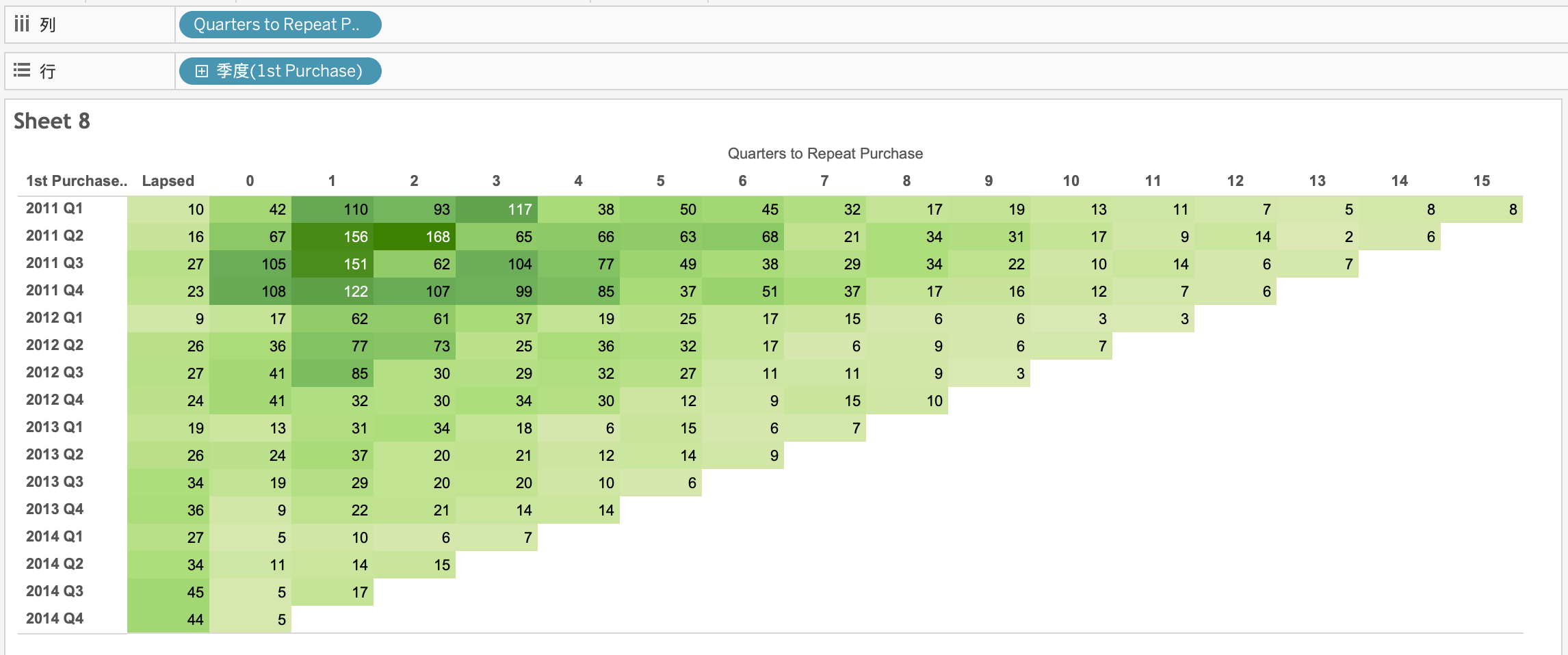
Scenario Description: Acquiring new customers can be very costly, so we want to ensure existing customers make repeat purchases. How many customers make repeat purchases in one, two, three, N quarters? How many never make repeat purchases? What if we segment repeat purchase behavior by quarterly cohorts? We can use FIXED expressions to find each customer's first and second purchase dates and calculate the number of quarters between repeat purchases.
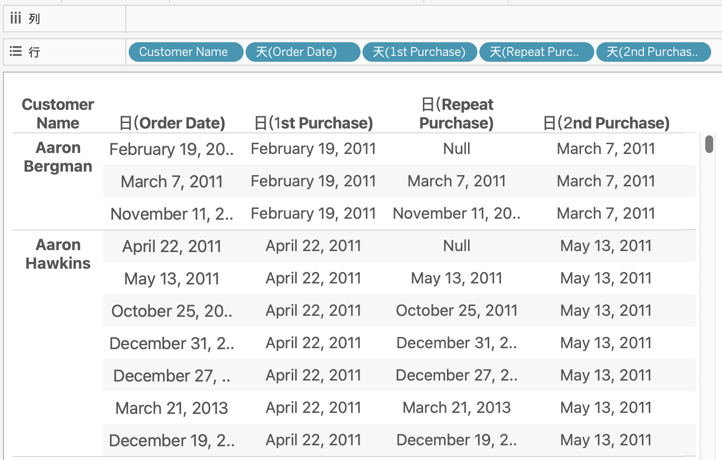
Visualization Key: Order date vs. time between two purchases for a customer, and the corresponding customer count.
Tableau LOD
Time between two purchases for a customer.
First Purchase Date: {FIXED [Customer ID]:MIN([Order Date])}
Exclude First Purchase Date: IIF([Order Date]> [First Purchase Date],[Order Date],NULL)
Second Purchase Date: { FIXED [Customer ID]: MIN([Exclude First Purchase Date])}
Calculate time between two purchases: DATEDIFF(‘quarter’,[First Purchase Date],[Second Purchase Date])
Note
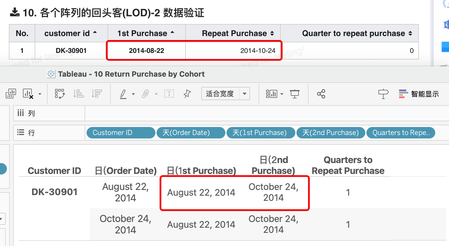
Tableau's quarter difference calculation is not precise, leading to significant discrepancies in results. For example, for a customer with first order date 2014-08-22 and second order date 2014-10-24, strictly speaking, the quarter difference is less than one quarter—it just crosses a quarter boundary. In Tableau, if the date crosses a quarter boundary, even by one day, the quarter difference is 1. This is inconsistent with database quarter differences or business quarter differences.
BI LOD
Time between two purchases for a customer.
First Purchase Date 1st Purchase:
{FIXED `customer id` : MIN(`order date`)}Exclude First Purchase Date Repeat Purchase:
IF(`order date` > #{1st Purchase}, `order date`, null)Second Purchase Date 2nd Purchase:
{FIXED `customer id` : MIN(#{Repeat Purchase})}
Calculate time between two purchases Quarter to repeat purchase:
DATEDIFF('quarter', #{1st Purchase}, #{2nd Purchase})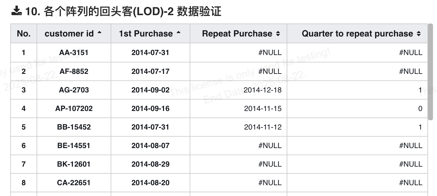
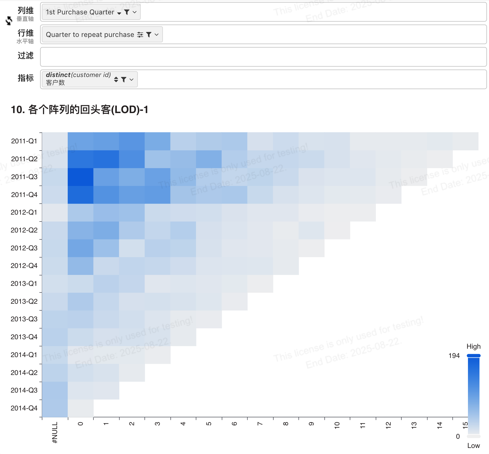
Heatmap
Column Dimension Convert First Purchase Time to Quarter:
CONCAT(YEAR(#{1st Purchase}), '-Q', QUARTER(#{1st Purchase}))Row Dimension Use calculated field [Quarter to repeat purchase]:
12. Relative Period Filtering
Scenario Description:
Comparing Year-to-Date and Month-to-Date with the previous year is a common metric for analyzing performance. By filtering relative to today, we can easily derive analysis. But what if the data is refreshed weekly?
Suppose your last refresh was on March 1, but the current date is March 7. A Month-to-Date comparison would show last year's March 1-7 versus this year's March 1.
This would trigger a severe alert, but it shouldn't! We can use a simple LOD expression to find the latest date in the dataset.
Visualization Key: This year's profit compared to last year's. When comparing year-over-year by week or month, the number of days in the last period should be determined based on the data date within that last period.
Tableau LOD
Missing the cutoff date for last year's YTD, need to compare with this year's max date.
Day of Year of Max Date = DATEPART(‘dayofyear’, {MAX([Order Date])} )
Day of Year of Order Date = DATEPART(‘dayofyear’, [Order Date] )
Filter Field
Period Filter = [Day of Year of Max Date] >= [Day of Year of Order Date]
BI LOD
Day of Year of Max Date = DAYOFYEAR({FIXED  : MAX(`order date`)})
Day of Year of Order Date = DAYOFYEAR(`order date`)
-- Filter field
Period Filter = #{Day of Year of Max Date} >= #{Day of Year Order Date}
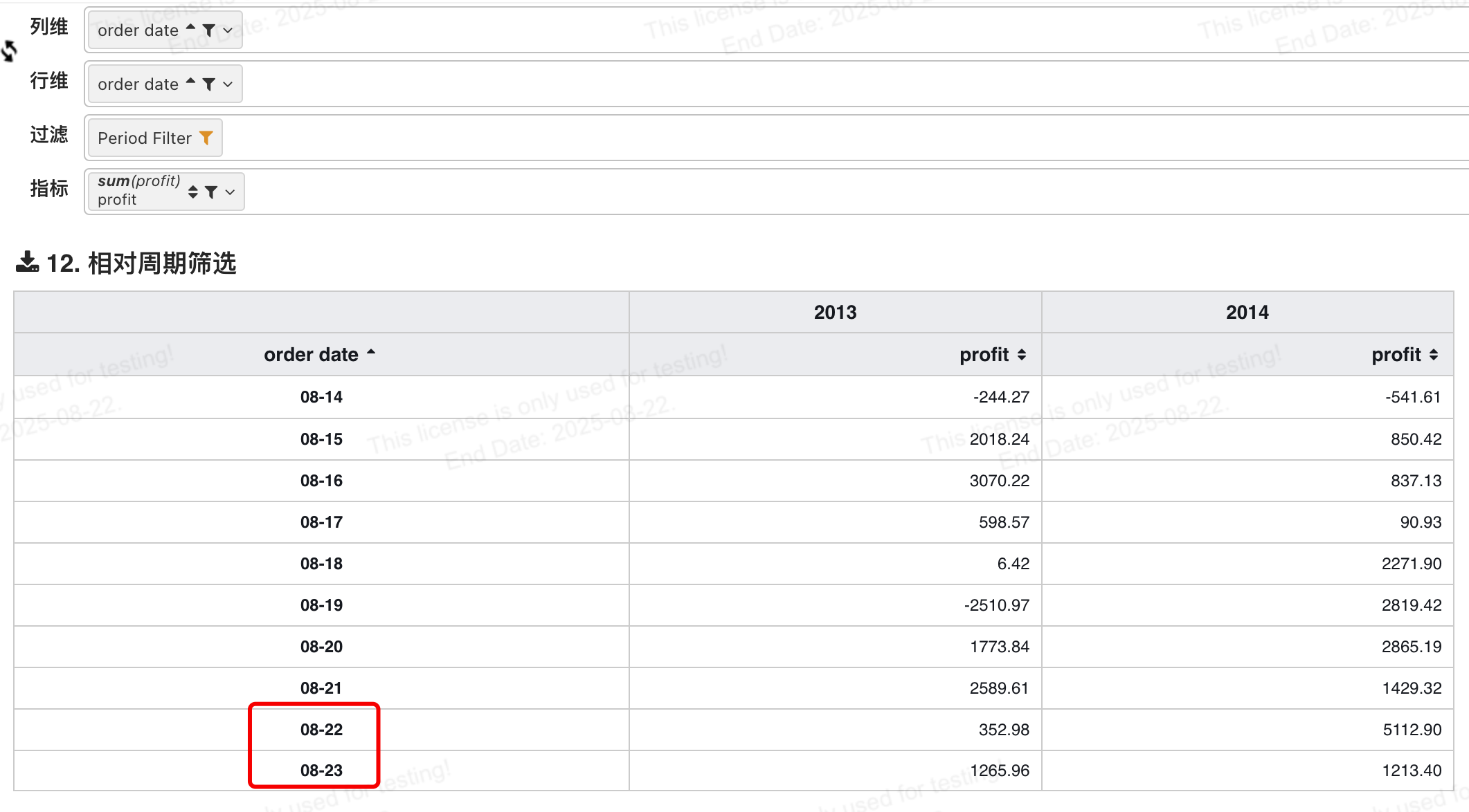
Both years' dates are cut off at August 23.
13. User Login Frequency
Scenario 13: User Login Frequency
Scenario Description:
How many users log in to the website or application monthly, every two months, every three months, and so on? What is the average login rate? How skewed is the distribution around this average?
The data granularity is login date per user ID. That is, each day a user logs in is recorded as a row. Generating this view requires segmenting the number of customers by login rate, meaning we must segment one measure by another.
We learned in Example 1 how to easily perform such analysis using LOD expressions.
Visualization Key: Time between first and second login, and the corresponding number of users.
Tableau LOD
Time between first and second login, and login count per user.
First login date + latest login date, fixed+min/max functions:
{FIXED [User ID]:MIN([Log in Date])}, {FIXED [User ID]:MAX([Log in Date])}

Calculate the interval between the two dates above using datediff, with parameter set to month:
DATEDIFF(‘month’,[First Login Date],[Latest Login Date])

Calculate login count per user, fixed +countd:
{FIXED[User ID]:COUNTD([Log in Date])}

Calculate average login period per user, interval/count:
ROUND([Interval]/[Login Count Per User])

Reference line, average login period for all users:
{EXCLUDE [Average Login Period]:AVG([Average Login Period])}

Column gradient color:
AVG([Average Login Period])-AVG([Average Login Period for All Users])
BI LOD
First login date + latest login date, fixed+min/max functions:
{FIXED `User ID` : MIN(`Log in Date`)}, {FIXED `User ID`:MAX(`Log in Date`)}

Calculate the interval between the two dates above using datediff, with parameter set to month:
Total Months User is Active = DATEDIFF('month', #{1st Login Date}, #{Last Login Date})

Calculate login count per user, fixed +countd:
Total Months User is Active = {FIXED `User ID`: DISTINCT(`Log in Date`)}

Calculate average login period per user, interval/count:
Log in Frequency = ROUND(#{Total Months User is Active} / #{Number of logins per user})

Reference line, average login period for all users:
Average Log in Frequency = {EXCLUDE `Log in Frequency` : AVG(`Log in Frequency`)}

Column gradient color:
MAX(`Log in Frequency`) - ${Average Log in Frequency}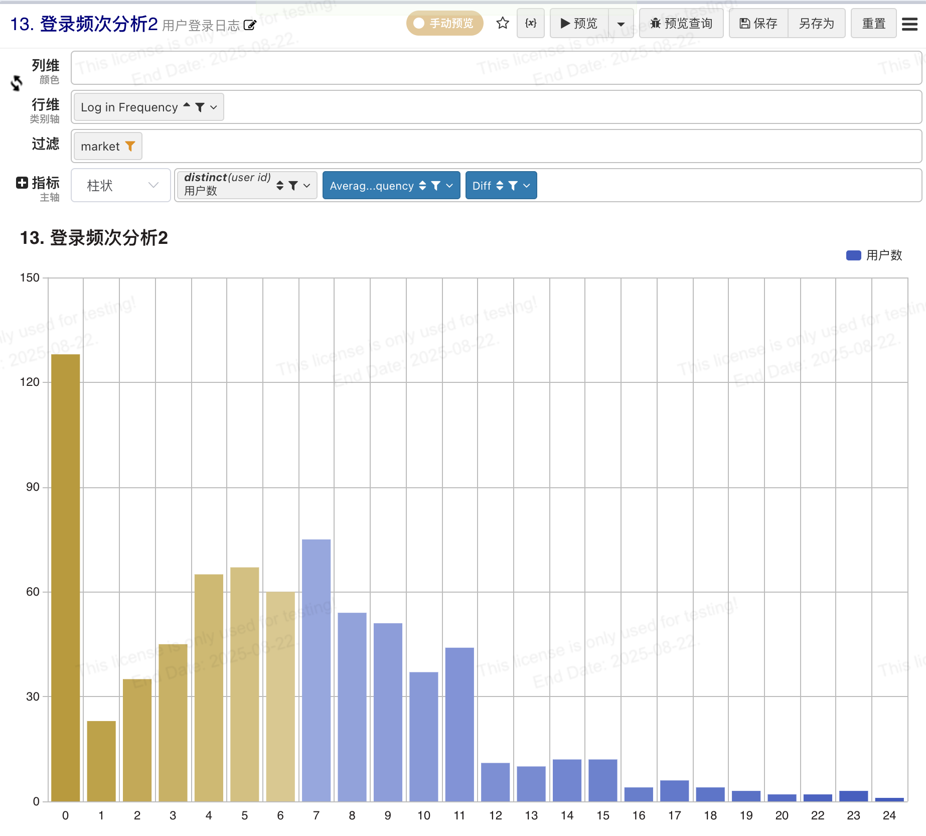
14 Proportional Brushing
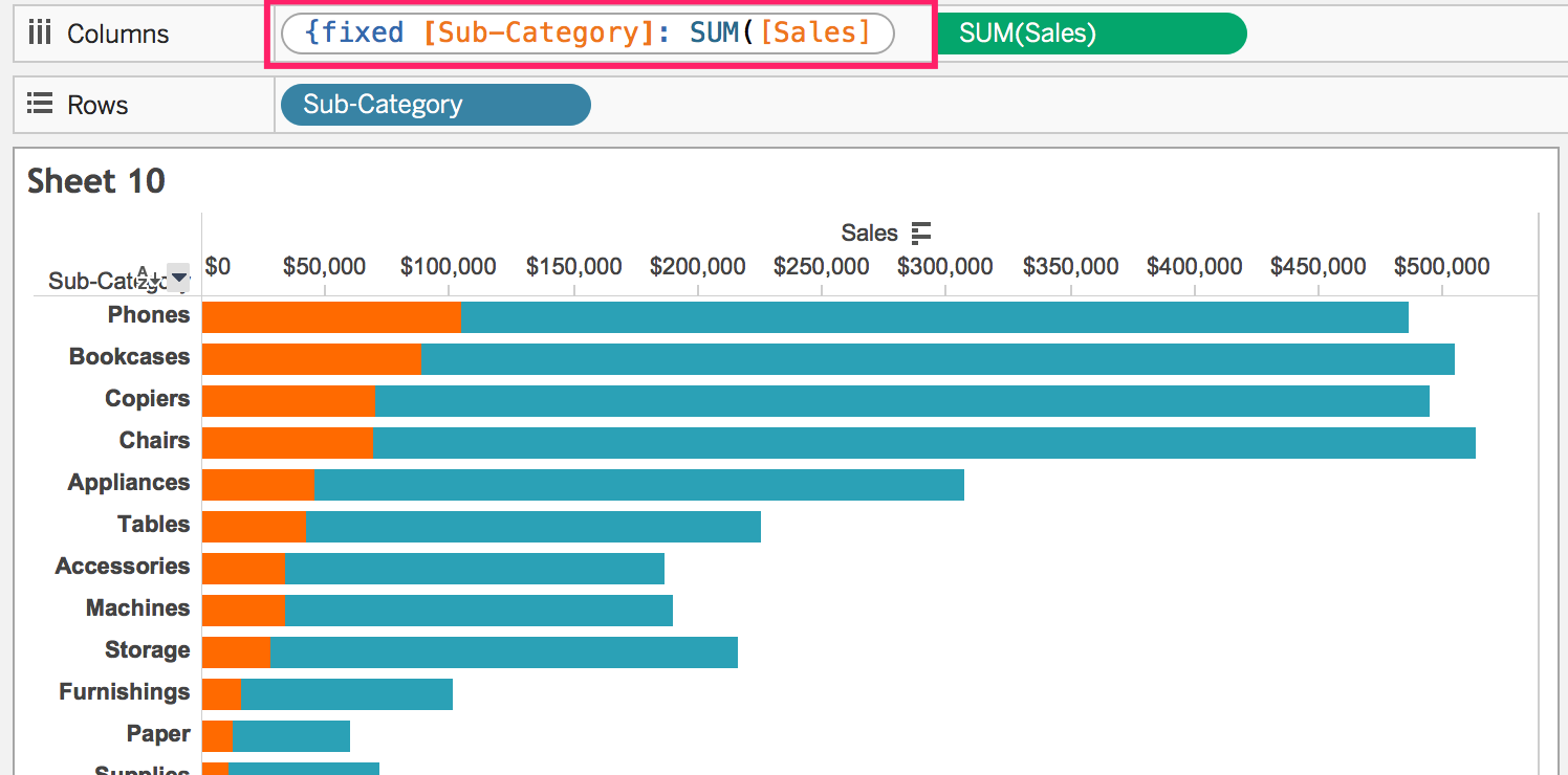
Scenario Description: The most basic question in any analysis is: "Compared to what?" When filtering, we sometimes need to compare the selection with the total, not simply drill down into the selection. This technique is called proportional brushing.
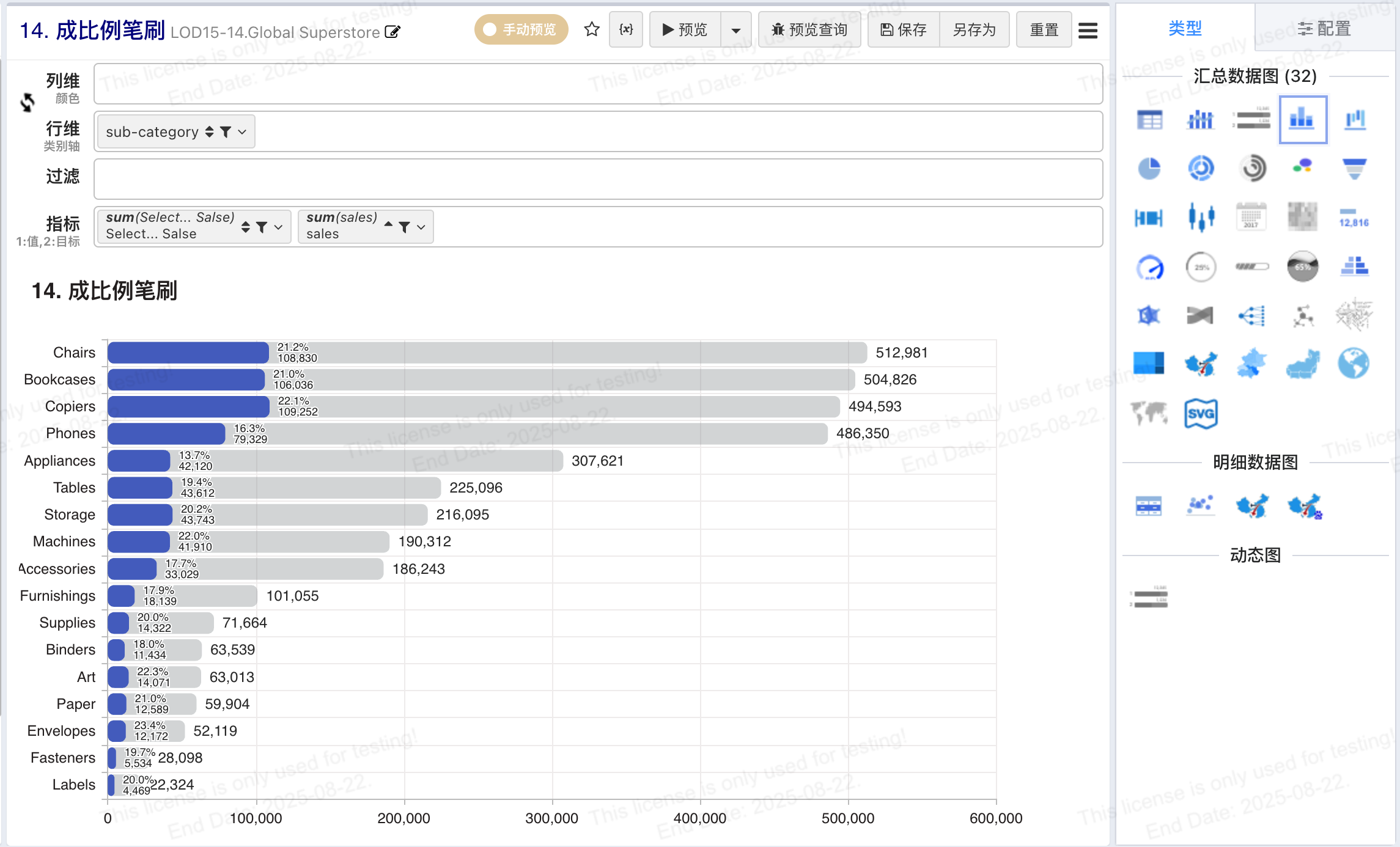
Visualization Key: Country's sales proportion in each category.
LOD Tableau
Total sales quantity (higher aggregation level)
Sales of this sub-category across all countries: {Fixed [Sub-Category] : Sum([Sales]) }Proportion: SUM([sales])/SUM([Sales of this sub-category across all countries])
BI LOD
-- Sales of this sub-category across all countries:
{FIXED [Sub-Category] : SUM([Sales]) }

Sales of selected country:
IF(`country`='${country!"China"}', `sales`, 0)
Select a Progress Bar chart, set the value axis to horizontal.