Progress Bar
Progress Bar
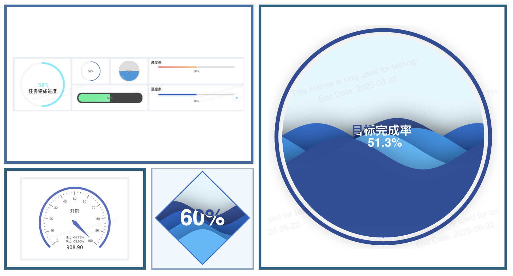
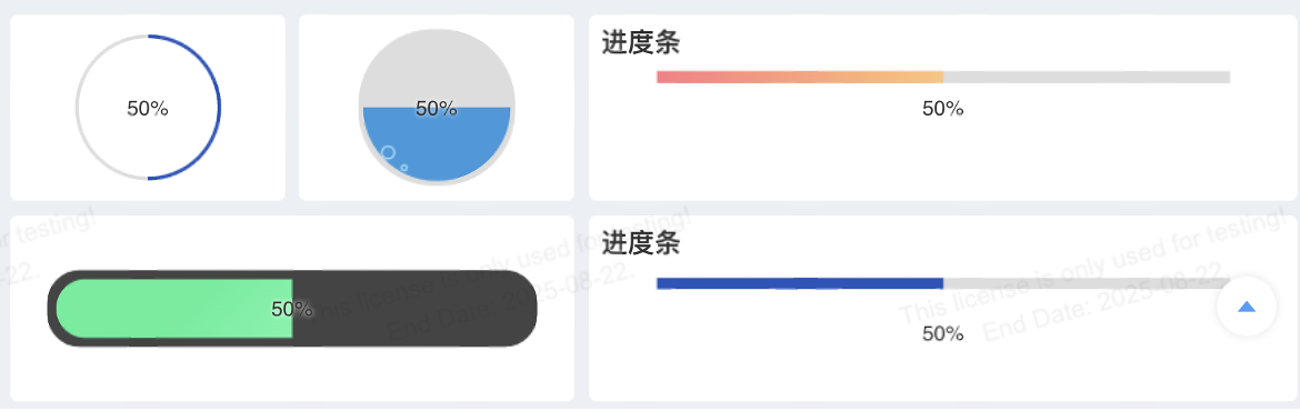
Progress bar-type charts include Progress Bar, Circular Progress Bar, Gauge Chart, and Liquid Fill Chart.
Progress Bar
The progress bar chart component is a non-ECharts chart component based on SVG (loading.io). The configurable options and adjustable style effects may not be as extensive as those of ECharts-based charts.
| Design Area | Chart Element | Requirement |
|---|---|---|
| Row Dimension | X-Axis | Place 0 or more dimension nodes |
| Column Dimension | Y-Axis | Place 0 or more dimension nodes |
| Metric | Value | Place 1 or more metric nodes. Add a second metric for the maximum value, matched by metric position. |
Style Configuration
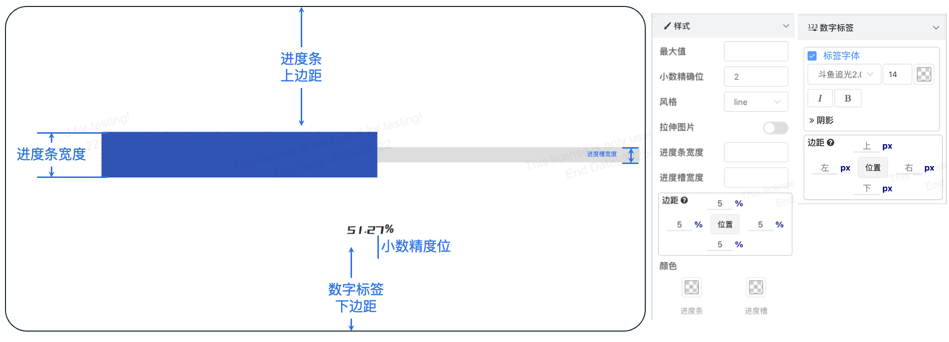
Progress Bar Styles
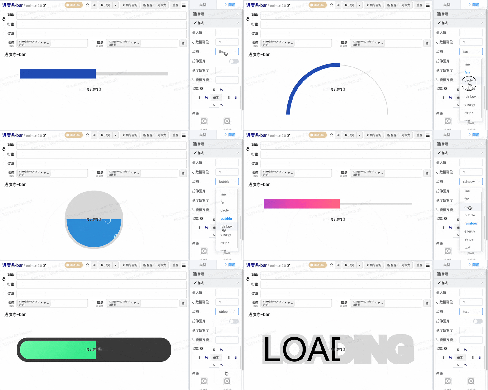
If changing the style does not update in real-time, try clicking Preview to force an update.
Circular Progress Bar
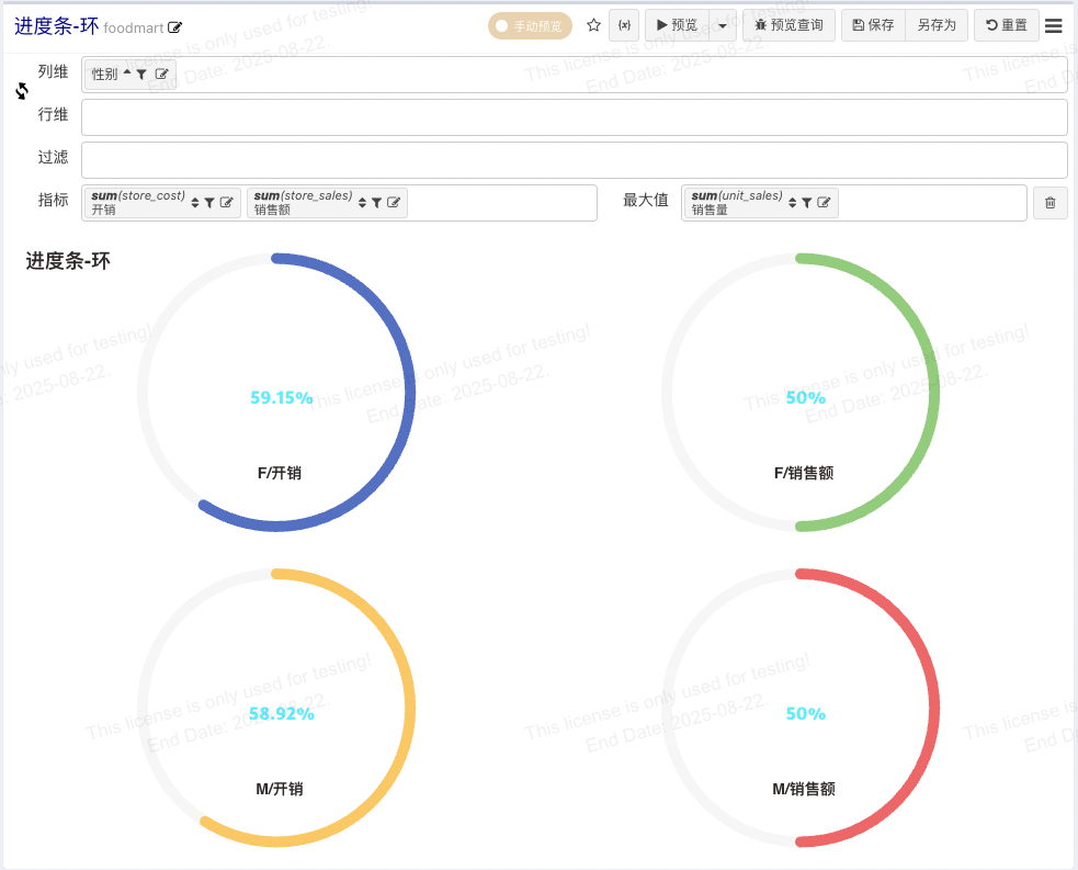
The circular progress bar is an ECharts chart that supports drawing multiple progress rings at once.
| Design Area | Chart Element | Requirement |
|---|---|---|
| Row Dimension | X-Axis | Place 0 or more dimension nodes |
| Column Dimension | Y-Axis | Place 1 or more dimension nodes for splitting metrics |
| Metric | Value | Place 1 or more metric nodes. Add a second metric for the maximum value, matched by metric position. |
- Multiple progress bars can be achieved by configuring metric splits via column dimensions or by using multiple metrics.
- Supports dynamic maximum value configuration; can match maximum values by position. As shown in the image below, two metrics are configured, but only the first has a maximum value set.
Style Configuration
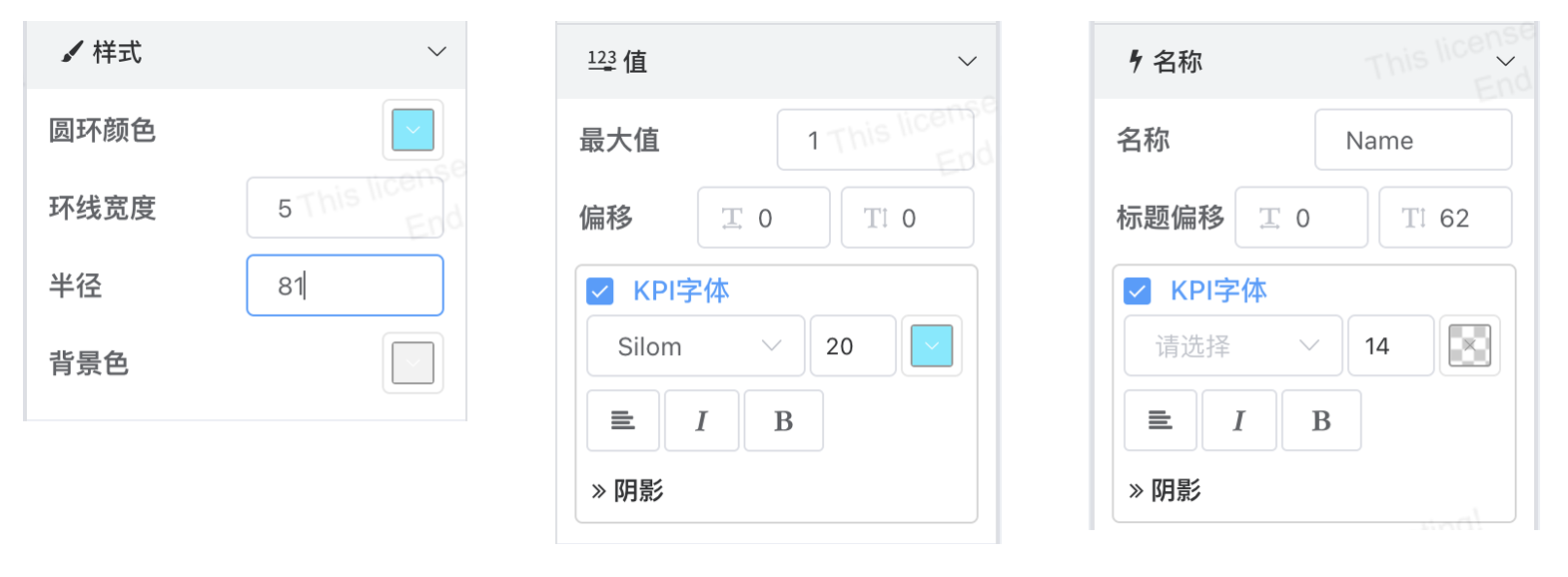
- Ring Color: For multiple progress rings, colors are controlled by the color palette.
- Ring Width: Controls the thickness of the progress bar.
- Radius: Controls the size of the ring within the grid, measured in percentage of the grid.
- Background Color: Color of the progress track.
- Maximum Value: Configure a static maximum value.
- Value Position Offset: Controls the position of the percentage indicator in the center of the ring.
- Title Name: Name configuration when displaying a single progress ring.
- Title Position: Controls the position of the name within the ring.
- Layout - Split: Controls the row and column splitting for multiple charts.
Gauge Chart
| Design Area | Chart Element | Requirement |
|---|---|---|
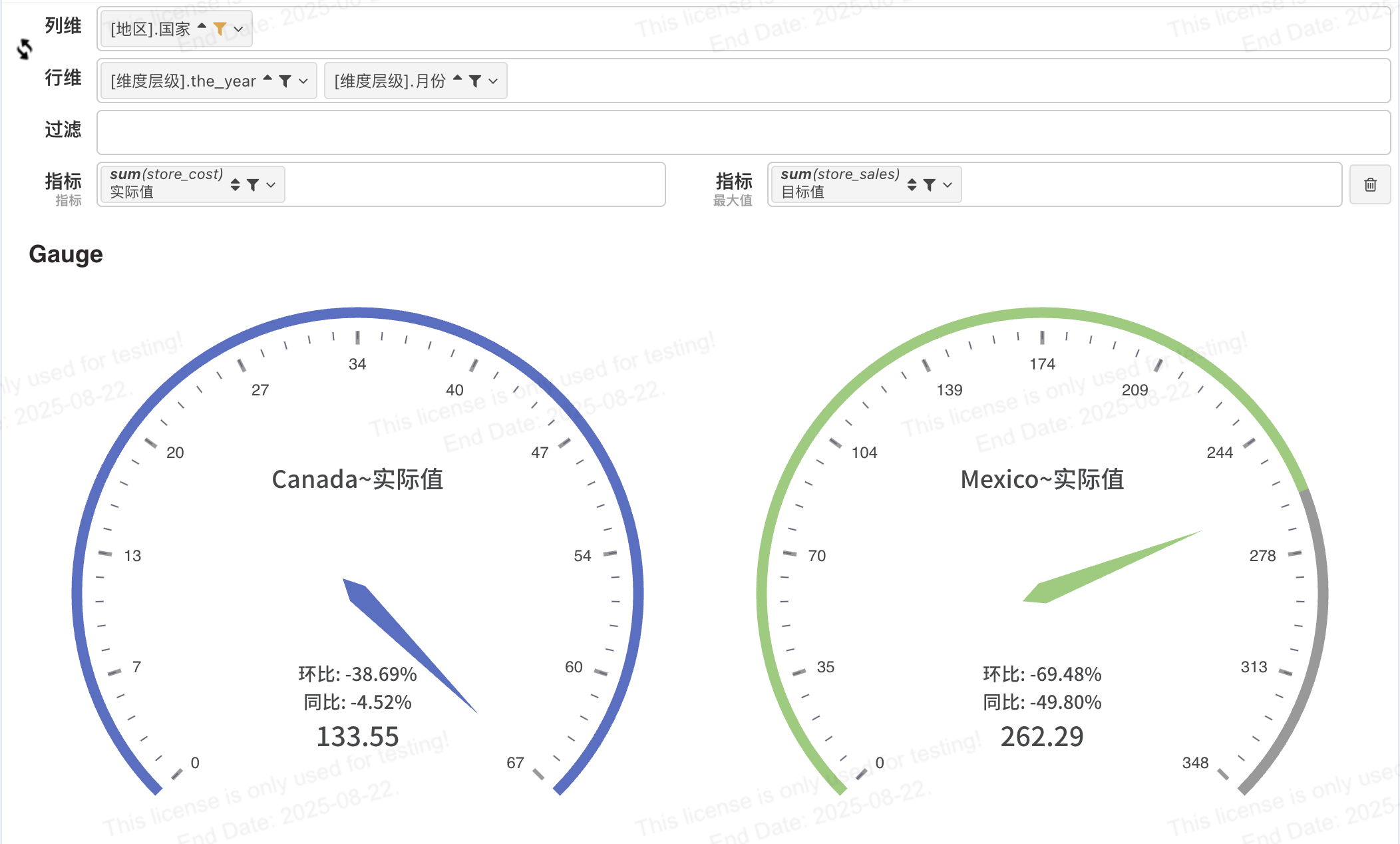
| Row Dimension | X-Axis | Place 1 or more dimension nodes for calculating period-over-period changes |
| Column Dimension | Y-Axis | Place 1 or more dimension nodes for splitting metrics |
| Metric | Value | Place 1 or more metric nodes. Add a second metric for the maximum value, matched by metric position. |
Style Configuration
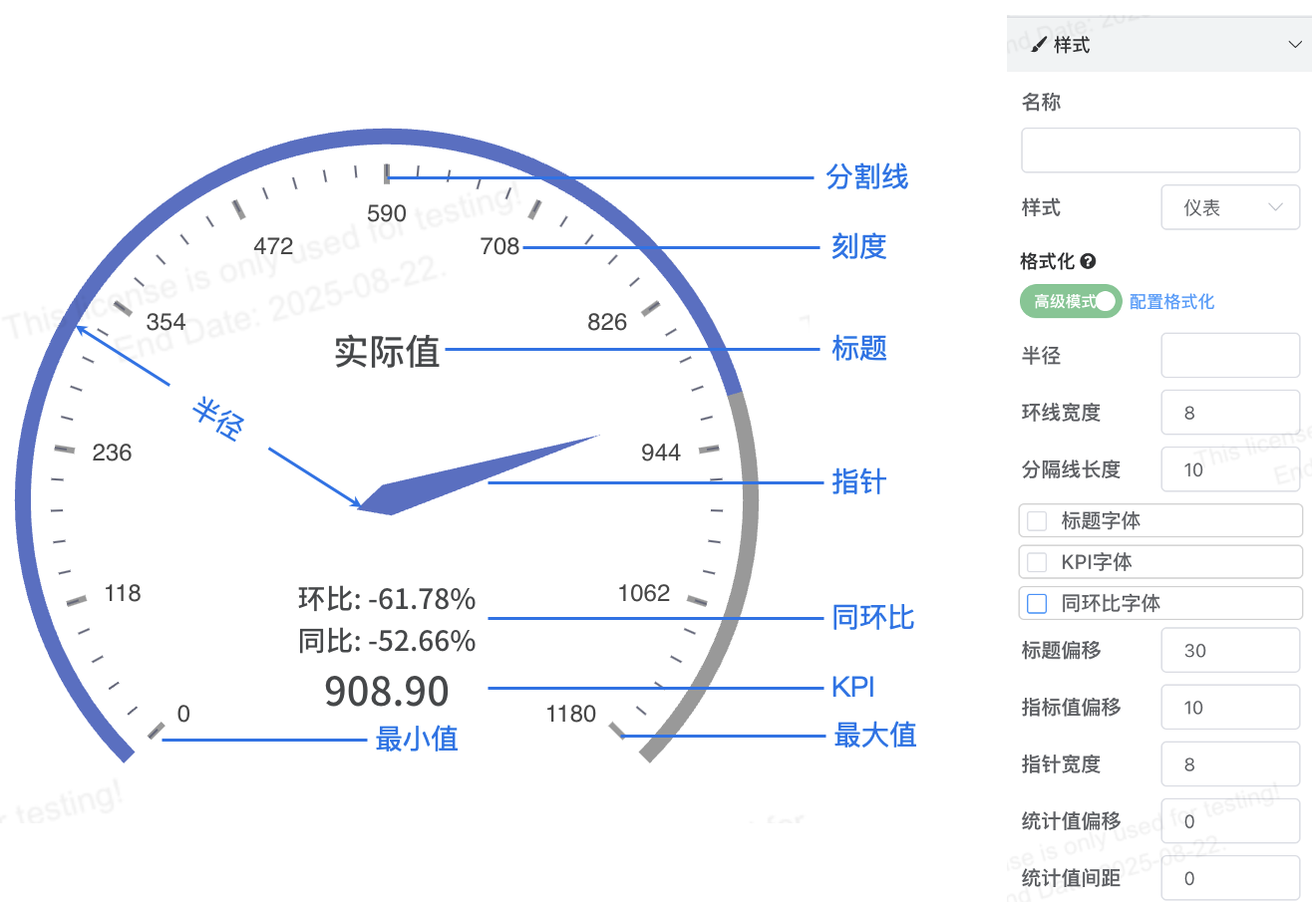
- Axis Style - Category Ticks, Dial Style: If decimal points appear in ticks, configure via category axis tick formatting.
- Title, Metric Value, Statistical Value (period-over-period changes): Supports offset configuration for top and bottom positioning.
- Statistical Value Spacing: Controls spacing between values.
Liquid Fill Chart (Water Ball)
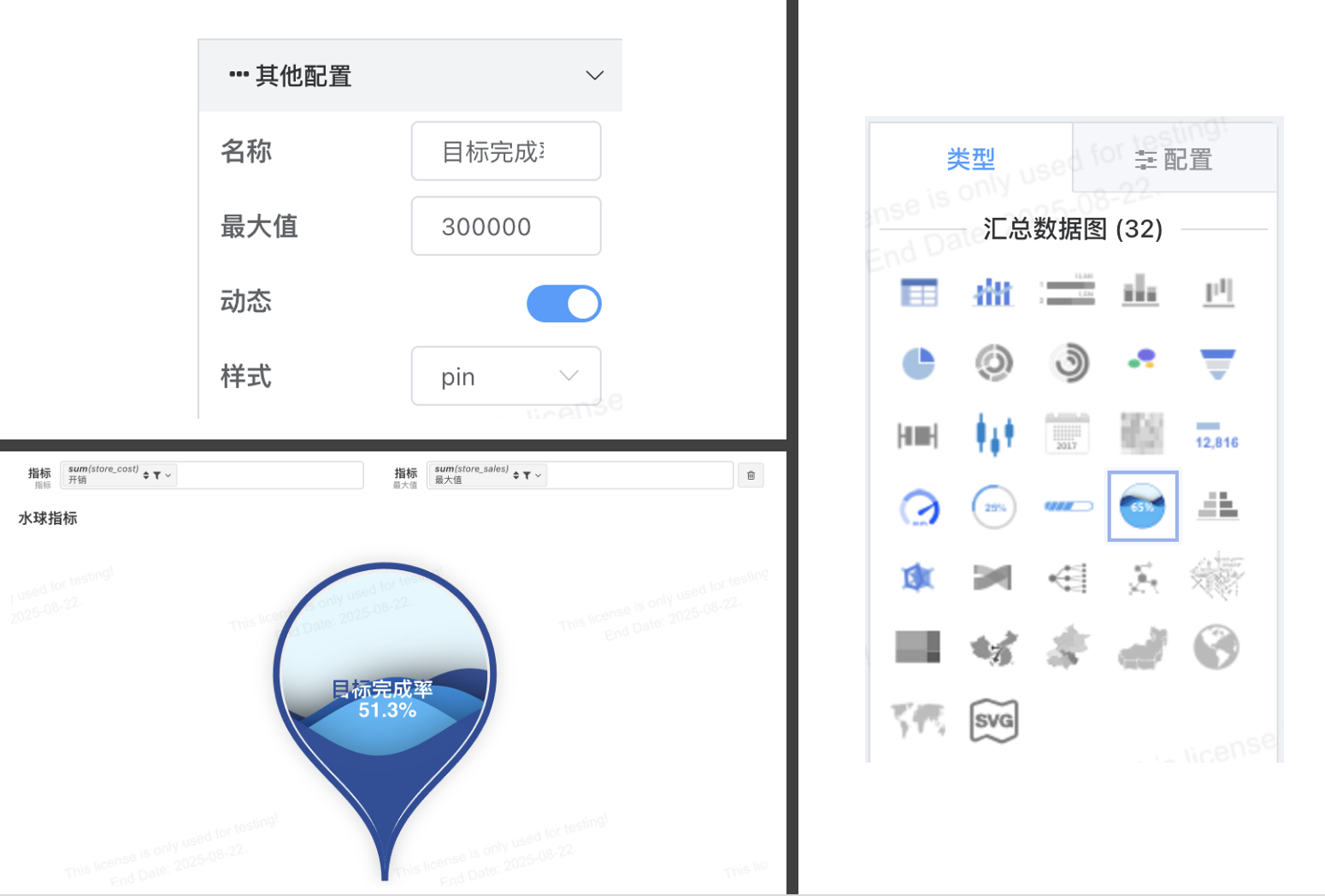
The liquid fill chart uses the capacity of a water ball to represent progress. The maximum value can come from a dynamic metric (add a second metric for the maximum value). If no dynamic metric is configured, a static maximum value can be set.
| Design Area | Chart Element | Requirement |
|---|---|---|
| Row Dimension | X-Axis | Place 0 or more dimension nodes |
| Column Dimension | Y-Axis | Place 0 or more dimension nodes |
| Metric | Value | Place 1 metric node. Add a second metric for the maximum value. |