
Query Parameter
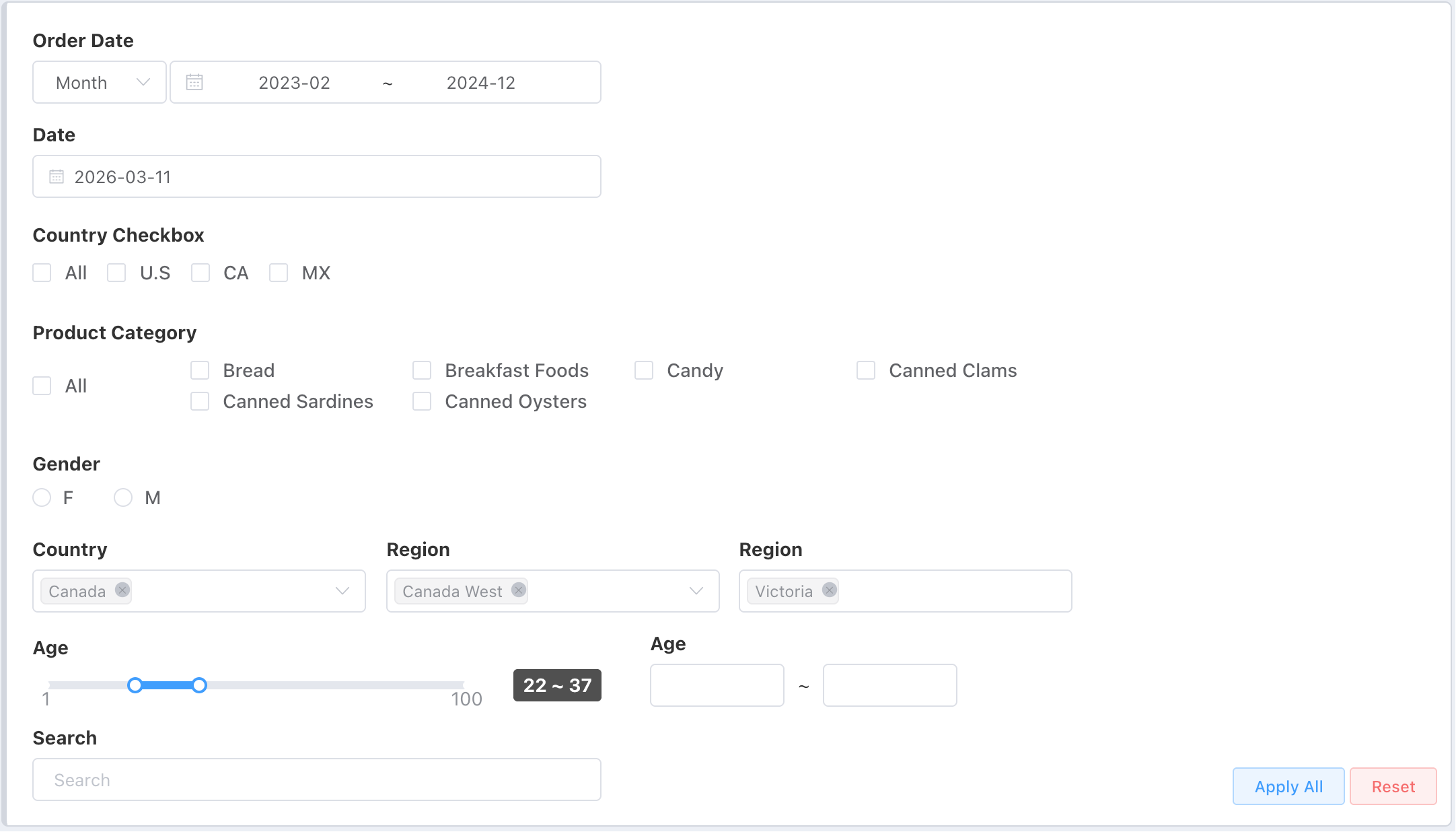
Query Parameter Components
Purpose of Dashboard Parameters (Filters)
The main purpose of dashboard parameters is to allow users to dynamically adjust and filter data displays, thereby meeting personalized needs or exploring specific data perspectives. By setting different parameters, users can easily filter datasets to obtain deeper data insights.
Types of Dashboard Parameters
Dashboard parameters provide various input methods to adapt to different usage scenarios and needs:
- General Filter: A universal filter that can implement all forms of filtering such as [=, ≠, >, <, range query, keyword query].
- Dropdown Selector: Select one or more values from a predefined list of options.
- Date Range: Select a time interval to limit the data query timeframe.
- Date: Select a specific date as a query condition.
- Checkbox: Allows multiple selections, suitable for picking a combination that meets requirements from a series of options.
- Radio Button: Select one value from a group of options, typically used for clear-choice situations.
- Range Query: Input a numerical interval, suitable for filtering needs based on numerical ranges.
- Keyword Search: Quickly find matching data records by entering keywords.
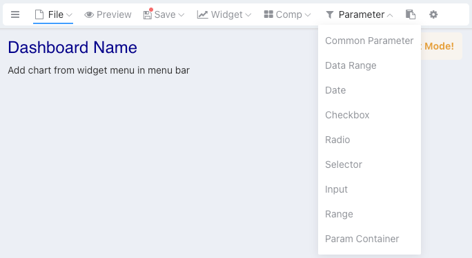
Adding Parameters (Filters)
In dashboard edit mode, select Parameters from the menu bar to add dashboard parameters.
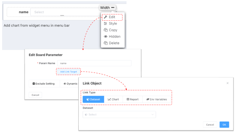
Link Target
Dashboard parameters establish associations with charts by adding Link Target.
- Link targets can be datasets or individual charts.
- One parameter can be linked with multiple different datasets or charts.
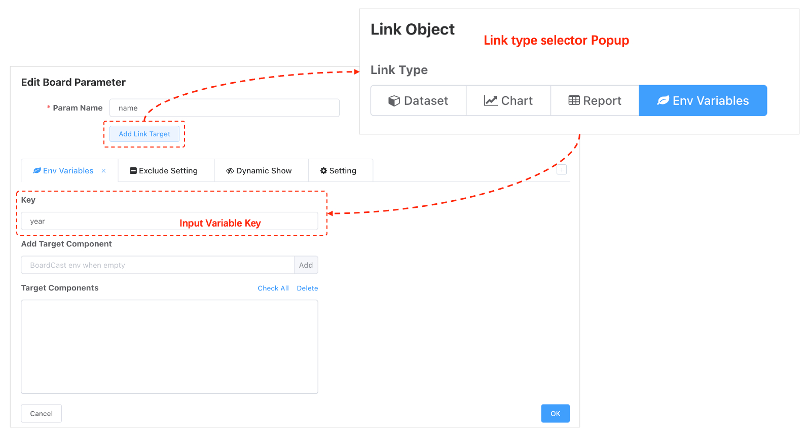
- When the linked object is an environment variable, all components using the environment variable will be affected when the parameter changes.
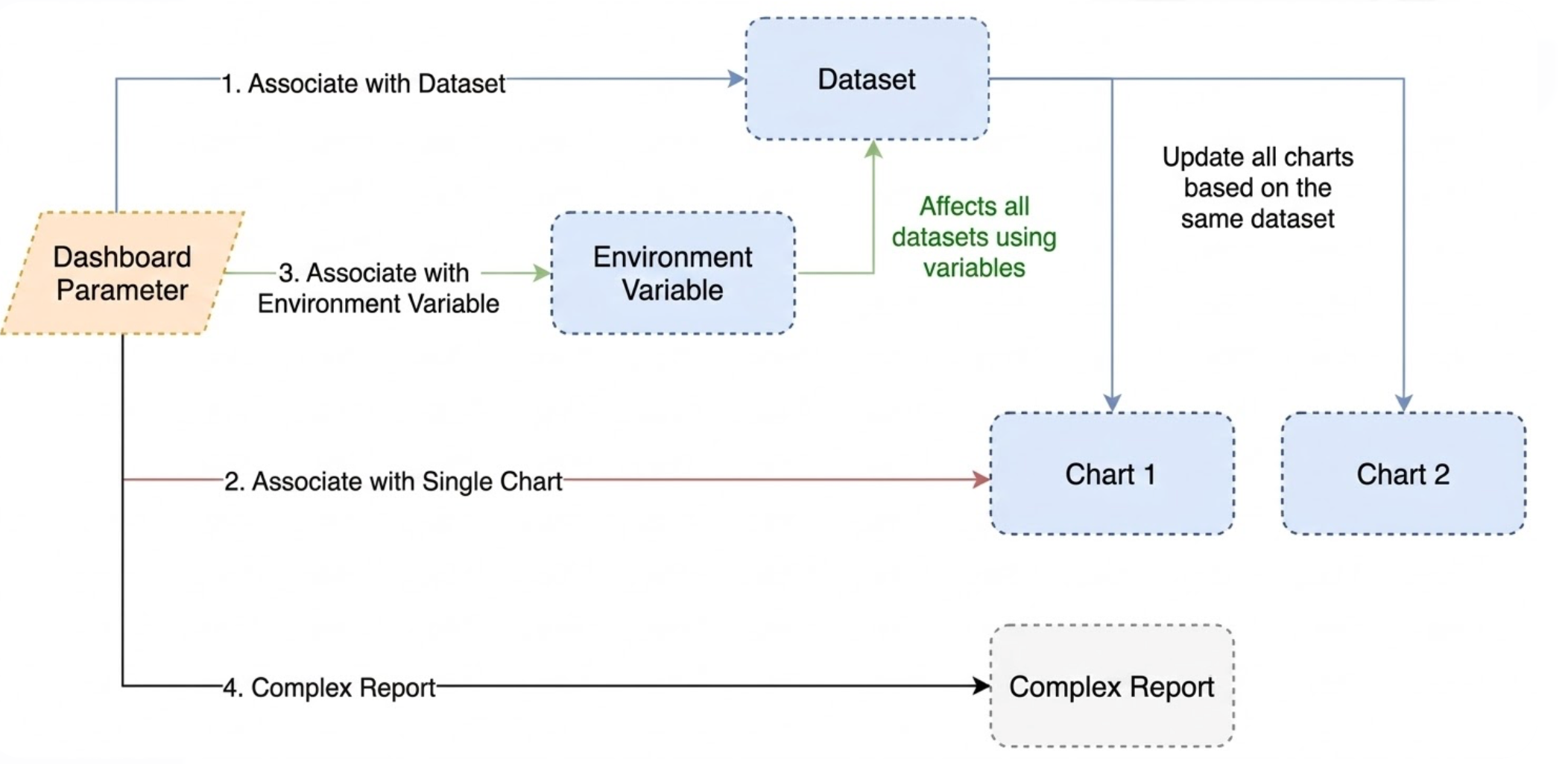
Link with Dataset
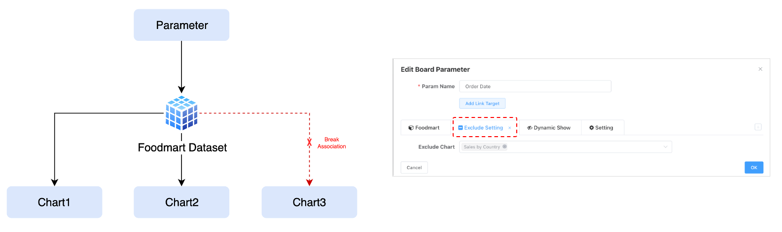
It is recommended to prioritize associating parameters with dimension nodes of dataset model. After associating with a dataset, all charts corresponding to that dataset will establish a connection with the dashboard parameter.
Exclude Charts
When we indirectly associate a dashboard parameter with all charts based on a dataset, if a particular chart (e.g., Total Annual Sales) is not supposed to be affected by this parameter, you can use the parameter exclusion object configuration.
Link with Env Variables
After associating with environment variables, they can be used for dataset and query variable settings, dashboard API dynamic request parameters, Query variable assignment, etc.
Link Field Settings
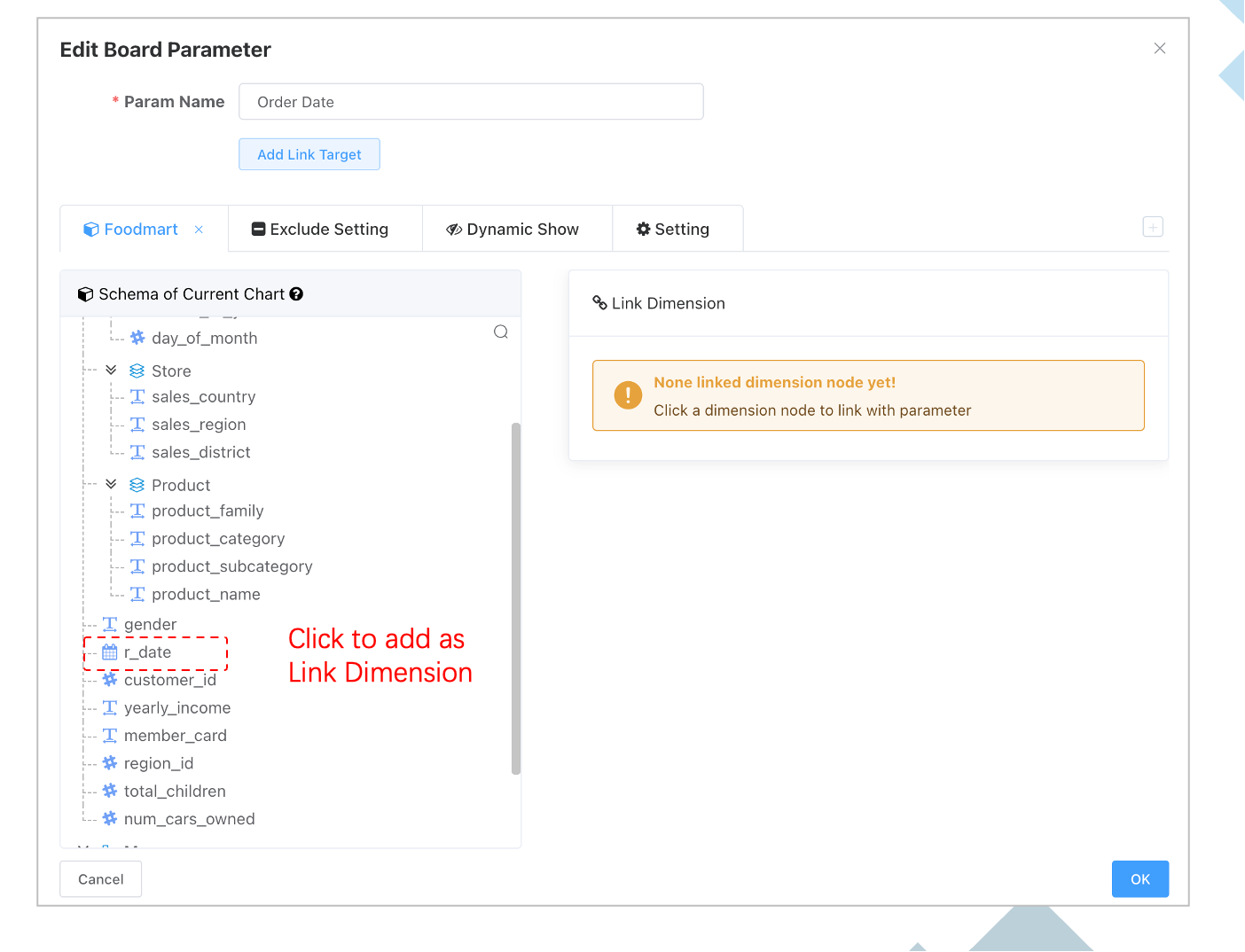
After adding an linked object, which specific dimension field of the dataset does the current parameter act upon? A dataset has multiple fields, so you also need to set which specific field of the dataset to associate with, indicating whether the current parameter is for filtering a date column, a country column, etc.
Fields Not Used in Charts
Dashboard parameters can be linked with all fields of a dataset, even if those fields are not used in charts.
Common Filter
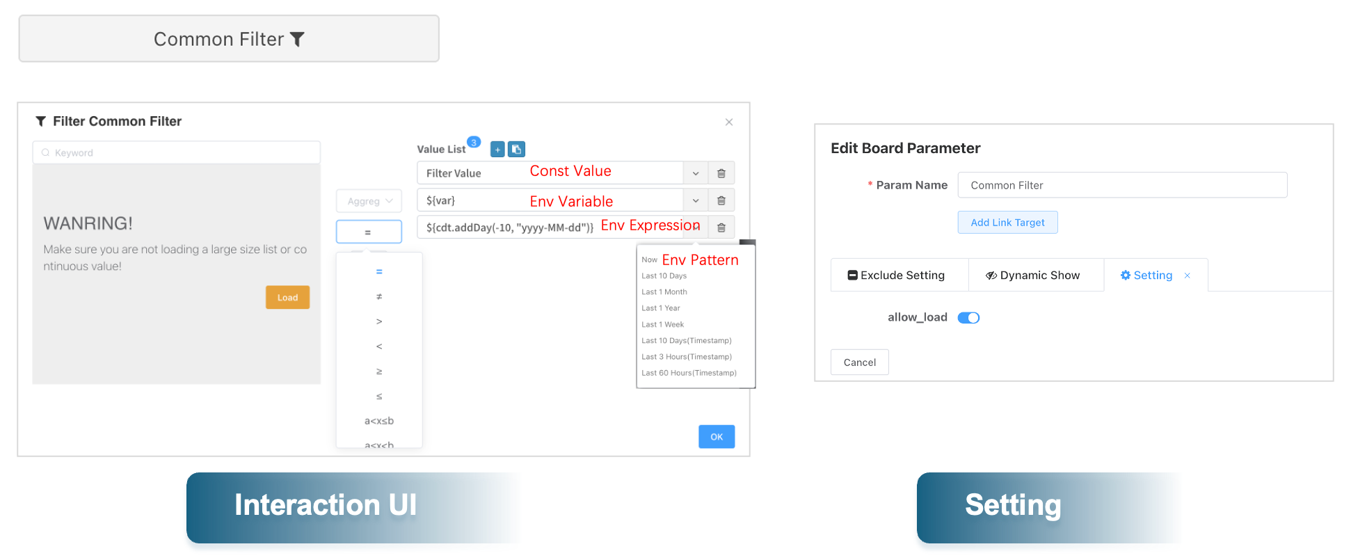
- The Common Filter is similar to filters in self-service analysis and can implement all forms of filtering such as [=, ≠, >, <, range query, keyword query].
- If you do not want users to load the content of linked fields, you can turn off the Allow Loading switch in the parameter configuration panel. This way, users can only set filter values through manual input.
- Filter value list supports variable parsing. You can select common date variable templates via the dropdown box.
Date Range Filter
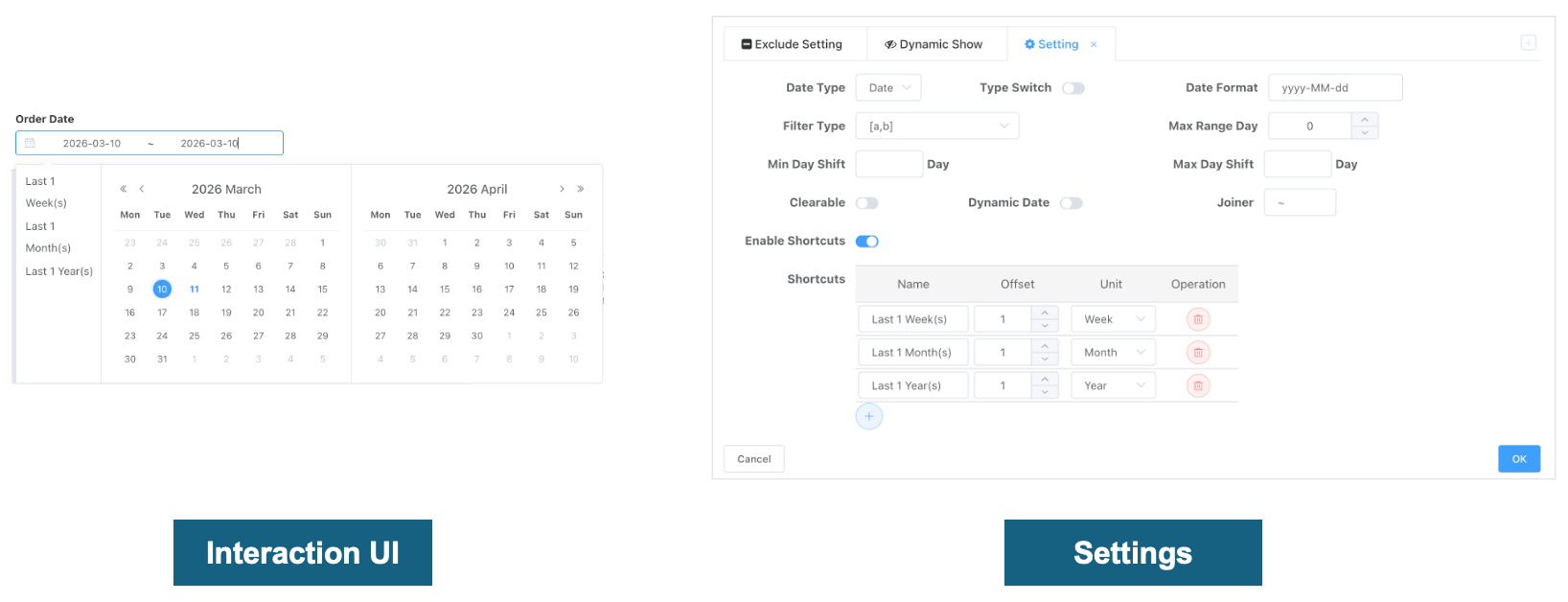
The configuration items for the date range filter allow users to customize the behavior and appearance of the date picker to meet different data filtering needs. The following explains the function of each configuration item:
| Configuration Item | Explanation |
|---|---|
| Date Type | The date granularity users can choose from, specifically: Year Range, Month Range, Day Range, Week Range, Quarter Range |
| Type Switching | Controls whether users are allowed to switch between different date types in the dashboard viewing state. Date type switching linked fields must be of date type, not string dates After enabling type switching, switching to different date types automatically changes the date value passed according to the type. |
| Date Value Format | The format in which the selected date is passed as a value. No need to set when the linked field is of date type; the system will automatically set the date format based on the date type. Value format is commonly used in the following scenarios: - linked field is a string date: e.g., yyyyMM, 202501 - After associating with environment variables, used for string concatenation. |
| Filter Type | Defines how the date range is applied to data filtering, such as closed interval [a,b] or open interval (a,b), etc. |
| Maximum Days | Sets the maximum date span users can select, e.g., 30 means the maximum selectable range is 30 days. |
| Min/Max Date Offset from Today | Sets the dates users can select on the date control; dates less than the minimum or greater than the maximum cannot be selected as start or end dates. |
| Clearable | Allows users to clear the selected date settings, restoring to default (off). |
| Dynamic Date | When enabled, the date range is automatically calculated and set based on the current date when the dashboard initializes and loads. |
| Enable Quick Dates | When enabled, displays preset quick date options in the date picker for easy and fast selection. |
| Quick Dates | Users can customize quick date options, including name (e.g., "Last 1 Week"), offset, and unit, etc. |
| Date Format | Sets the display format for dates, e.g., yyyy-MM-dd represents year-month-day format. |
| Connection Symbol | Sets the connection symbol for the date range, default is ~, but can be modified to other symbols like - or TO. |
Dynamic Date
When dynamic date configuration is enabled, the date range is automatically calculated and set based on the current date when the dashboard initializes and loads.
Start Date Offset from Today and End Date Offset from Today are used to define the offset values for the start and end points of the date range relative to the current date.
- Value: Input the specific number of days, weeks, months, or years. Negative numbers represent offsets backward in time.
- Unit: Select the time unit, such as "Day", "Week", "Month", or "Year".
For example:
- If "Start Date Offset from Today" is set to "-7 days", it means the range ends at the date 7 days ago.
- If "End Date Offset from Today" is set to "0 days", it means the range starts from today.
Take Start/End Value is used to calculate the date after dynamic offset to the "first day" or "last day" of the specified type.
- Year, Month, Day, Week: Select the time granularity.
- Start/End: Determine whether based on the start or end of the period.
For example: Assuming today is October 5, 2023, and we want to view data from the previous month, with the data range from the first day to the last day of the previous month.
Through these configuration items, users can flexibly define dynamic date ranges to meet data filtering needs in different scenarios, while maintaining operational simplicity and result accuracy.
Date Type Switching
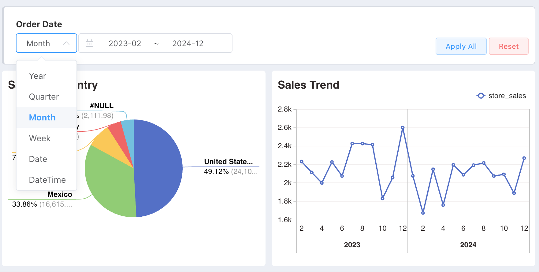
The date type switching function allows users to flexibly switch between different time granularities (such as year, month, week, etc.) to meet data query and analysis needs in different scenarios. This switching not only changes the date selection method in the user interface but also directly affects the logic and formatting of backend database queries. The following is a detailed explanation:
Date Type Switching Principle
When users select different date types on the front-end interface (e.g., switching from "Year" to "Month"), the system dynamically adjusts the display and interaction of the date picker based on the currently selected date type:
- Year: Users can select a specific year.
- Month: Users can select a specific month.
- Week: Users can select a specific week.
- Day: Users can select a specific date.
Database Query Logic Changes
The backend database query logic automatically adjusts the formatting of date fields according to the date type selected by the user to ensure the accuracy and consistency of query results, such as:
- Selecting Year: The database query uses
DATE_FORMAT(date_field, 'yyyy')to extract and match year information. - Selecting Month: The database query uses
DATE_FORMAT(date_field, 'yyyy-MM')to extract and match year-month information.
linked Field Requirements
To ensure the correctness and effectiveness of the date type switching function, the linked field must be of date type and cannot be a string representation of a date. This is because:
- Date type fields can be processed by the
date_formatfunction.
Example Explanation
Assume there is an order table containing an order_date field that records the date information for each order. If the user selects "Year" as the date type and chooses 2024, the database query statement might be:
SELECT * FROM orders WHERE DATE_FORMAT(order_date, 'yyyy') = '2024';If the user switches to "Month" and selects August 2024, the query statement automatically adjusts to:
SELECT * FROM orders WHERE DATE_FORMAT(order_date, 'yyyy-MM') = '2024-08';Thus, through the date type switching function, users can conveniently view and analyze data at different time granularities, while the system can automatically adapt to the corresponding query logic, ensuring data display accuracy and efficiency.
Date
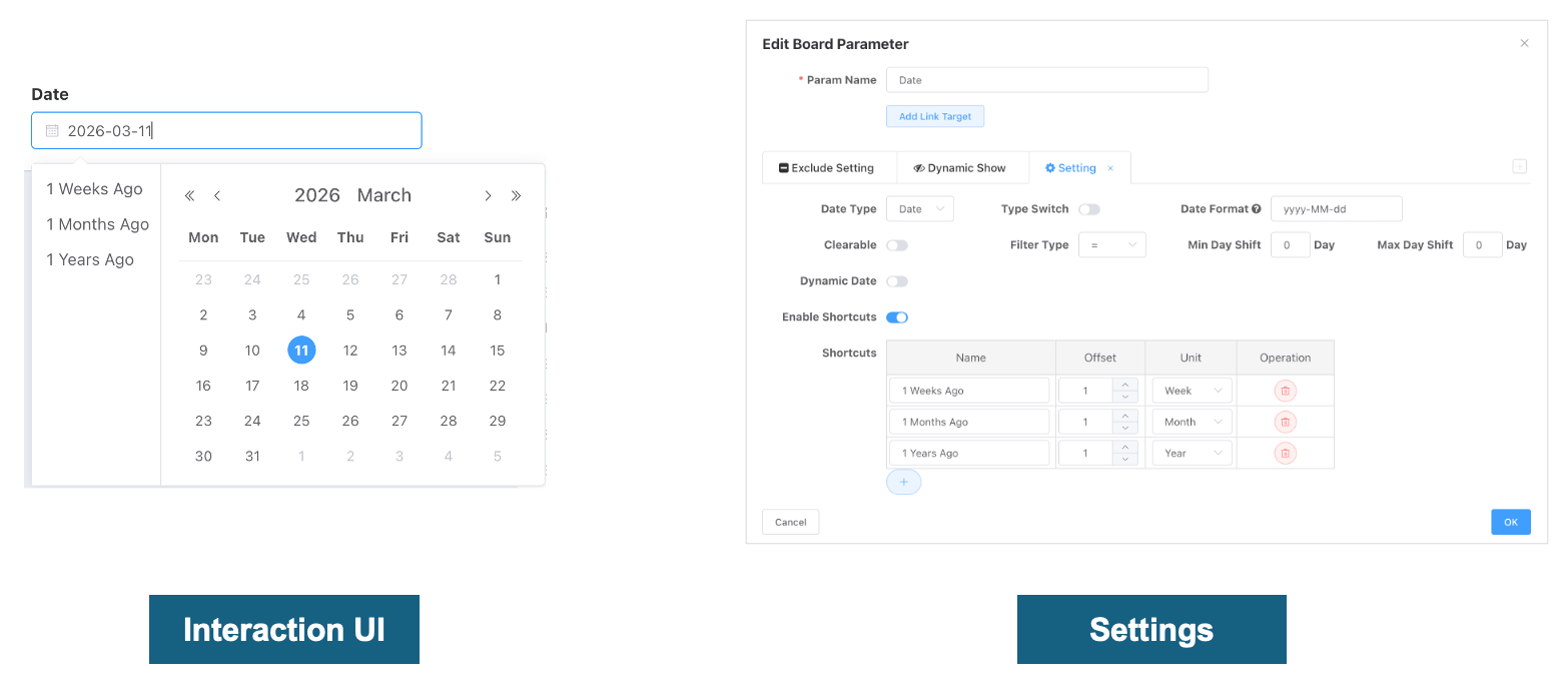
The configuration of the Single Date filter control is basically the same as that of the date range.
| Configuration Item | Explanation |
|---|---|
| Date Type | The date granularity users can choose from, specifically: Year, Month, Day, Week, Quarter |
| Type Switching | Controls whether users are allowed to switch between different date types in the dashboard viewing state. Date type switching linked fields must be of date type, not string dates After enabling type switching, switching to different date types automatically changes the date value passed according to the type. |
| Date Value Format | The format in which the selected date is passed as a value. No need to set when the linked field is of date type; the system will automatically set the date format based on the date type. Value format is commonly used in the following scenarios: - linked field is a string date: e.g., yyyyMM, 202501 - After associating with environment variables, used for string concatenation. |
| Filter Type | Defines how the date is applied to data filtering, such as: =, >, <, >=, <= |
| Min/Max Date Offset from Today | Sets the dates users can select on the date control; dates less than the minimum or greater than the maximum cannot be selected. |
| Clearable | Allows users to clear the selected date settings, restoring to default (off). |
| Dynamic Date | When enabled, the date is automatically calculated and set based on the current date when the dashboard initializes and loads. |
| Enable Quick Dates | When enabled, displays preset quick date options in the date picker for easy and fast selection. |
| Quick Dates | Users can customize quick date options, including name (e.g., "Last 1 Week"), offset, and unit, etc. |
| Date Format | Sets the display format for dates, e.g., yyyy-MM-dd represents year-month-day format. |
Checkbox
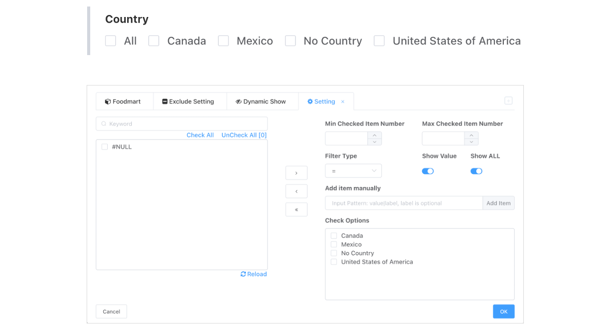
| Configuration Item | Explanation |
|---|---|
| Min/Max Selections | Configure the minimum and maximum number of items that can be selected. |
| Filter Type | Controls whether users are allowed to switch between different date types in the dashboard viewing state. Date type switching linked fields must be of date type, not string dates After enabling type switching, switching to different date types automatically changes the date value passed according to the type. |
| Filter Type | Defines how the date is applied to data filtering, such as: =, ≠ |
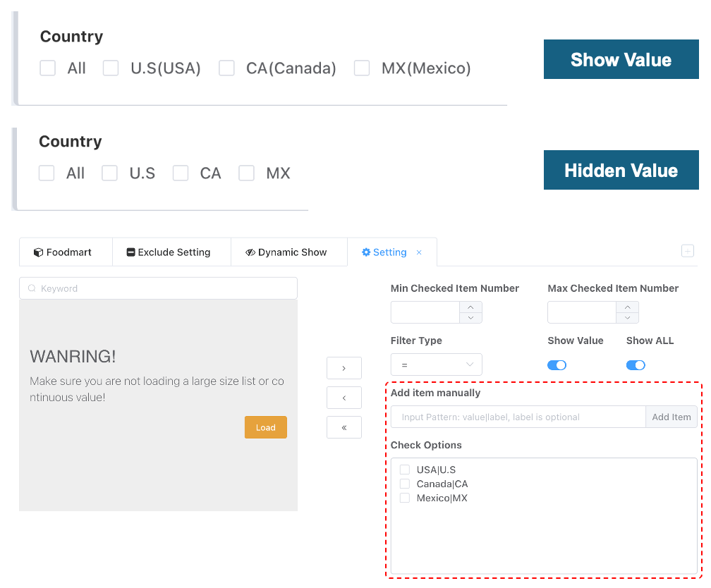
| Manual Input Add Value | CheckBox options are fixed static options; users can maintain options through manual input. |
| Options | The current CheckBox options. |
| Add Target Field Members | Users can also load target field members from the left side and add them to the options. |
Option Value and Name
If users need to separate the display value from the passed value for options, they can add options in the format option_value|option_name.
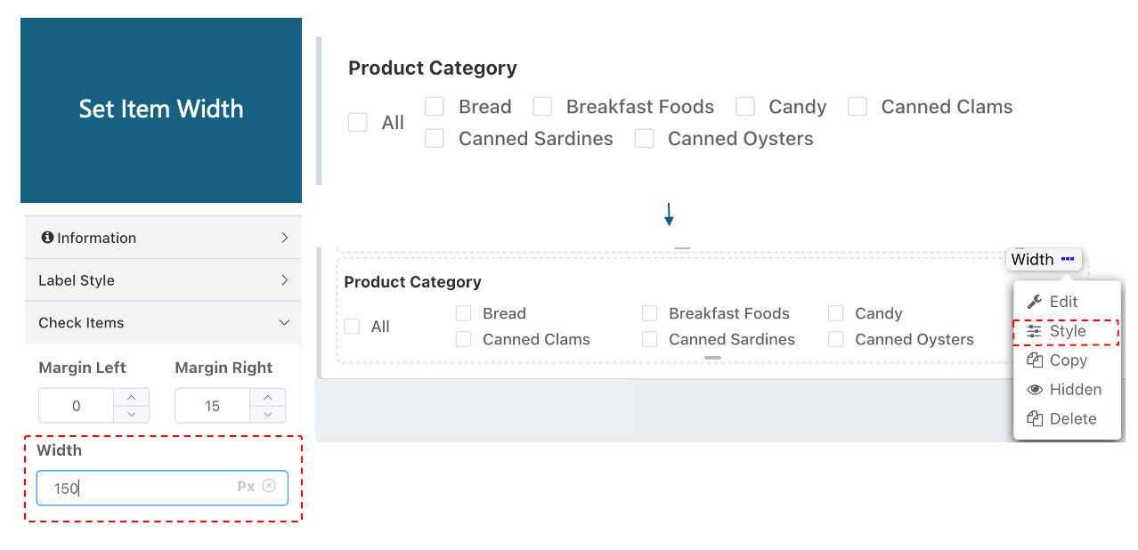
Option Width Setting
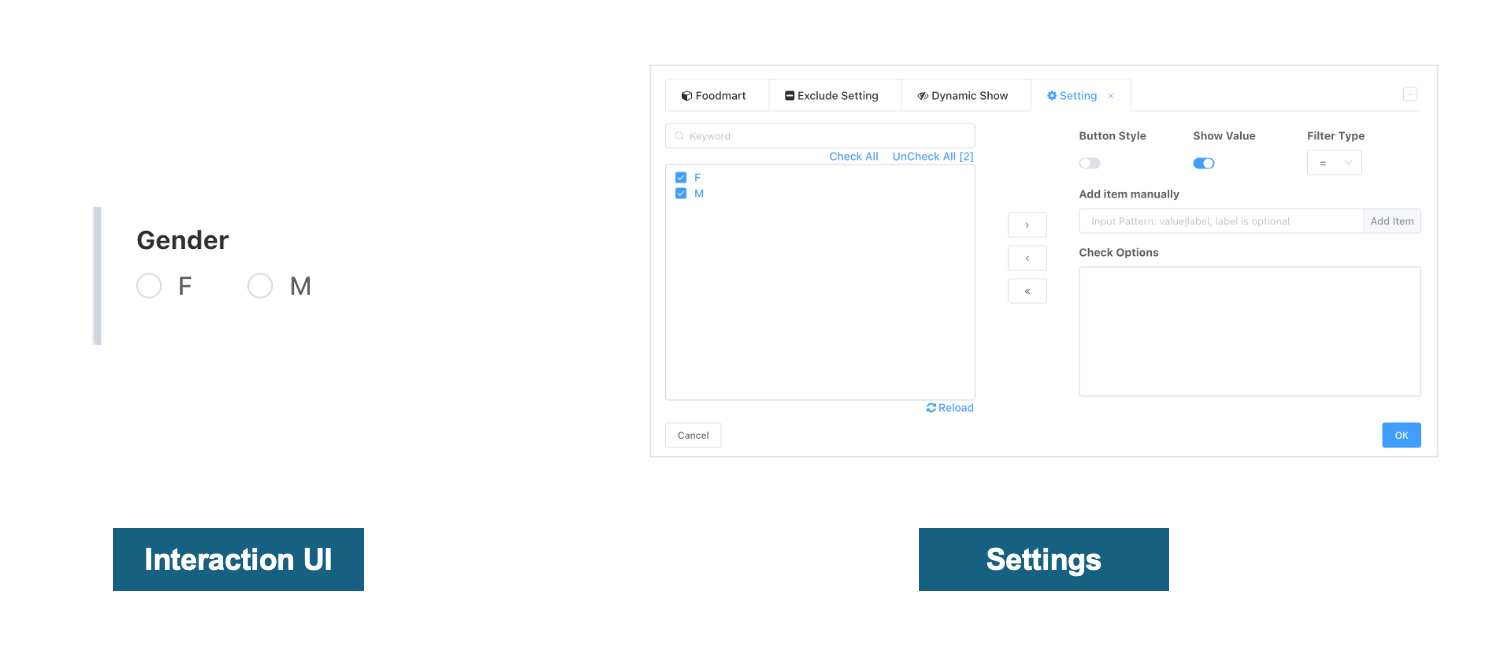
Radio Button
| Configuration Item | Explanation |
|---|---|
| Filter Type | Defines how the date is applied to data filtering, such as: =, ≠ |
| Manual Input Add Value | CheckBox options are fixed static options; users can maintain options through manual input. |
| Check Options | The current CheckBox options. |
| Add Target Field Members | Users can also load target field members from the left side and add them to the options. |
Dropdown Selector
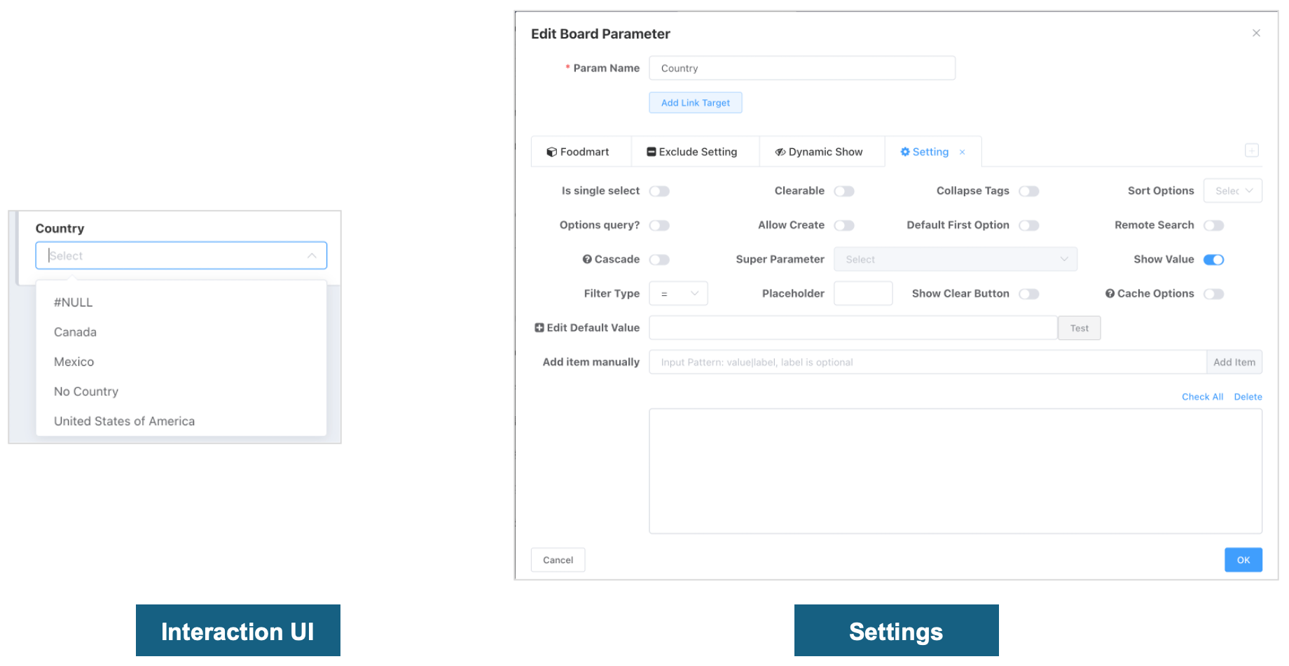
Configurations
| Configuration Item | Explanation |
|---|---|
| Single Select | When enabled, users can only select one option. |
| Clearable | When enabled, users can clear the selected option. |
| Collapse Multiple | When enabled, in multi-select mode, selected options are displayed collapsed. |
| Option Sorting | Sets the sorting order for options, ascending or descending. |
| Filter Type | Sets the type of filter condition, such as: =, ≠, >, < |
| Set Default Value | The default selected value; users can set a default value in the input box below, supports variables, click the "Test" button to test variable resolution. |
| Optional Value Query | When enabled, allows obtaining optional values through a query. |
| Allow Creating Entries | When enabled, users can manually input and create new option entries. |
| Default Select First | When enabled, the first option in the list is selected by default. |
| Remote Search | When enabled, supports remote search functionality, loading search results in real-time. |
| Display Option Value | When enabled, displays the specific option values on the interface. |
| Use Cache | When enabled, uses a caching mechanism to improve loading speed and performance. |
Option Value Query
Improve option retrieval efficiency by configuring a dropdown optional value query on a dimension dictionary table, and how to achieve the separation of (option value and option name).
What to do if the dropdown loads slowly?
Default Behavior
Dropdown options are obtained by constructing a subquery through the linked dataset field. If this dataset is a fact table, view, or is large and slow-performing, each field option subquery will incur significant query overhead.
Optional Value Query Setting
To optimize performance, users can enable the "Optional Value Query" function, and set up an SQL statement that directly queries a dimension dictionary table. This method can directly retrieve options from a dimension dictionary table specifically designed for fast lookups, significantly improving option loading speed and overall performance.
Example Configuration: Assume we have a country list to display in a dropdown:
SELECT country_code AS option_value,
       country_name AS option_name
FROM countries;
In this example:
country_codeis the option value, which will be the actual value submitted to the server.country_nameis the option name, which is the text label the user sees on the interface.
Summary
| Configuration Item | Explanation |
|---|---|
| Set Optional Value Query | Users can specify an SQL statement that directly queries a dimension dictionary table, improving option loading efficiency. |
| Option Value and Option Name | When the query returns two fields, the first field is used as the option value, and the second field as the option name. |
| Example SQL | SELECT option_value, option_name FROM dimension_dictionary; |
Through this method, it not only significantly reduces performance issues caused by frequent queries on large fact tables but also provides users with a more friendly and intuitive operation experience.
Cache
If optional value query is not configured, and the option list does not change frequently, users can also enable dropdown cache. The default cache validity period is 12 hours and can be configured.
Cache will not take effect in the following scenarios:
- The dimension configuration has an optional value query (including parameter configuration and dataset dimension configuration).
- The dataset field has permission rules configured.
Parameter Cascading
Parameter cascading is often used between two dropdowns with hierarchical relationships. When the value of the parent dropdown parameter changes, the options in the child dropdown are limited by the parent's selection, e.g., Country -> Region, Company -> Department.

- The first step in establishing cascading is to open the cascading switch in the child dropdown configuration interface and select the parent parameter for cascading.
Hint
When a child parameter establishes a cascading relationship with the correct parent, it only means the child dropdown will refresh its options when the parent changes. It does not mean the child can use the parent's selected content to limit its own options.
- Users can establish logical relationships between parent and child options in two ways:
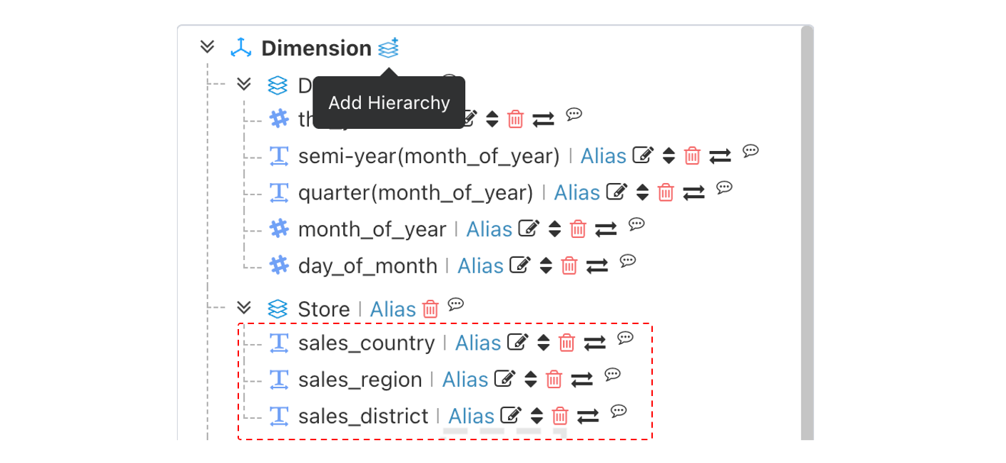
The parent and child correspond to hierarchical dimensions within the same dataset (subsequent updates will attempt to establish logical relationships simply by having parent and child in the same dataset).
Remote Search
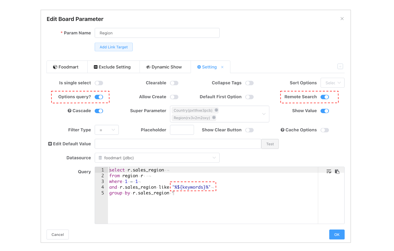
Dropdowns support remote search for scenarios where the number of dimension members is huge and exceeds the threshold, causing truncation. Remote search can precisely limit the option scope, thereby controlling the number of options. Remote search on dimension fields automatically generates a dimension column query using field-like matching as follows:
SELECT sales_region -- Dimension field
FROM (
-- Dataset query definition
) cb_view
WHERE sales_region like '%we%'
GROUP BY sales_region
You can also customize the remote query condition using the keywords built-in variable by enabling Optional Value Query.
Range Query
| Configuration Item | Explanation |
|---|---|
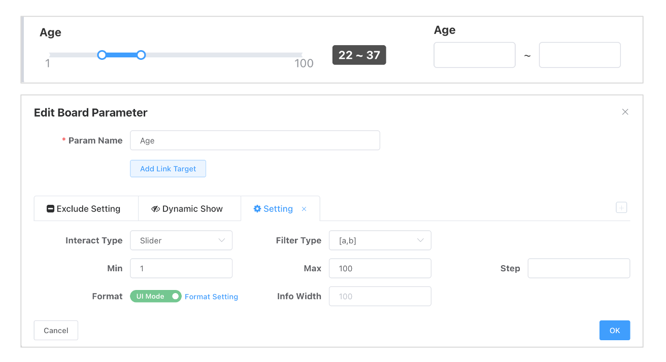
| Interaction Type | Sets the interaction method between the user and the filter, either a slider or input boxes. |
| Filter Type | Selects the type of relationship used to match input values and the dataset, such as [a,b]. |
| Minimum Value | Sets the lower limit of the selectable range. |
| Maximum Value | Sets the upper limit of the selectable range. |
| Step | Sets the increment for each movement of the slider. |
| Formatting | Provides advanced mode and options for configuring formatting for fine-grained control over displayed data. |
| Info Bar Width | Sets the width of the data range information display area to the right of the slider, in pixels (px). |
Input Box
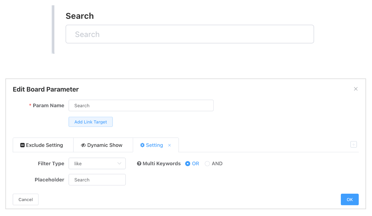
The input box is mostly used for keyword search scenarios.
| Configuration Item | Explanation |
|---|---|
| Filter Type | Selects the type of relationship used to match input values and the dataset, such as like, not like, =, etc. |
| Multiple Keywords | Keywords entered in the input box separated by English commas will be split into multiple keywords. Sets the logical relationship between multiple keywords, either OR or AND. |
| Placeholder | Provides hint text for the input box to help users understand how to input data. |
Parameter Container
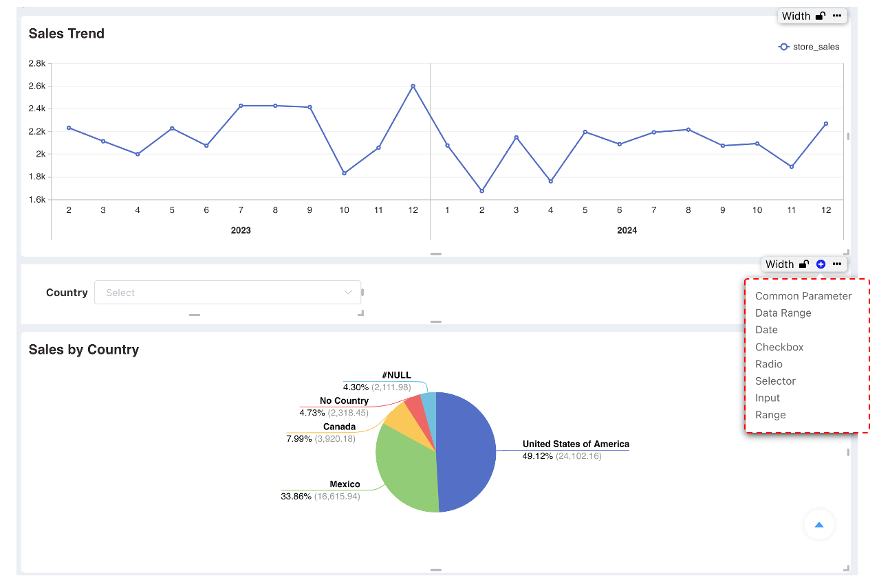
By default, dashboard parameters are usually placed in the parameter bar at the top of the dashboard. However, if you need to add query parameters in the middle or a specific location of the dashboard, you can achieve this through the following steps:
- Adding Query Parameters in the Middle of the Dashboard
- Add a Dashboard Parameter Container: First, insert a "Dashboard Parameter Container" at the location where you want to add query parameters. This container can be positioned and sized arbitrarily on the dashboard like other components (e.g., charts, text boxes, etc.).
- Adjust the Dashboard Parameter Container: Adjust the position and size of this container according to your layout needs. This allows you to precisely control where the query parameters appear on the dashboard and ensure they coordinate consistently with other elements.
- Add Parameter Components Inside the Parameter Container: Once the parameter container is in place, you can then add specific parameter components inside it. These components can include but are not limited to date range selectors, dropdown menus, text input boxes, etc., for receiving user query conditions.
Parameter Configuration
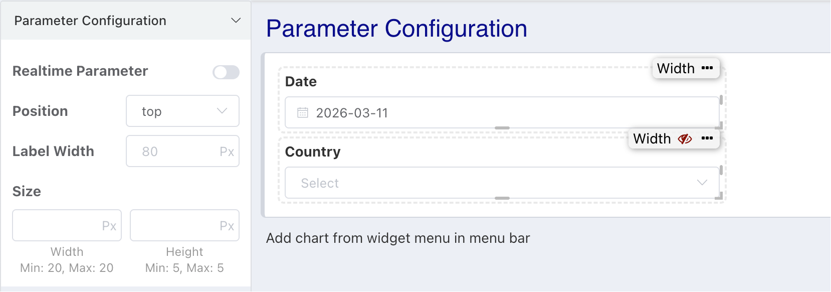
- After enabling real-time effect on parameter changes, each change to parameter content refreshes the dashboard immediately without needing to click query.
- Parameter name width defaults to 80px and can be adjusted in batches within parameter configuration.
- Dashboard parameters support setting the parameter name above the input item and support unified setting of height and width.
Parameter Hiding
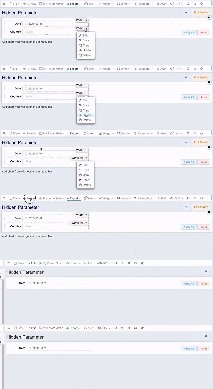
Grid dashboards support parameter hiding. A typical use case is linkage between dashboards, passing parameters without wanting the linkage parameters to be displayed.
- In edit mode, hidden parameters have a hidden icon in the upper right corner.
- In view mode, hidden parameters are not displayed.
- If there are filter conditions in hidden parameters, they still take effect.
Param Show Control by Env
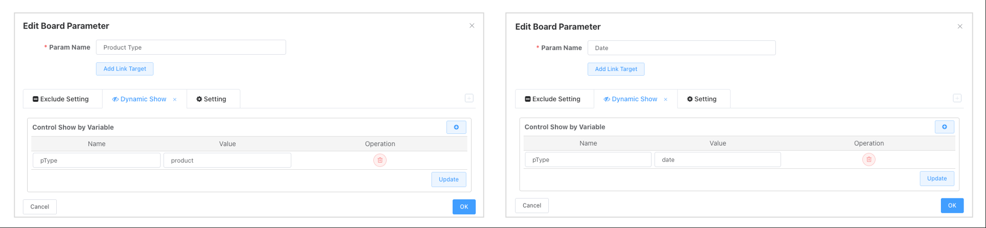
- Environment variables control whether a parameter is displayed. The parameter does not take effect when displayed.
- Unlike hiding, parameters controlled for display via variables do not participate in filtering data when they are not displayed.

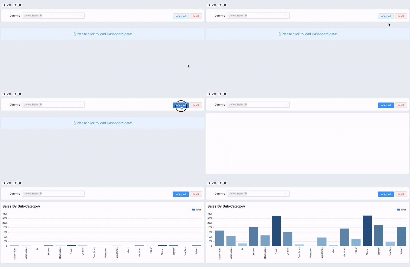
Dashboard Lazy Loading
If you don't want charts to load immediately after opening the dashboard, you can enable passive loading. Charts will not load automatically; they will load manually after setting query conditions and clicking the query button.

Parameter Groups
When there are many parameters on a dashboard or parameter value selection is complex, to avoid users repeatedly selecting and setting dashboard parameters, users can save the current dashboard parameter state as a My Parameter Group. Later, conditions can be restored with one click when needed.
If the saved parameter template is inconsistent with the current dashboard parameters (e.g., some parameters were deleted after the template was saved), restoring the parameter group will not restore the deleted parameters.