Cockpit Dashboard
Cockpit Dashboard
Cockpit Dashboard
Several Points to Note
- Cockpit layout differs from ordinary dashboards in that it has a fixed canvas size, commonly used for monitoring or large-screen displays.
- Components are allowed to overlap, and layers can be set, with higher layer values appearing on top.
- Component size can adapt to screen size.
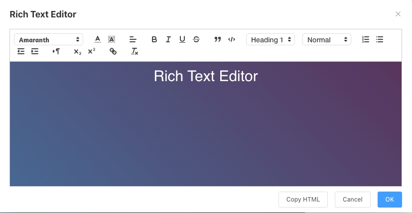
- All data for components, including text content modifications for titles, are in the configuration panel on the right side (except the rich text editor for now). Clicking different component types activates the corresponding configuration menu.
- Click on a blank area of the canvas to deactivate the currently selected component.
- Chart components still follow the dataset refresh interval rules for automatic refreshing.
- When previewing, ensure the browser does not block pop-ups.
- The cockpit layout introduces many fine-tuning experiences for charts, but this could be a double-edged sword. Without good design, the final presentation might not be ideal. In future product iterations, we will strive to allow users to design the best-looking large screens with minimal effort.
Interface Introduction
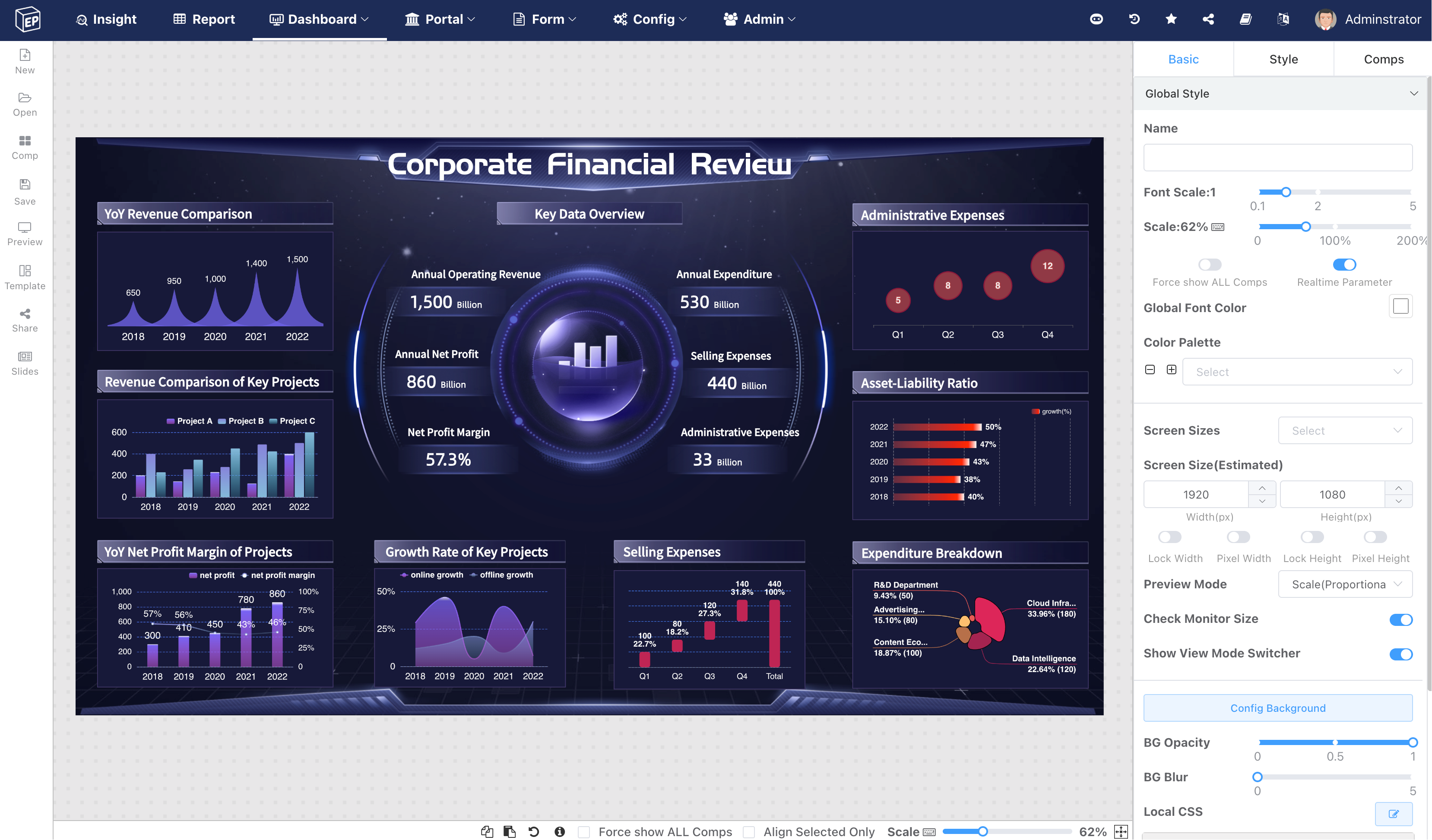
From left to right: Function buttons, Canvas, Fine-tuning area.
Basic Configuration Panel
The new large-screen designer has added features such as screen resolution presets, canvas zoom, global font scaling, and global color palette to support users designing boards for high-resolution large screens on smaller displays. Data: Click on a blank area of the canvas to display global styles.
Canvas Size
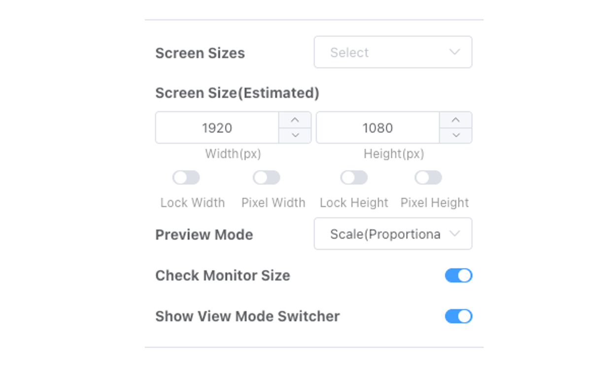
- The first step in large-screen design is determining the screen resolution and aspect ratio for future display.
- Screen size adjustment: Common screen presets include some common templates, like 2K, 4K, 8K.
- After selecting a template, the width and height input boxes below are set. Users can adjust them further based on actual needs.
- Large screen support is an estimate; it can adapt to full screen when the preview scenario doesn't differ significantly from the estimate.
- Components use canvas percentage width by default. You can switch between percentage and pixel width using the
Use pixel width/heighttoggle under large screen dimensions.
Position and Size
- All elements on the canvas can be dragged to any position, resized, and overlapped. Overlapping elements support layer setting.
- After single or multiple selection, fine-tune the position using keyboard arrow keys. The larger the canvas zoom ratio, the smaller the fine-tuning adjustment.
Pixel Width vs. Percentage Width
Percentage and pixel dimensions each have advantages and disadvantages.
- Percentage: After adjusting the canvas size, the component's position and size relative to the canvas remain unchanged. For example: size 50% width/height, position 10% from the left and top edges. Regardless of canvas adjustments, the component's position and size will be dynamically calculated to fit the canvas.
- Pixels: After adjusting the canvas size, the original pixel position and size remain unchanged. For example: when canvas size changes from 2K to 4K, if the original dimensions used pixel positioning, the element will only occupy 1/4 of the space.
- Applicable Scenario: Long images, long page creation where width remains constant, but canvas height needs to increase as content grows.
Lock Height/Width
By default in preview mode, the canvas zooms to fit the screen size. If users need to cancel scaling behavior on height/width, they can lock height/width to prevent scaling. Commonly used for long image display scenarios that allow scrollbars.
Preview Mode
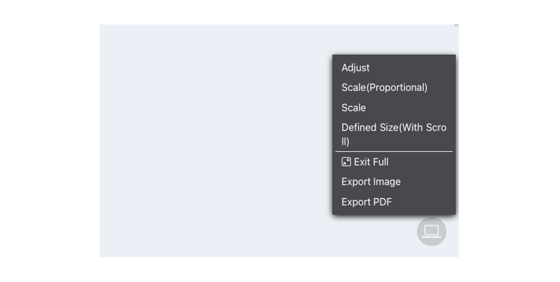
If no preview mode is selected, it defaults to Zoom (Maintain Percentage). Explanations for different preview modes:
- No Scaling (Percentage Adaptation)
- When using percentage dimensions, percentage adaptation preview dynamically adjusts element sizes on the canvas based on the actual display screen size, rather than using scaling.
- Suitable when the actual display screen size is larger than the design canvas size. It adapts to full screen without distortion caused by stretching.
- Zoom (Maintain Percentage)
- Zooms to fit the screen, maintaining aspect ratio.
- If the actual display screen aspect ratio differs from the design, white borders may appear.
- Zoom (Stretch to Full Screen)
- Zooms to fit the screen, stretching to fill the screen entirely.
- If the actual display screen aspect ratio differs from the design, distortion may occur, e.g., circles becoming ellipses.
- Set Dimensions (Scrollbars)
- Displays the canvas at the set dimensions. If the canvas is larger than the screen, scrollbars appear. If smaller, white borders appear.
When the Show Preview Mode Toggle switch is enabled, users can adjust and switch to a suitable preview mode in the lower right corner during preview.
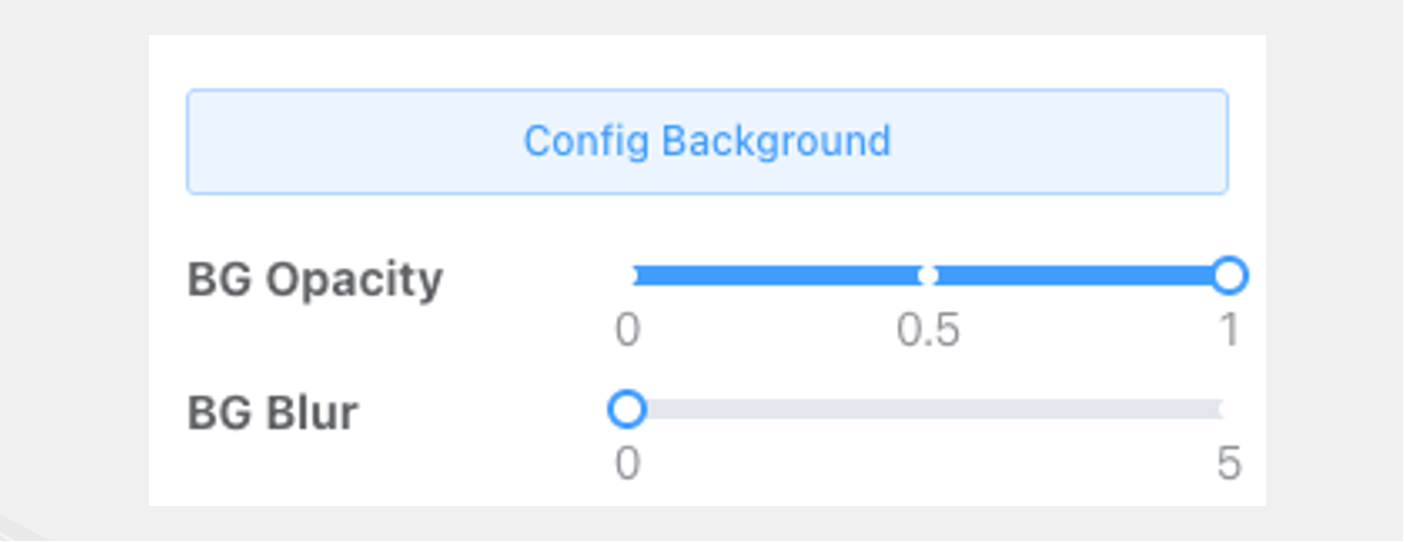
Canvas Background
Set background color, background image, background transparency, blur, etc.
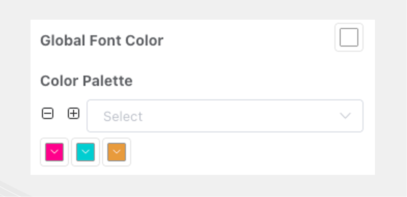
Global Font Color
The color palette is used to adjust the color scheme for graphics series; global font color is used to adjust component font colors.
Component Basics
Single Selection
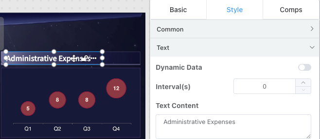
Clicking a single component activates the corresponding fine-tuning menu in the right panel. Different component types have specific fine-tuning items. By default, the right panel activates the item bar corresponding to the component. General configuration includes items supported by all components.
General Configuration
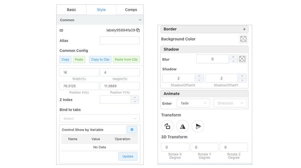
The General Configuration panel includes:
- Component ID: Unique identifier for the component, can be used for dashboard parameter environment variable changes to target zoom influence scope, avoiding global component refresh.
- Component alias configuration.
- Size and position settings.
- Layer configuration.
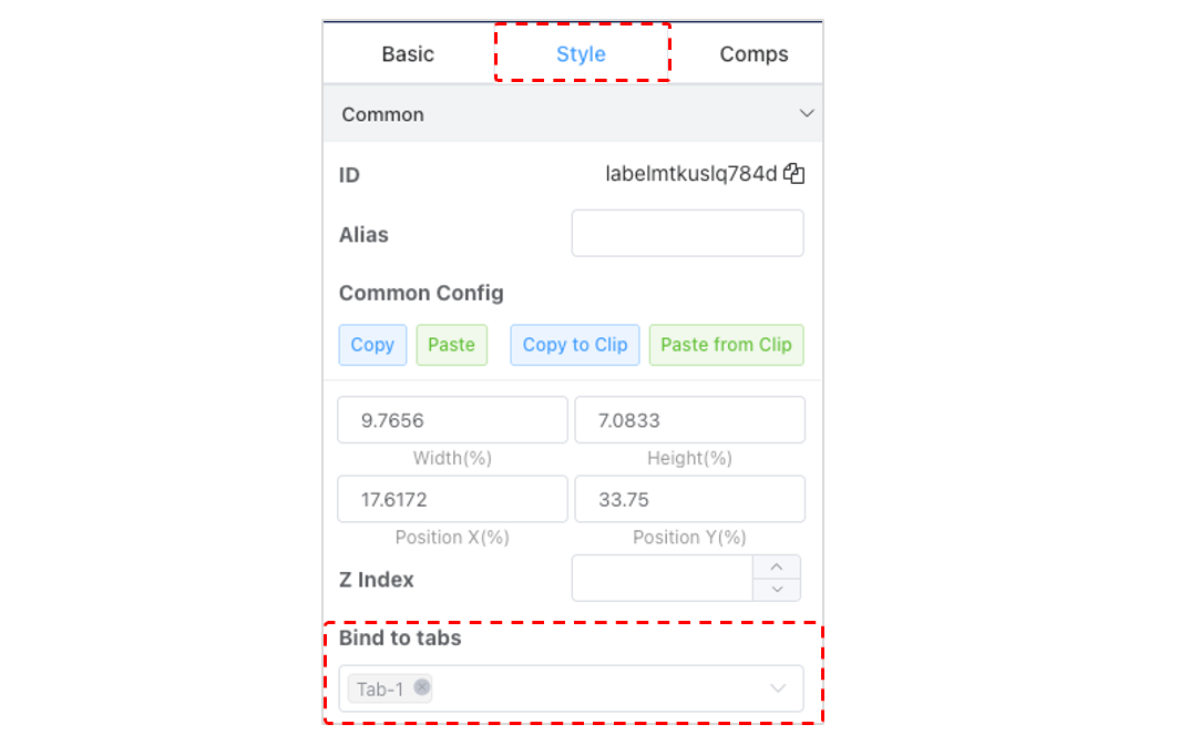
- Bind to Tab: After adding tab components to the dashboard, you can select which tab it corresponds to.
- Border, background, shadow configuration.
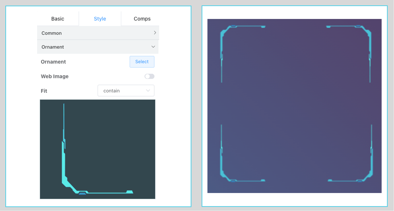
- Rotation: Commonly used for symmetrical display with irregular borders.
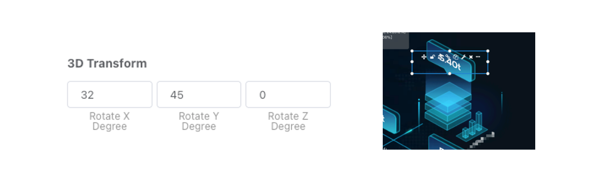
- Transform: Commonly used in conjunction with 2.5D font mapping.
Multiple Selection
- Press and hold the left mouse button on a blank area of the canvas to drag-select multiple components.
- Hold Shift/Ctrl/Alt and click multiple components to add to the selection. Clicking a selected component can deselect it.
- Click on a blank area of the canvas in any selection state to deselect all components.
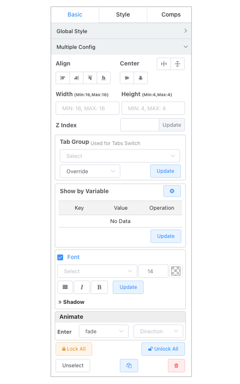
- When multiple components are selected, the multiple selection operation menu in the right panel is activated, allowing the following operations on the selected components:
- Alignment: Align top, bottom, left, right.
- Centering: Vertical, horizontal center.
- Uniformly adjust component sizes.
- Delete all selected components.
Canvas Layer Settings
- Use the
...icon in the upper right corner of a component to bring up the icon settings menu, or use corresponding shortcuts to set layers. - Click a component and use the right configuration panel,
Basic -> General Configurationto input a specific layer.
Drag Alignment
Drag alignment, size adjustment alignment.
- Corresponding edge alignment, vertical/horizontal centerline alignment, offset edge alignment (top, bottom, middle any position alignment).
- Size adjustment: top/middle/bottom, left/middle/right six-edge alignment.
- In scenarios with many components, support enabling alignment only for selected target components.
Align Only Selected Components
When there are too many components on the canvas, especially when small components need alignment, automatic alignment can be difficult to operate and may even cause unwanted alignment interference. Solutions:
- Check
Align Selected Onlyin theBottom Menuof the middle canvas, then select target components (multiple selection allowed), and drag the component that needs moving (the moving component does not need to be selected).
- Use multiple selection alignment.
Component Locking
Locking is available for borders, decorations, and titles.
- Locked components cannot be directly selected via mouse, which helps prevent these components from interfering with selection operations for other components (especially drag-selection).
- Locked components can be located and selected in the component list in the right panel, then unlocked.
- Locked components can be selected via drag-selection.
Non-Chart Components
Add components: Text, Clock, Rich Text Editor, Static Border, Dynamic Border, Divider Line, iframe, Icon, etc. Clicking a single component activates the corresponding fine-tuning menu in the right panel.
Text
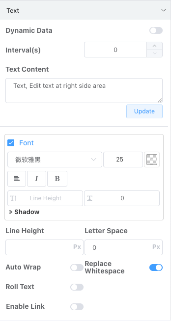
Rich Text
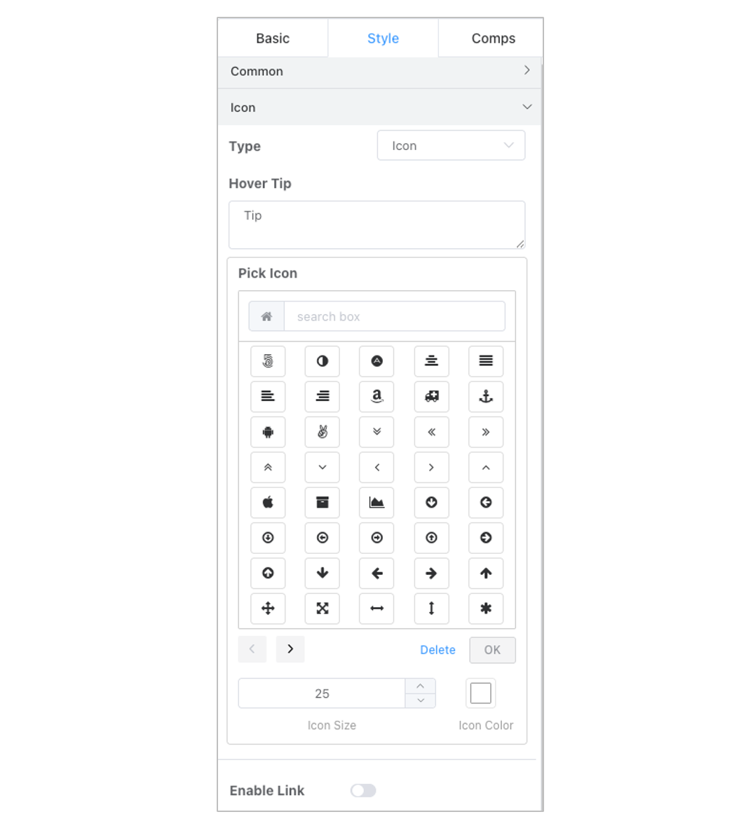
Icon
Clock
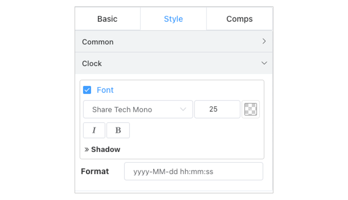
Adjust the time format to display only date or only time.
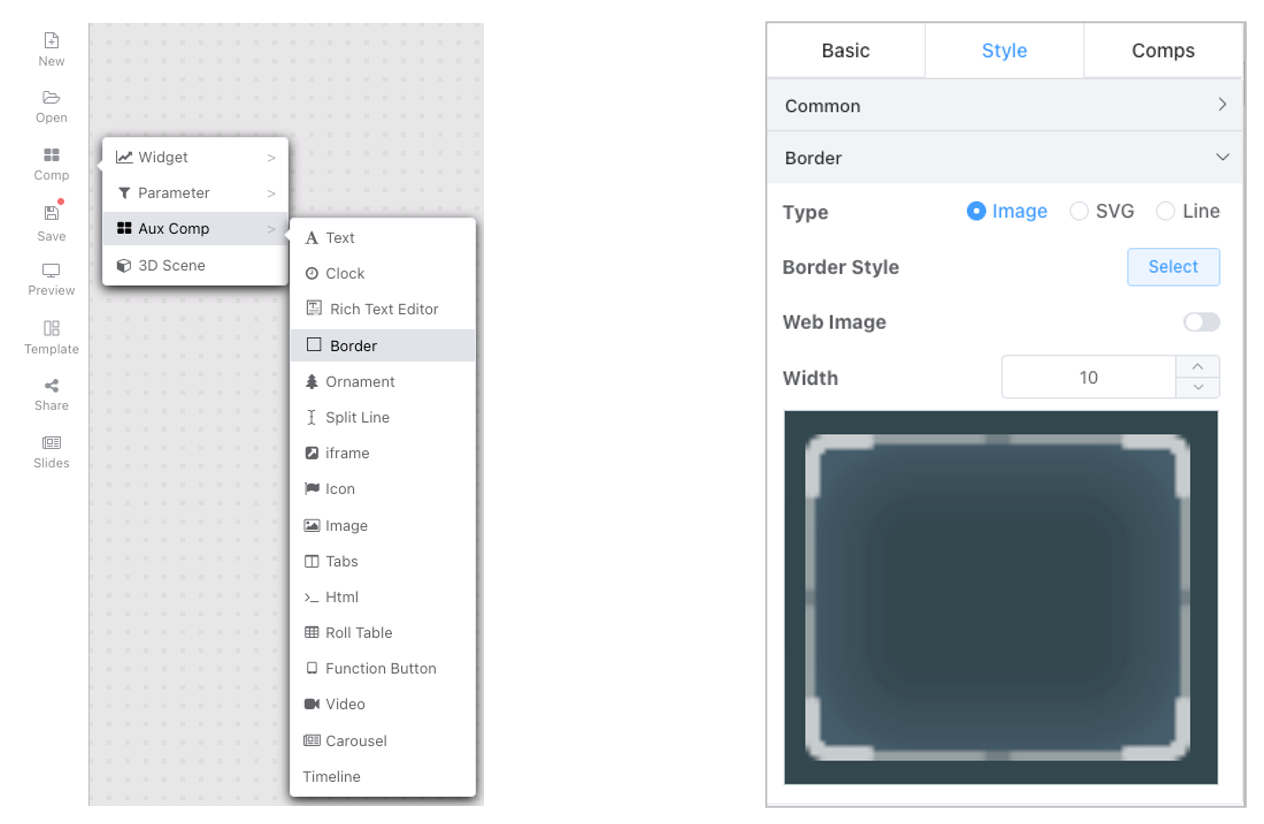
Border
- Image border
- SVG border
- Line border
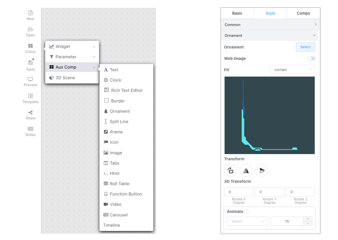
Ornament
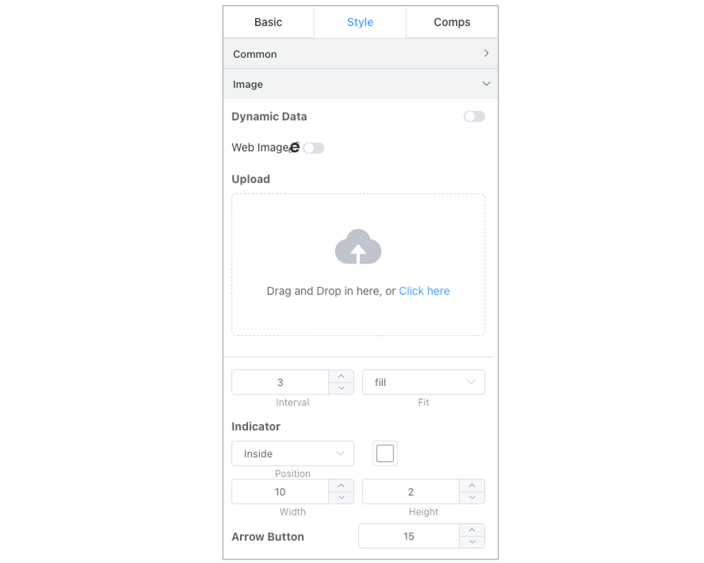
Image
Iframe
Iframe component URLs support using environment variables.
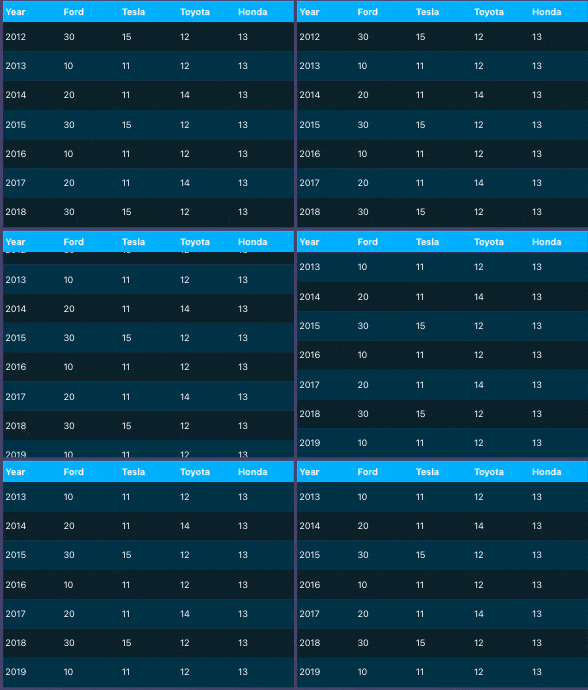
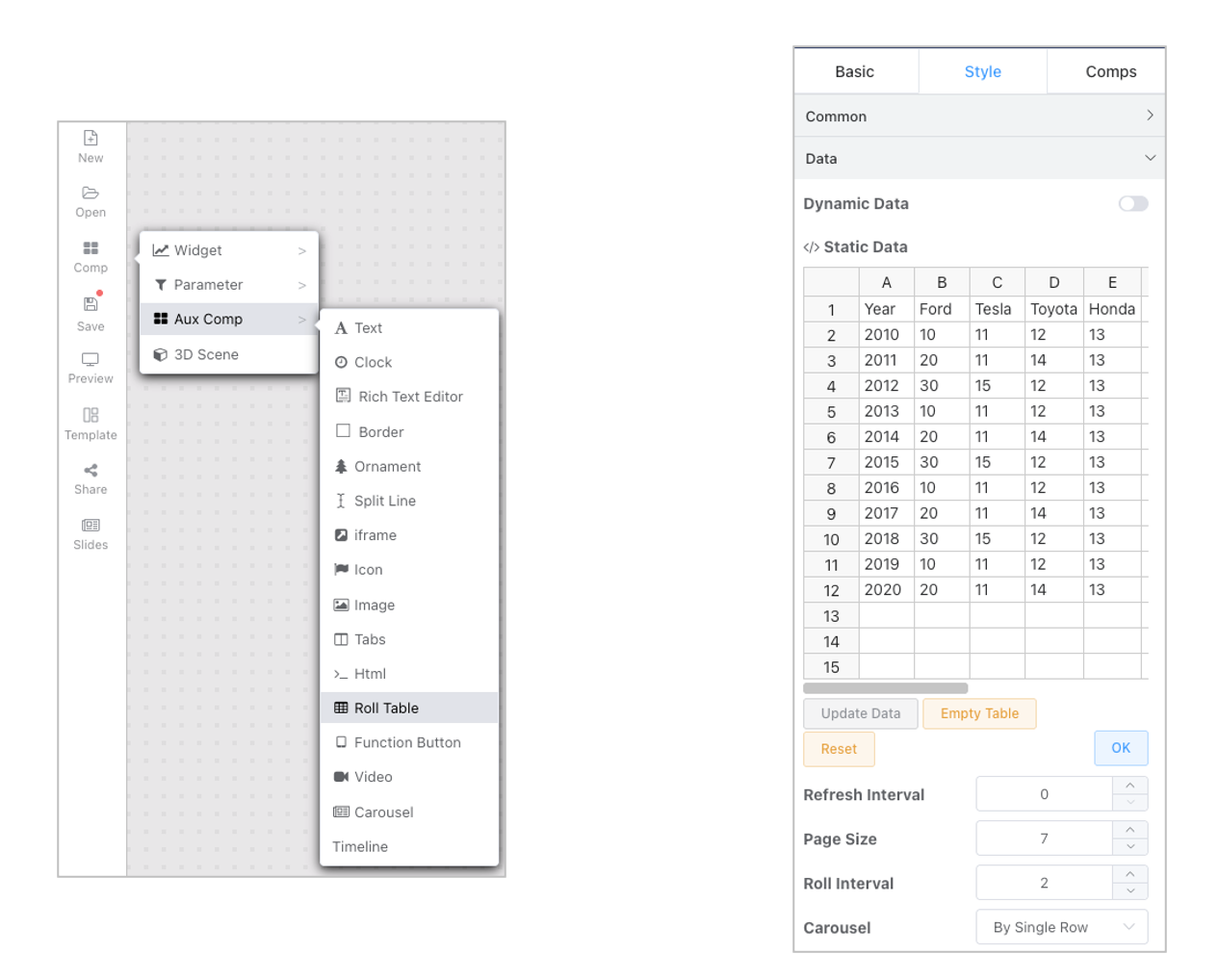
Scroll Table
- Carousel table data often works with dynamic data.
- Dynamic Query Query is a regular query supporting up to the first 1000 rows of returned data. The query supports environment variable resolution.
- API interfaces can adapt to data of any structure. For specific data structures, see templates in script adaptation.
- Dynamic data refresh interval and scrolling interval are in seconds. Data does not update the table immediately after refresh; it updates after the current table scrolling ends.
- Table header, content, and serial number styles can be configured independently.
- Developer Mode
Column Definition: Includes column width settings and column alignment. Columns are hidden when width is 0.- Use formatting functions to transform column content into various HTML formats.
- Combine with debugger and Chrome Developer Tools for debugging. Reference link.
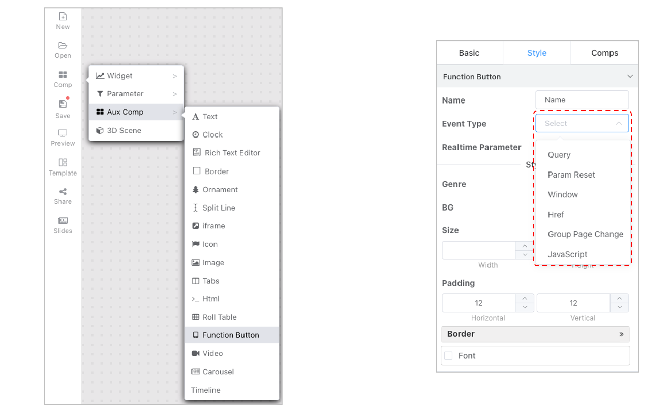
Function Buttons
Function buttons currently mainly support parameter query and reset functions. Dashboards with query buttons are recommended to disable the real-time effect on parameter changes configuration.
Tab
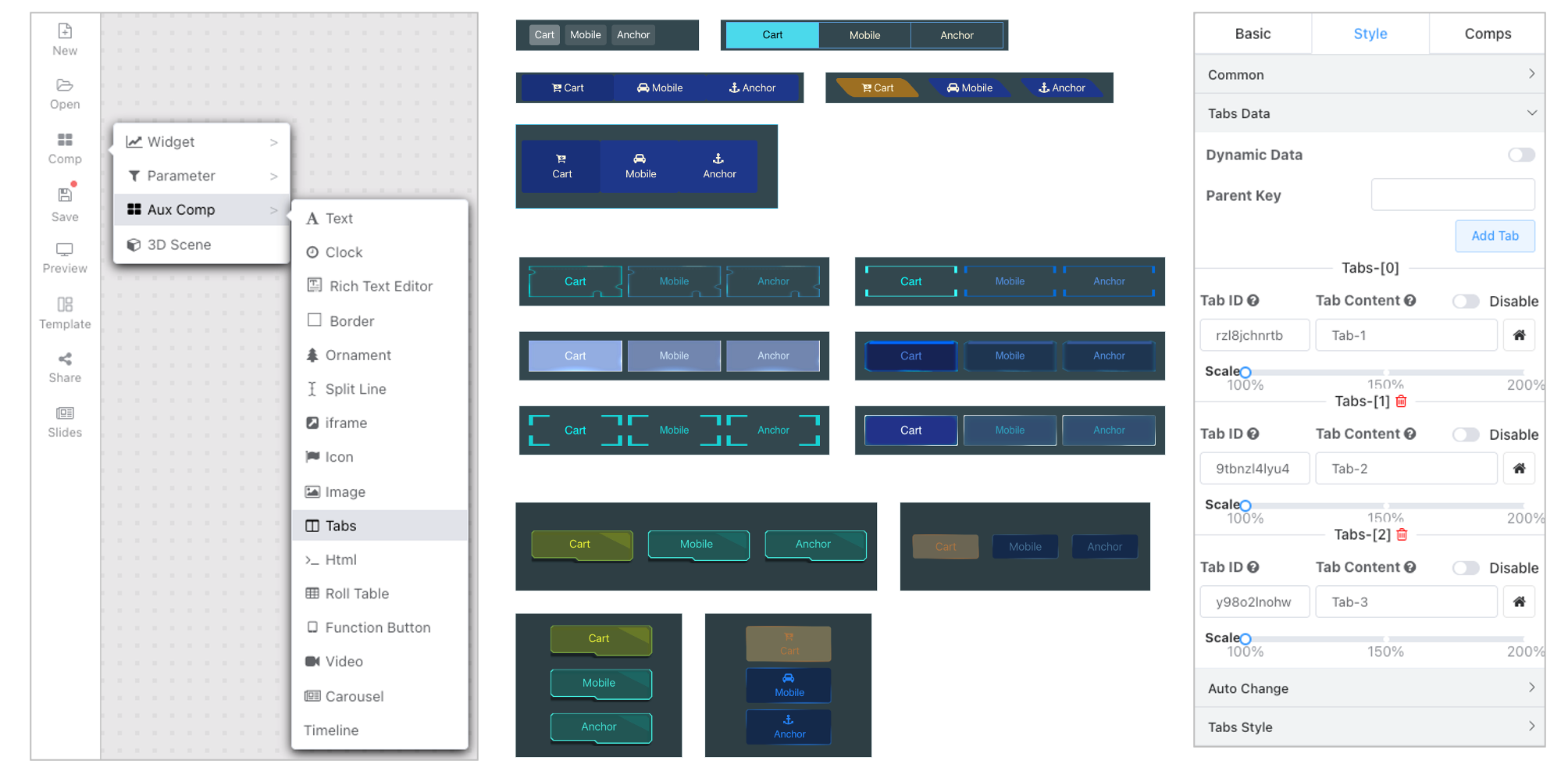
Different from traditional tab containers, tab components control whether a component is displayed via tab signals.
- Tab binding can be performed in batch operations via multiple selection configuration.
- It can also be done individually for a component in the component's general configuration.
- By default, tabs within the same group are mutually exclusive. You can configure the tab ParentKey to achieve mutual exclusion between different tab groups, making tab page layouts more flexible.
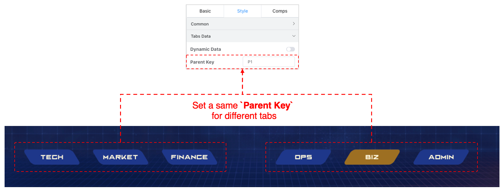
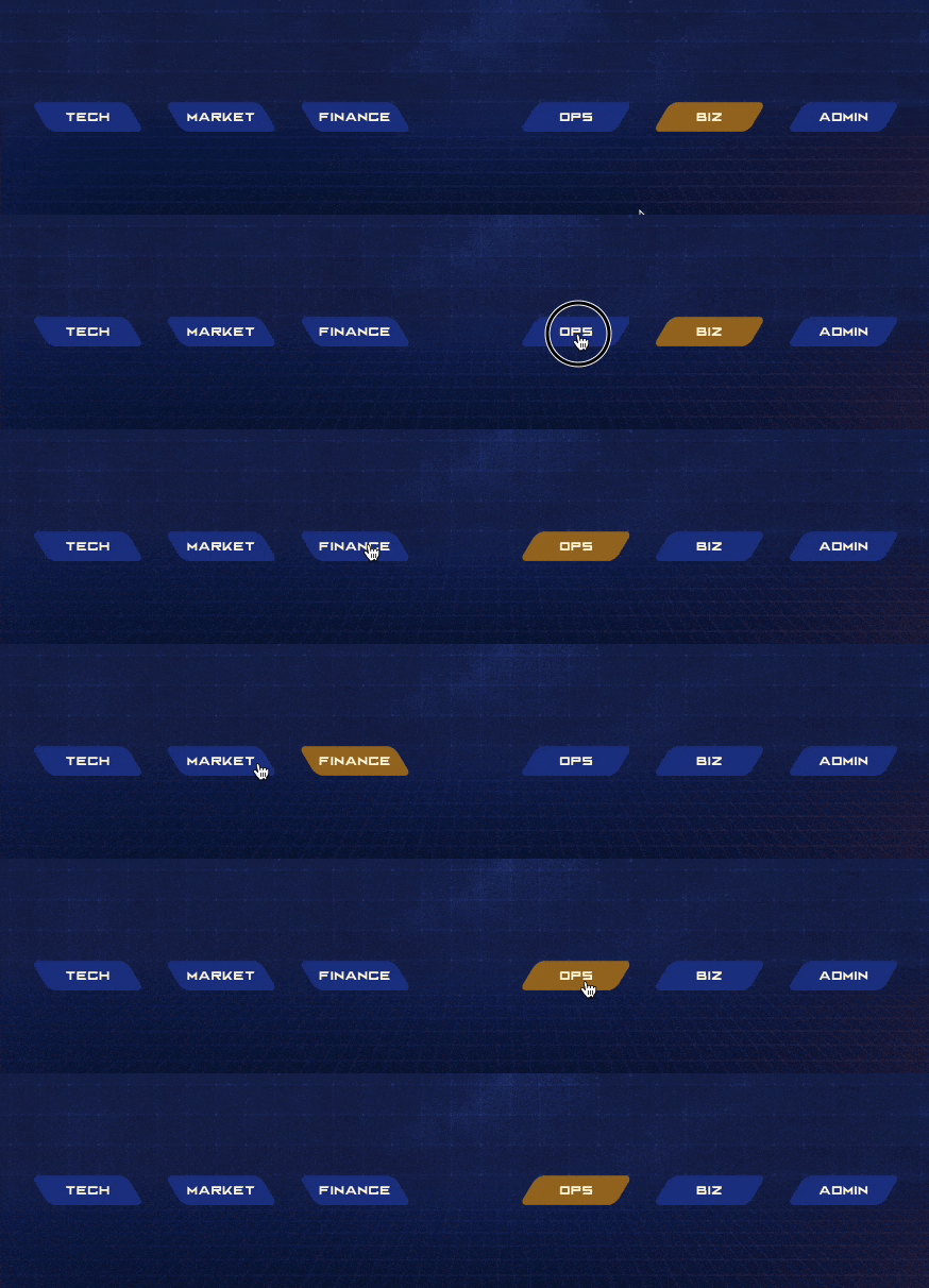
Chart Elements
To meet users' personalized needs, the new version supports hundreds of chart fine-tuning items. The chart fine-tuning menu changes dynamically with the activated chart type.
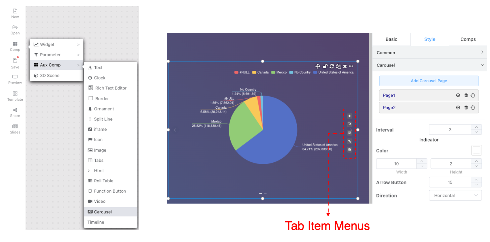
Carousel Chart
IFrame Component Linkage
Large-screen iframe message interaction is consistent with free layout message interaction. Click to view
Dynamic Components
Combined with linking to environment variables in dashboard parameters, users can dynamically obtain data to switch some static components. Currently supported dynamic data acquisition for static components:
- Text
- Rich Text
- Image Carousel
- iframe
Environment variable setting generation methods: Parameters, Linkage
Dynamic Data Acquisition
- API Method: Data requests are sent as POST. Users need to fill in the request URL. All environment variables are sent in the request body as JSON data.
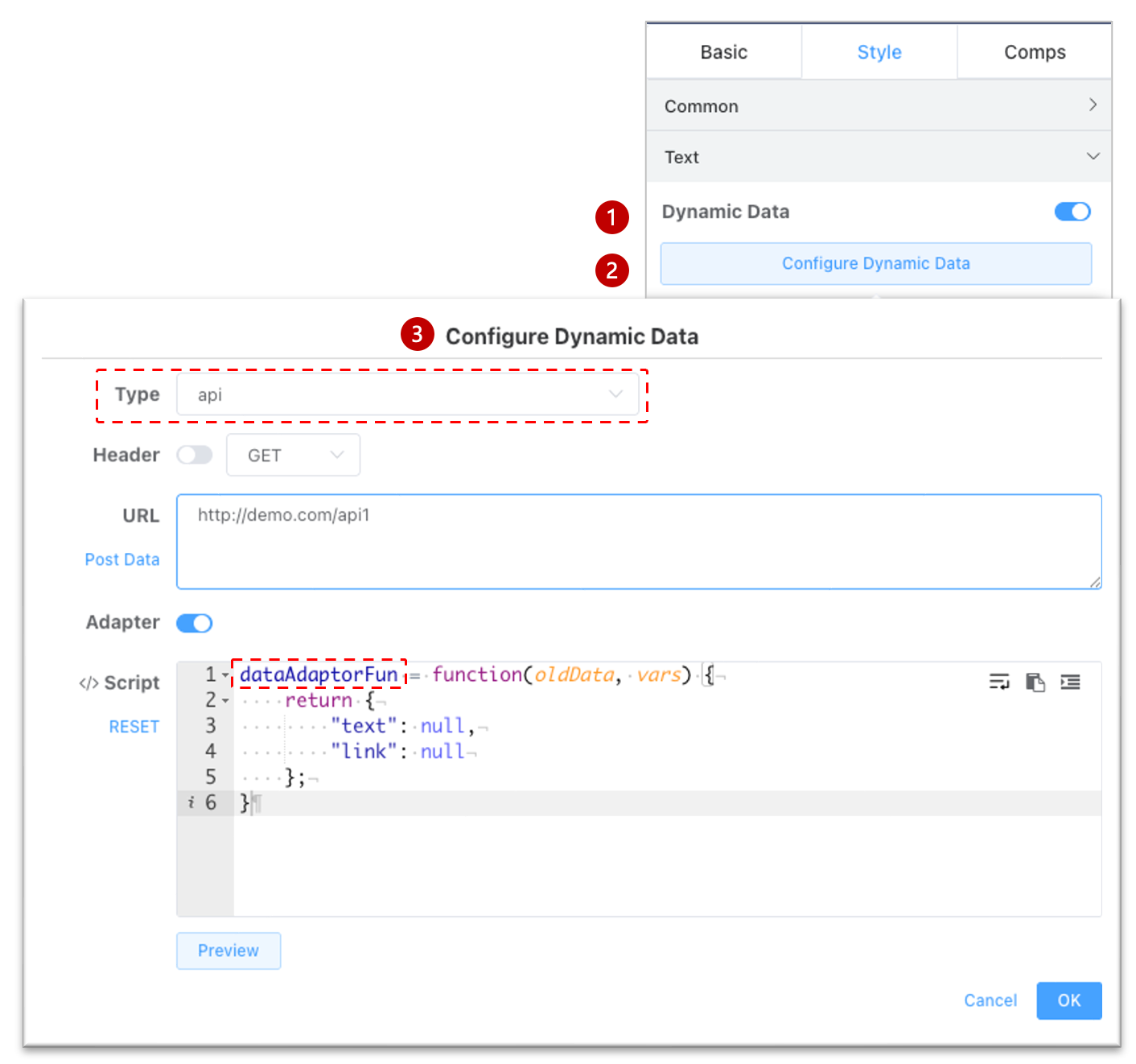
If the returned data structure does not match the component's expected data structure, you can use the script adaptation function to adjust the data structure.
dataAdaptorFunis the alias for the script adaptation function.
- Query Method: Users can directly query the data source. The query script can use environment variables to dynamically generate queries with different conditions and structures. Variable usage rules are consistent with Dataset Variable Syntax. After the query returns a result set, different components retrieve data based on agreed column names. If the agreed column name does not exist, data is matched by column order.
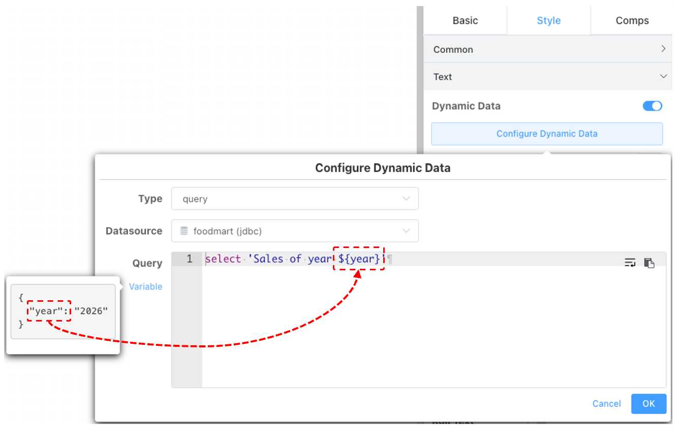
Text Component
Expected API request return data structure:
{
    "text": false,
    "link": "https//xxxx"
}
SQL query returns two columns and one row. Column headers are arbitrary; row count is automatically limited if necessary.
| text | link |
|---|---|
| Text content | http://xxxx |
Text style, whether hyperlinks are supported, cannot be dynamically modified; users can set these on the page.
Rich Text Editor
Expected API request return data structure:
{
    "text": "<span class=\"ql-align-center\"><span style=\"color: rgb(255, 255, 255);\">Rich Text Editor I am dynamic</span></span>"
}
Returns one row, one column.
| text |
|---|
| HTML content |
Image Carousel
Expected API request return data structure:
{
    "images": [
        {
            "url": "https://cboard_beta.gitee.io/ibi-doc/assets/ds-test-es.png"
        },
        {
            "url": "https://cboard_beta.gitee.io/ibi-doc/assets/saiku_crtbl.png"
        }
    ]
}
Returns a maximum of 10 rows, temporarily one column.
iframe Component
Expected API request return data structure:
{
    "url": "https://cn.bing.com/"
}
Returns one row.
Animation Configuration
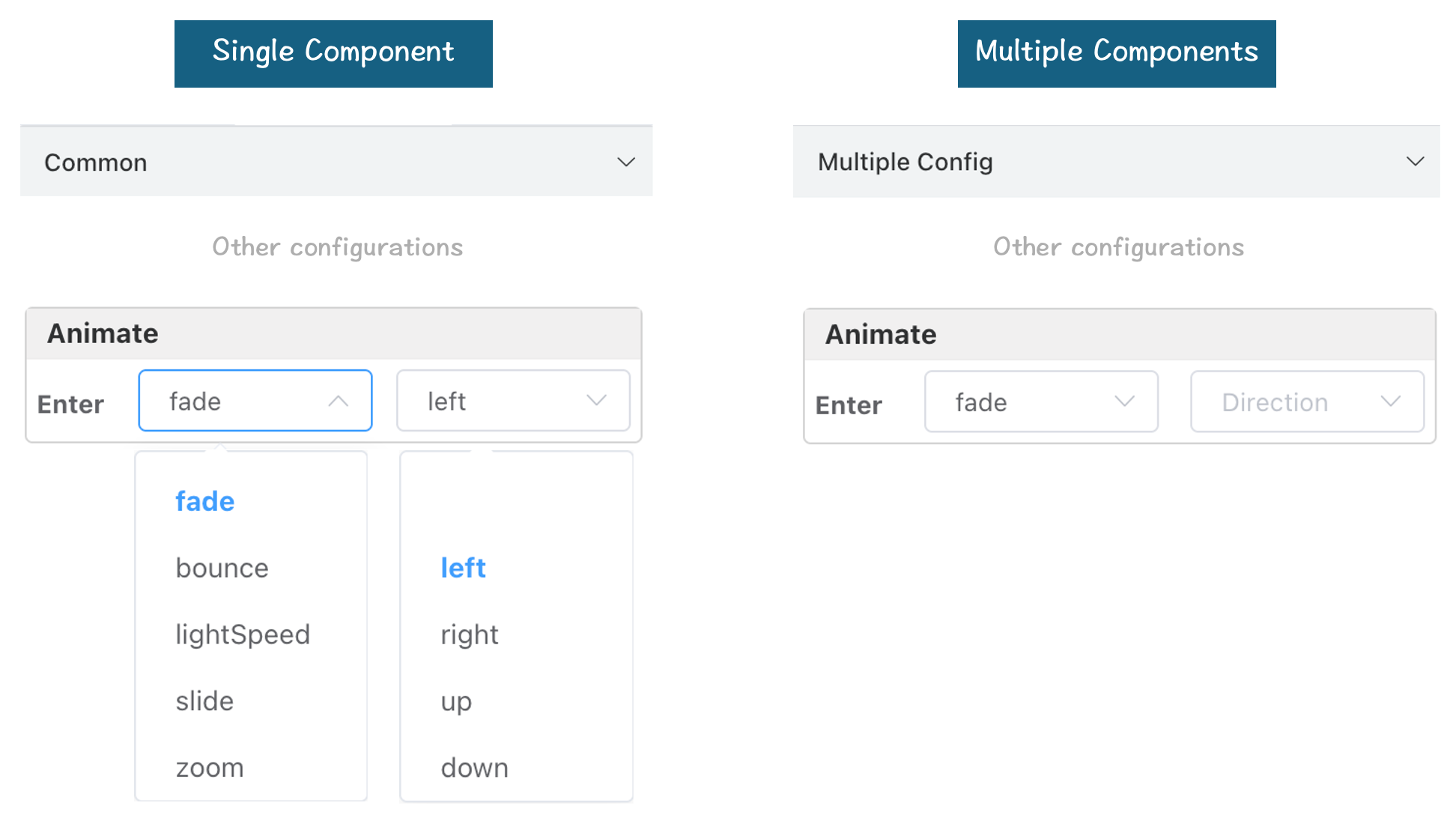
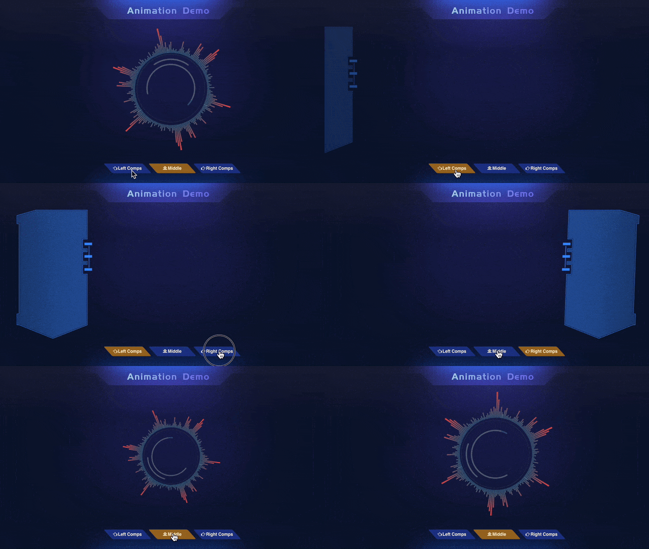
Large screen component entrance animation settings consist of an action and a direction configuration. For a single component, configure in the component's General Configuration panel. After multiple selection, support batch configuration in the Multiple Selection Configuration panel.
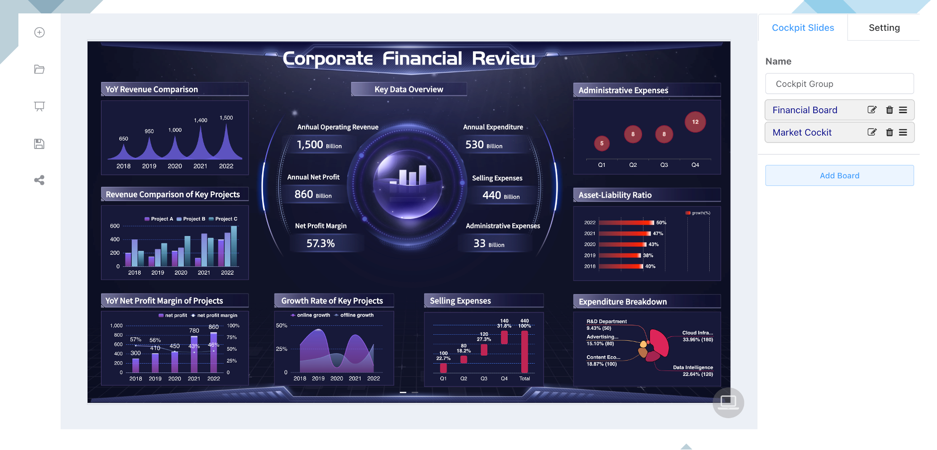
Cockpit Group / Slides