Column / Line Chart
Column Chart/ Bar Chart / Line Chart etc.
Column and Line Chart is a hybrid type of graph combining column chart, line chart, and column-line chart (single axis or dual axis). The commonly mentioned bar chart also belongs to this category (by setting the value axis as the x-axis).
| Design Area | Chart | Requirement |
|---|---|---|
| Row Dimensions | Category Axis | Place one or more dimension nodes, usually used as the category axis |
| Column Dimensions | Classification | Place 0 or more dimension nodes |
| Metrics | Place 1 or more metric nodes | |
| Add Axis | Show Dual Axis | It is recommended to configure different chart types for different axes, e.g., column-line |
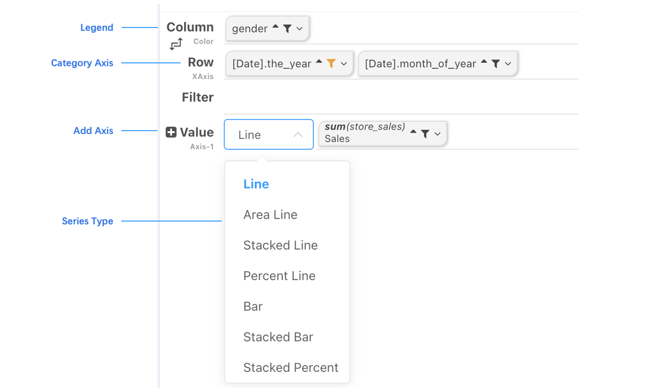
Each column is displayed as a line or a column chart series.
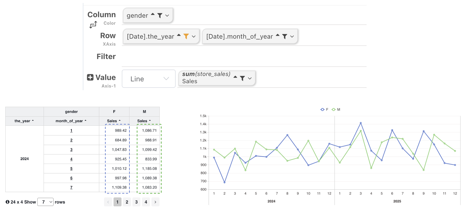
Stacked Column (Line)
Select "Stacked Bar" from the axis type dropdown to stack split metrics (with column dimensions).
Note
Before v1.10, metric stacking could only stack the same metric. Multiple different metrics without column dimensions could not be stacked.
Stacking Supports Stacking by Axis
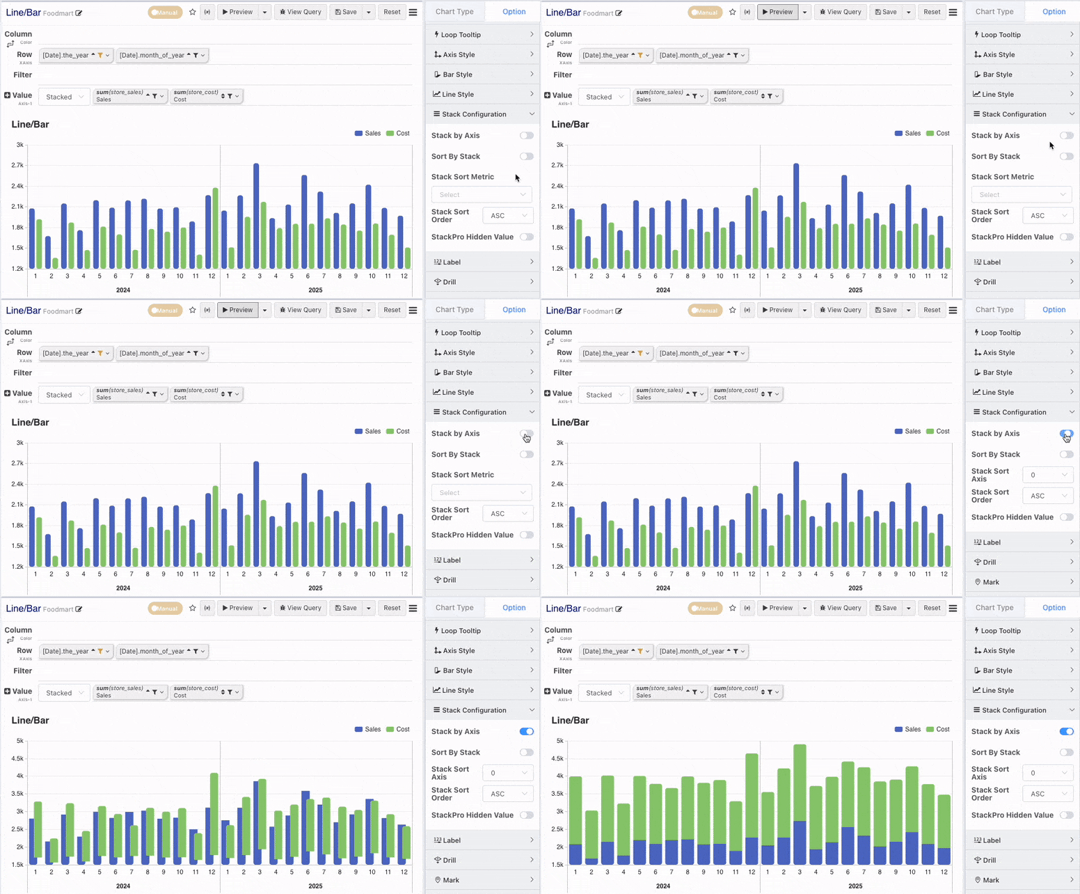
Stacked Sorting Supports Selecting Axis/Stacked Metric Sorting
By default, stacking applies to the same metric split by column dimensions. If your data requires stacking different metrics based on business logic, you can achieve this with the following configuration:
Stack different metrics by column dimension → Enable Stacked Sorting → Select Stacked Metric
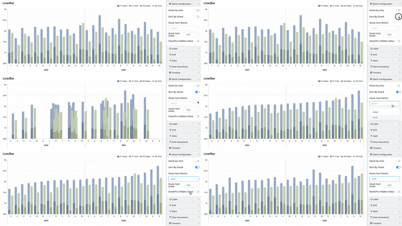
If you are using stack by axis → Enable Stacked Sorting → Select Stacked Axis
Dual Axis Chart
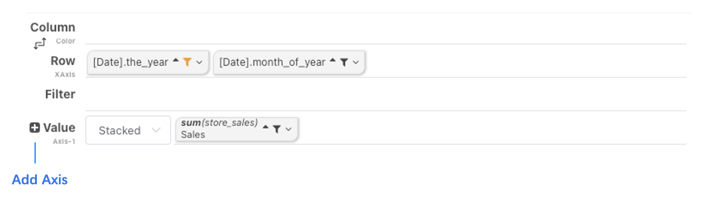
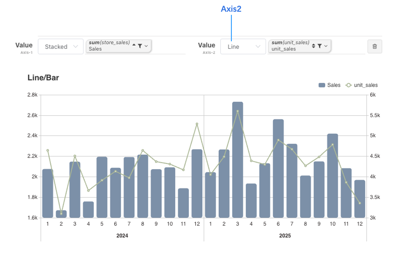
Adding an axis to a column-line chart creates a dual axis chart. It is recommended to configure different chart types for different axes, e.g., column-line.
Bar Chart / Column Chart
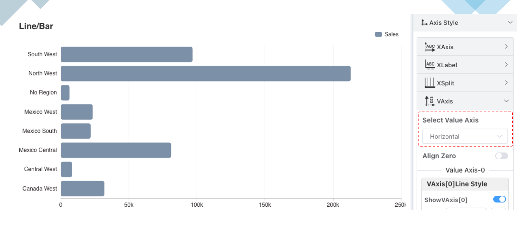
By default, the value axis is vertical. Setting the value axis as the horizontal axis creates a horizontal bar chart.
Mountain Chart (Hill Chart)
A column chart can achieve a mountain chart effect by setting the column style. The minimum value of the mountain chart's value axis is forced to 0; otherwise, the mountain's starting point may not align with the category axis.
Layout and Split
Split into Rows and Columns
After enabling chart splitting, an N*N grid is automatically generated based on the chart data volume. Users can input fixed row and column numbers to create split sub-cells.
- After splitting, only percentage margins can be configured within the internal grid.
- After splitting, sub-chart titles support configuration of horizontal and vertical position offsets.
- Sub-title fonts support independent configuration.
Split Basis
Split basis supports splitting by metric position. Column-line charts support configuring the number of split column dimensions:
- Split by all column dimensions (default).
- Split by partial column dimensions.
- Split by metric position.
- Split by column dimensions + metric position.
- Split by partial column dimensions + metric position.
Shared Axes
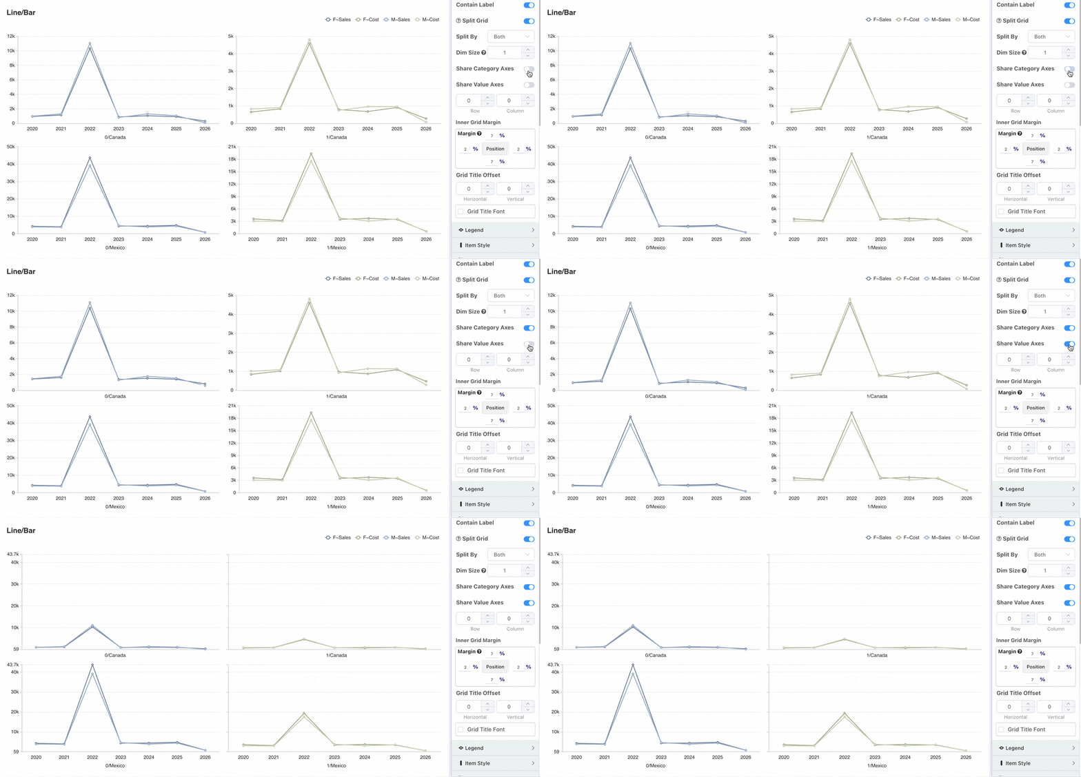
By default, each sub-chart has its own axes, with the value axis's max and min values independently auto-adapted. Starting from v2.1, sharing the value axis and category axis is supported.
After sharing the value axis, the minimum and maximum values of all sub-charts are unified, making it easier to compare data differences across charts.
Style Configuration
Chart Elements (Composition)
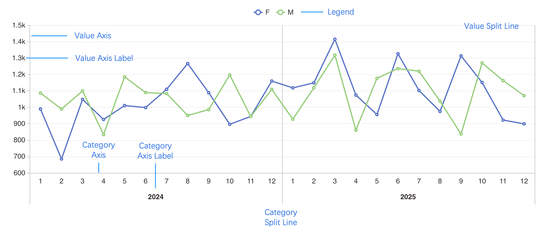
Before configuring chart styles, please understand several important elements that compose a chart:
- Legend
- Category Axis
- Value Axis
- Ticks
- Axis Title
- Gridlines
Axis Style Configuration
Legend
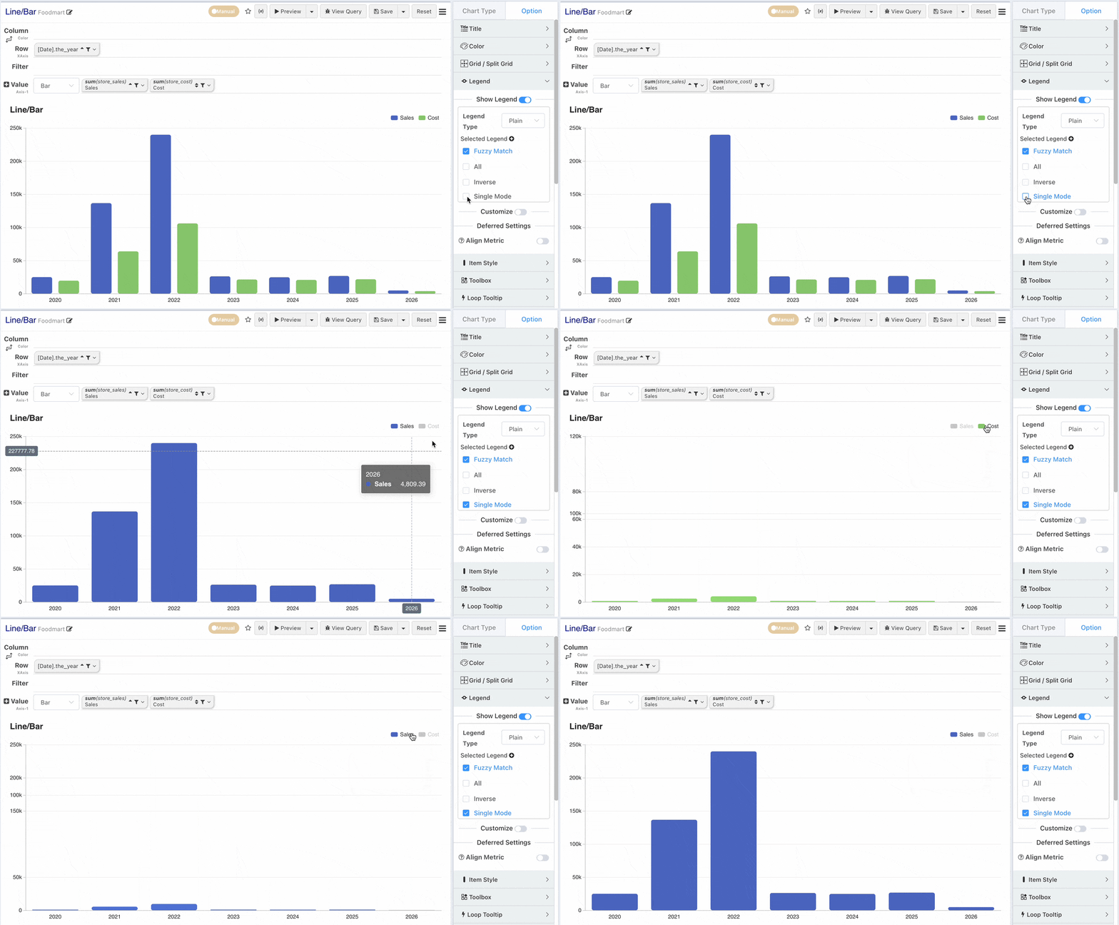
Single Selection Mode
Enabling single selection mode displays data for only one series at a time when the chart is shown.
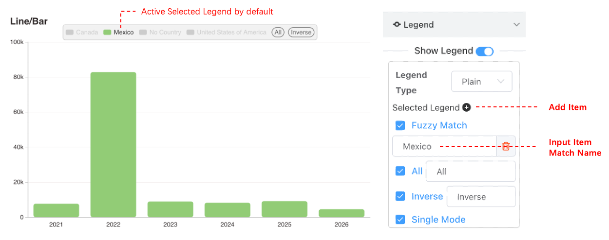
You can also set the legend selected by default during initialization.
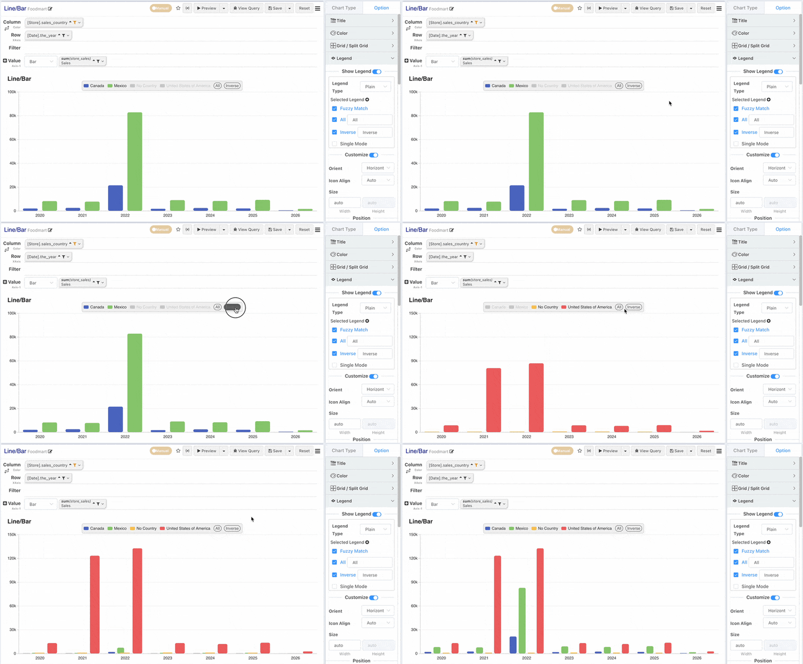
Select All and Invert Selection
- Invert Selection: Activates unselected legends and deactivates selected ones.
- Select All: Selects all legends.
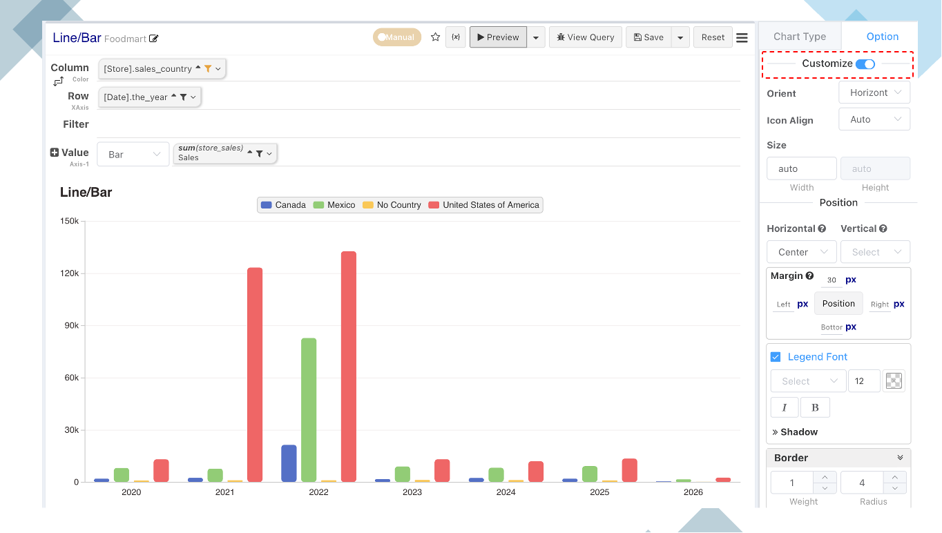
Legend Layout Style
Legend layout supports configuration of:
- Horizontal position
- Vertical position
- Margin control
- Font, border, etc.
Timeline Configuration
Supports splitting by column dimensions into different nodes of a timeline for dynamic storytelling.
- Column-line chart timeline configuration, used for the number of column dimensions in timeline nodes. Defaults to all column dimensions; can be configured to use only the first N column dimension groups.
Value Style
Metric Coloring Basis
Do products with better sales earn more profit?
Answering this question requires considering two metrics: sales revenue and profit. Now, we can sort by sales revenue while coloring based on profit.
Hide the profit metric, and the value style of sales revenue will be colored based on the hidden profit values. This way, you get the product category sales ranking below, where deeper blue indicates more profit, and yellow indicates negative profit, i.e., loss-making products.
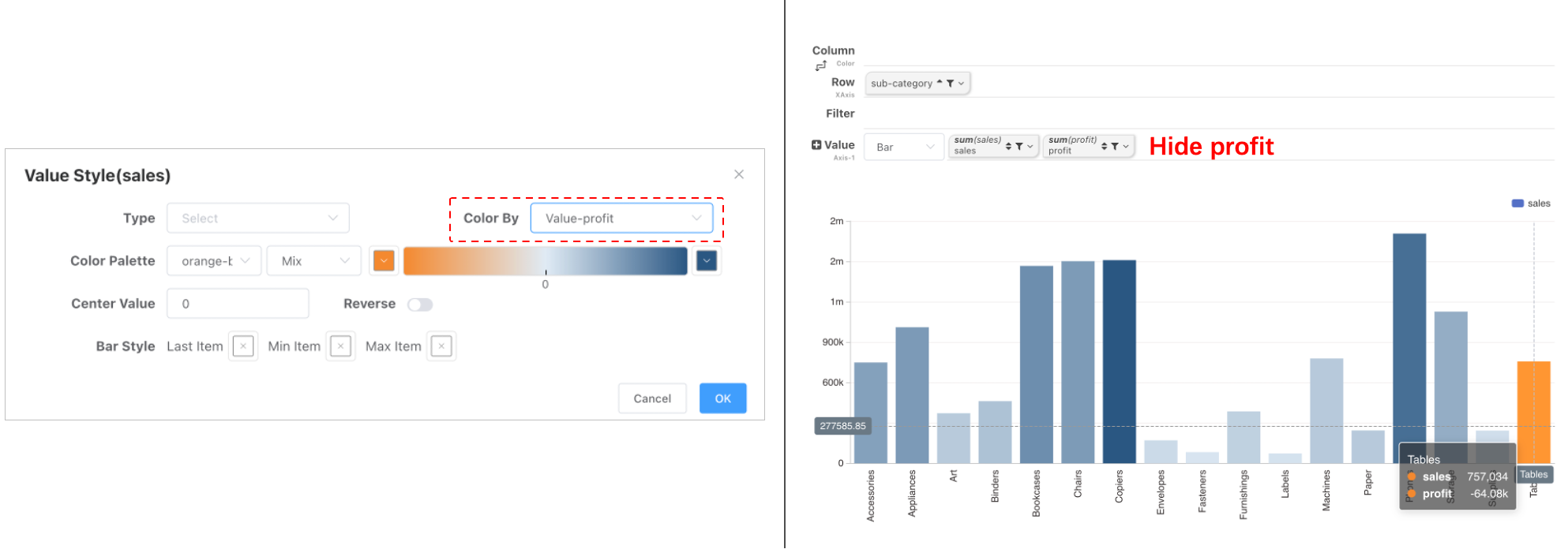
- Supports different colors for positive and negative numbers. Automatic color schemes assign different colors to negative numbers when both positive and negative values exist in a metric for easier distinction.
- Supports custom metric color schemes.
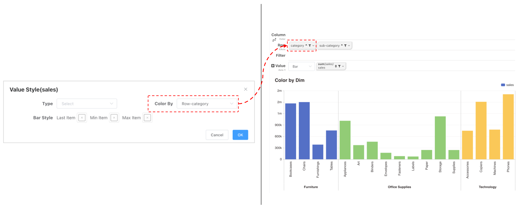
Color by Dimension
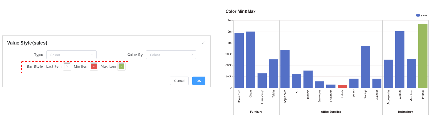
Color Maximum, Minimum, and Last Item in Column Chart
Color the maximum, minimum, and last item.
Data Mark
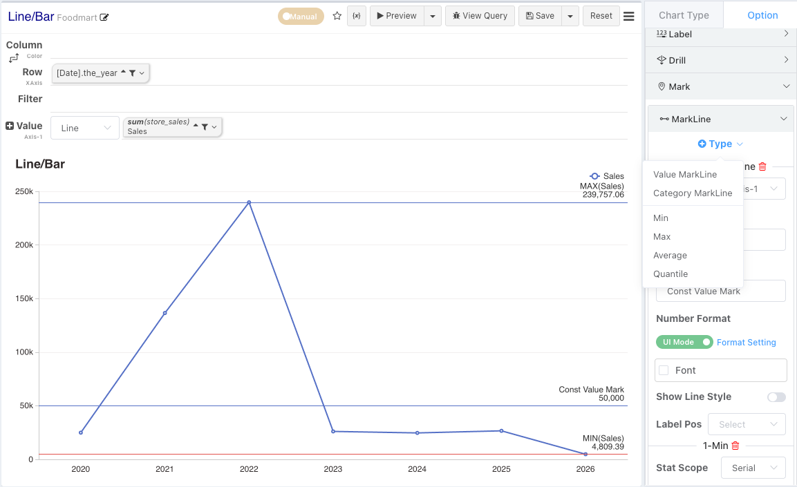
Value Axis Marker Lines
Value axis marker lines include:
- Minimum and maximum value marker lines
- Mean value marker line
- Specific value marker line
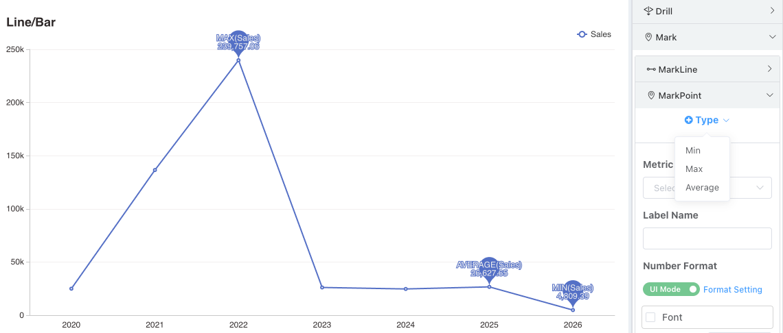
Mark Points
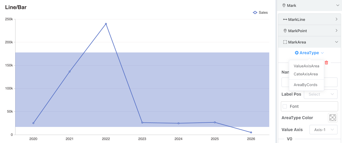
Area Marking