Funnel Chart
Funnel Chart
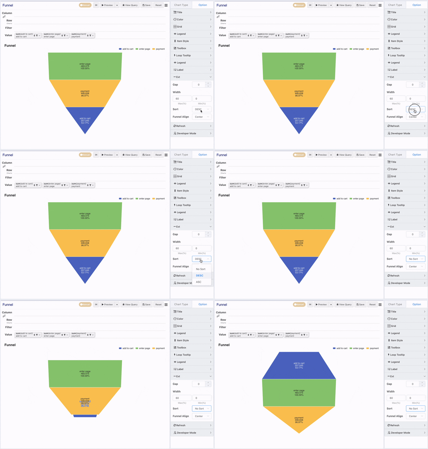
A Funnel Chart, shaped like a "funnel," is used for single-process analysis, consisting of N process steps between the start and the end. The funnel always starts at 100% and decreases sequentially at each step. Each step is represented by a trapezoid, forming an overall funnel shape. Generally, the height of all trapezoids should be consistent, which helps people discern differences between values.
It's important to note that the steps in a funnel chart have a logical sequential relationship. Also, the flow volume for all steps in a funnel chart should use the same measure. Funnel charts are most suitable for presenting the progression of business processes, such as user conversion rates, order processing status, recruitment hiring stages, etc. Through a funnel chart, you can intuitively see the proportion of each part of the process, identify issues, and make decisions.
Typically, a funnel needs to display values for a series of different metrics like Impression -> Click -> Submission -> Payment. In a cross-table, these are multiple columns placed in the value axis. Values in a row are automatically sorted by size to form the funnel. Therefore, one row corresponds to one funnel in the chart. The demo below has no practical meaning and is just for illustration.
Funnel Sorting
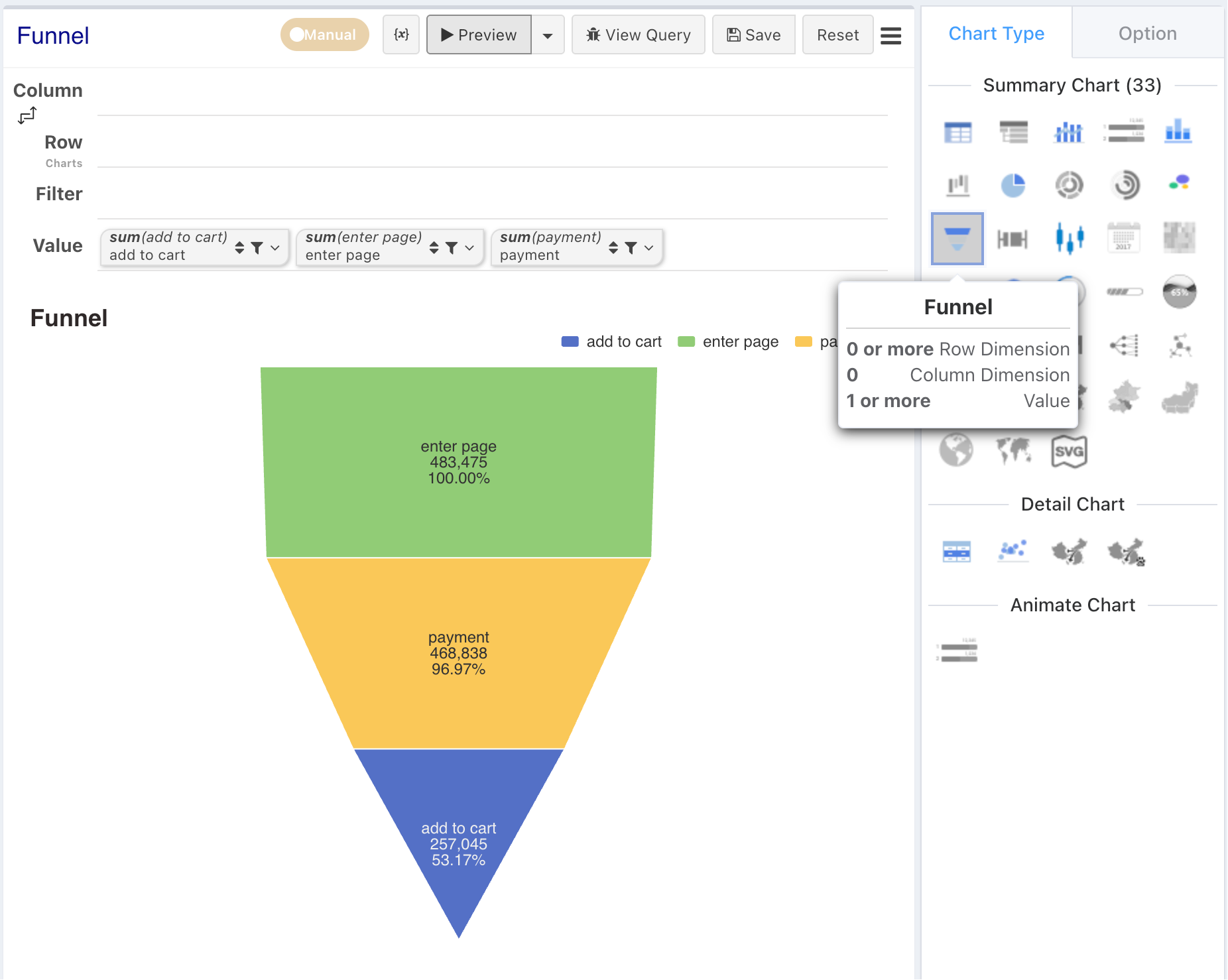
By default, the funnel sorts multiple measures from largest to smallest in descending order. If you don't need sorting or want ascending order, you can adjust it in the configuration panel.