ChartsChart Detail
Heatmap
Heatmap
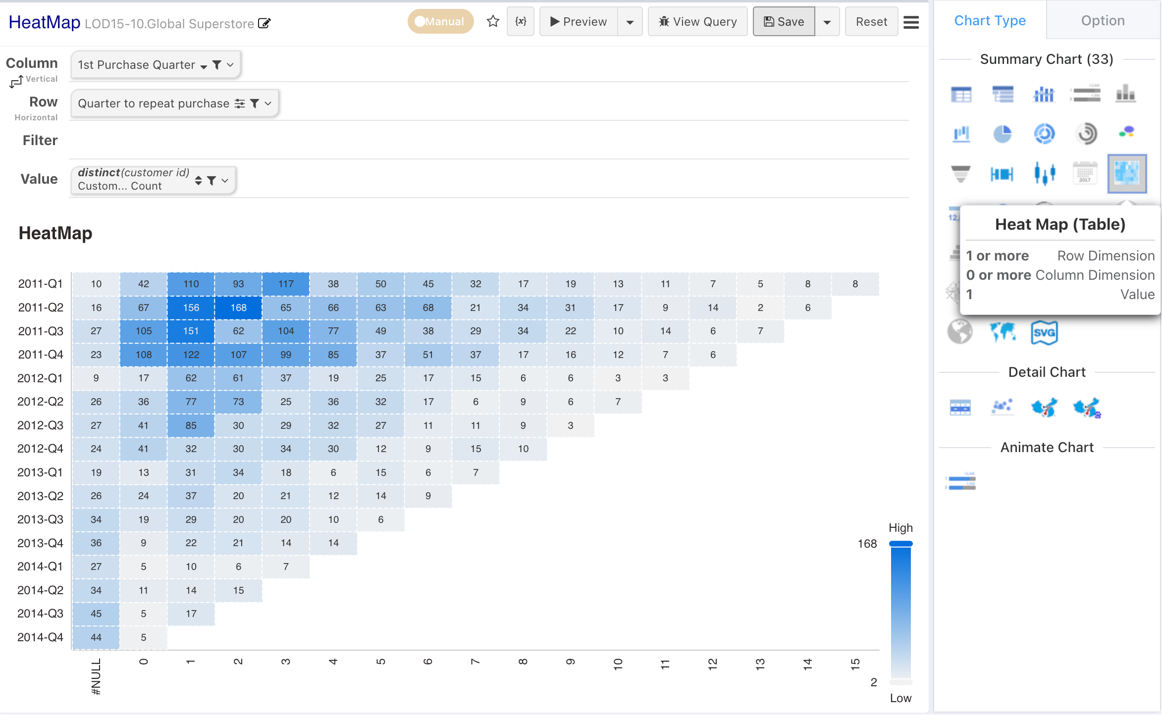
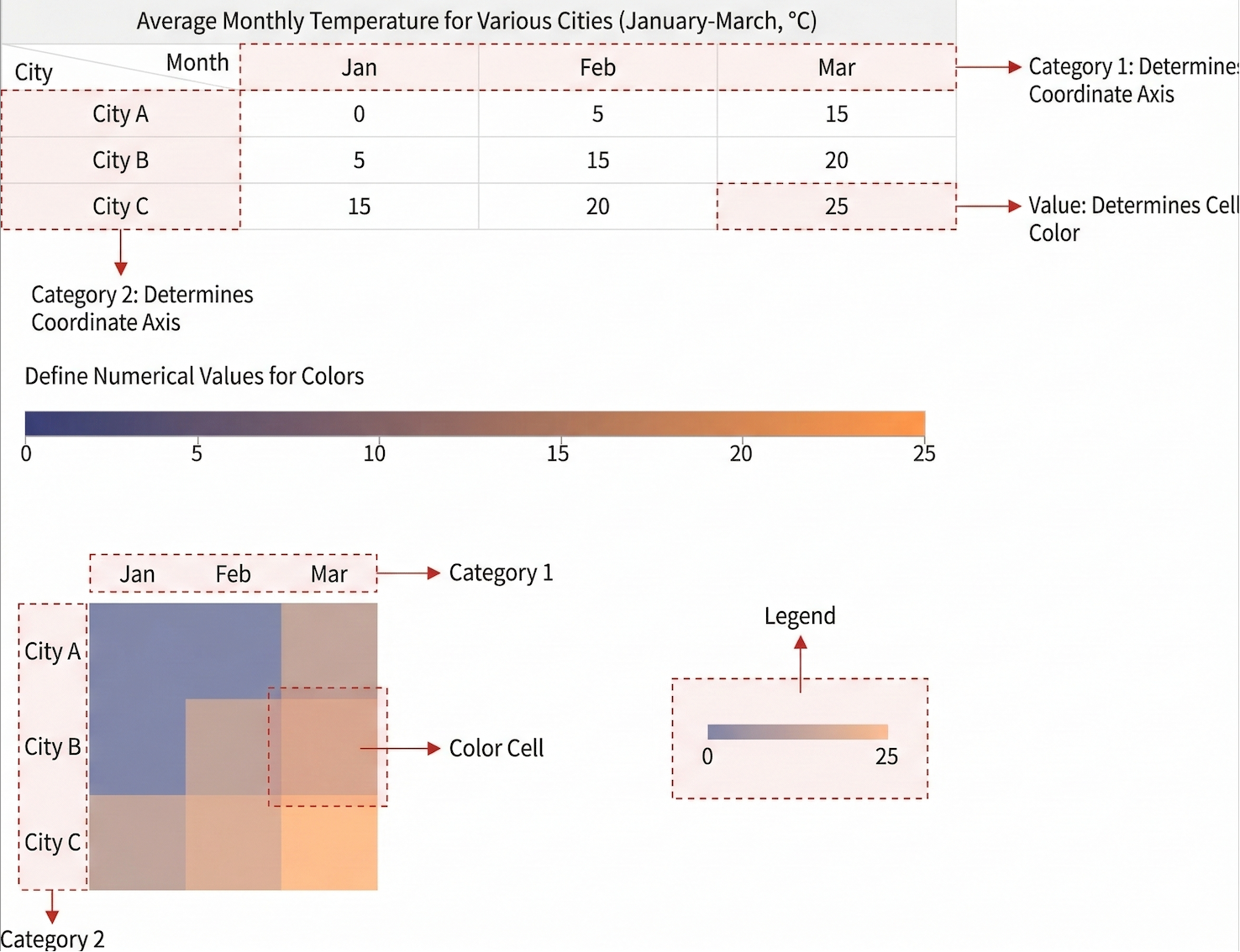
A heatmap is a statistical chart that displays data by coloring blocks. When plotting, rules for color mapping need to be specified. For example, larger values can be represented by darker colors, while smaller values by lighter colors; larger values can be represented by warmer colors, and smaller values by cooler colors, and so on.
Heatmaps are suitable for viewing overall situations, identifying outliers, showing differences between multiple variables, and detecting any correlations between them.
Configuration
| Design Area | Chart | Requirement |
|---|---|---|
| Row Dimensions | x-axis | Place 1 or more dimension nodes |
| Column Dimensions | y-axis | Place 0 or more dimension nodes |
| Metrics | Place 1 metric node |