Pie Chart
Pie Chart
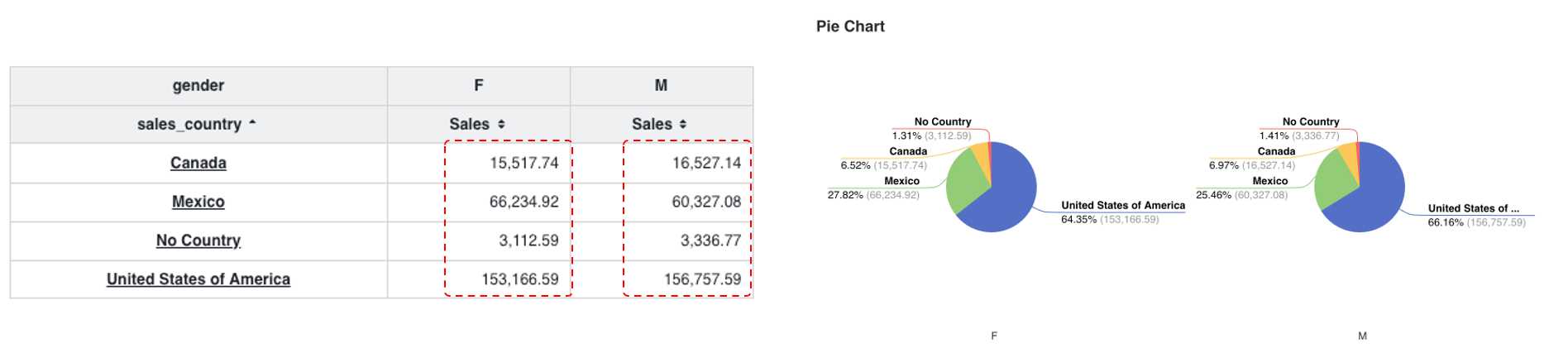
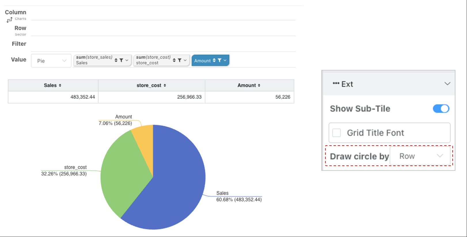
The pie chart is used to display data proportions. By default, it corresponds to a cross-tab with each column displayed as a separate pie chart. You can configure the drawing rules to render pie charts by row — one pie chart per row.
Donut Chart and Rose Chart
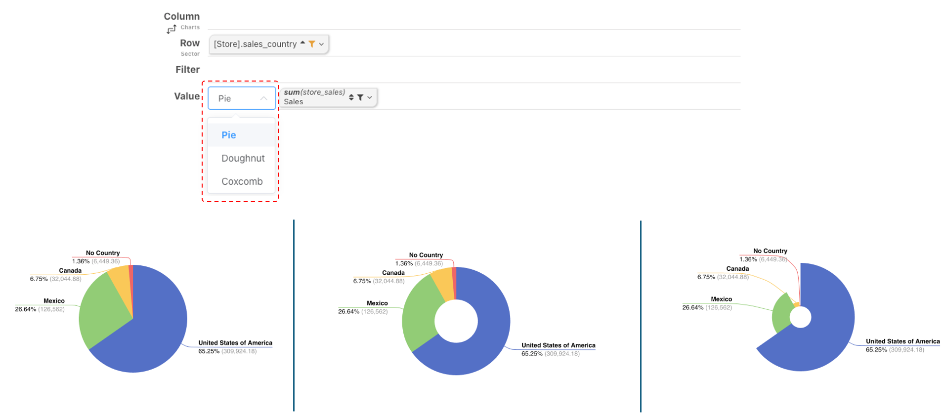
Donut charts and Nightingale rose charts are also types of pie charts. A standard pie chart can be transformed into a donut chart by configuring the inner and outer radius sizes.

Layout
In ECharts, the layout of a pie chart does not have the concept of top, bottom, left, and right margins; it only has center and radius. If the chart legend is wide, space can be freed up by adjusting the horizontal offset in the layout settings.
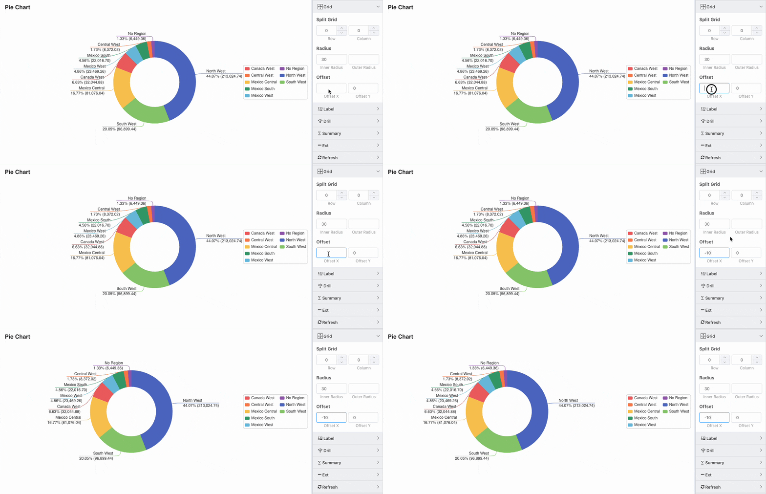
For two-row legend charts, adjust the height property of the legend size to a fixed value. When the height is insufficient, the legend will automatically split into multiple columns.
Numeric Labels
Multiple Pie Charts
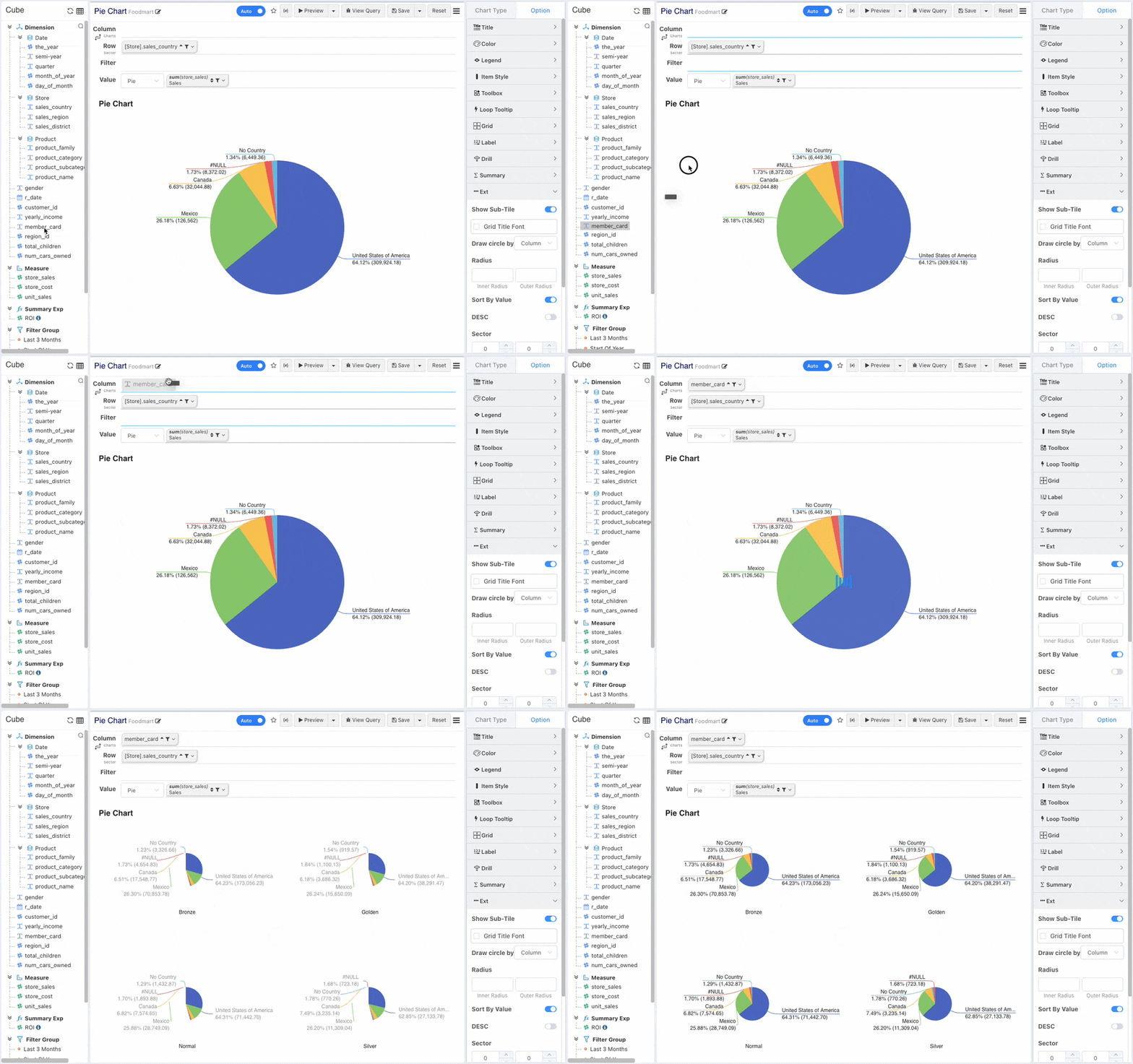
When column dimensions are added, multiple columns are automatically split into multiple pie charts. Supports configuring the split row and column counts. If the row * column grid count > number of pie charts, split according to the user-configured rows and columns. If insufficient, split automatically in an NxN matrix.
Sector Sorting
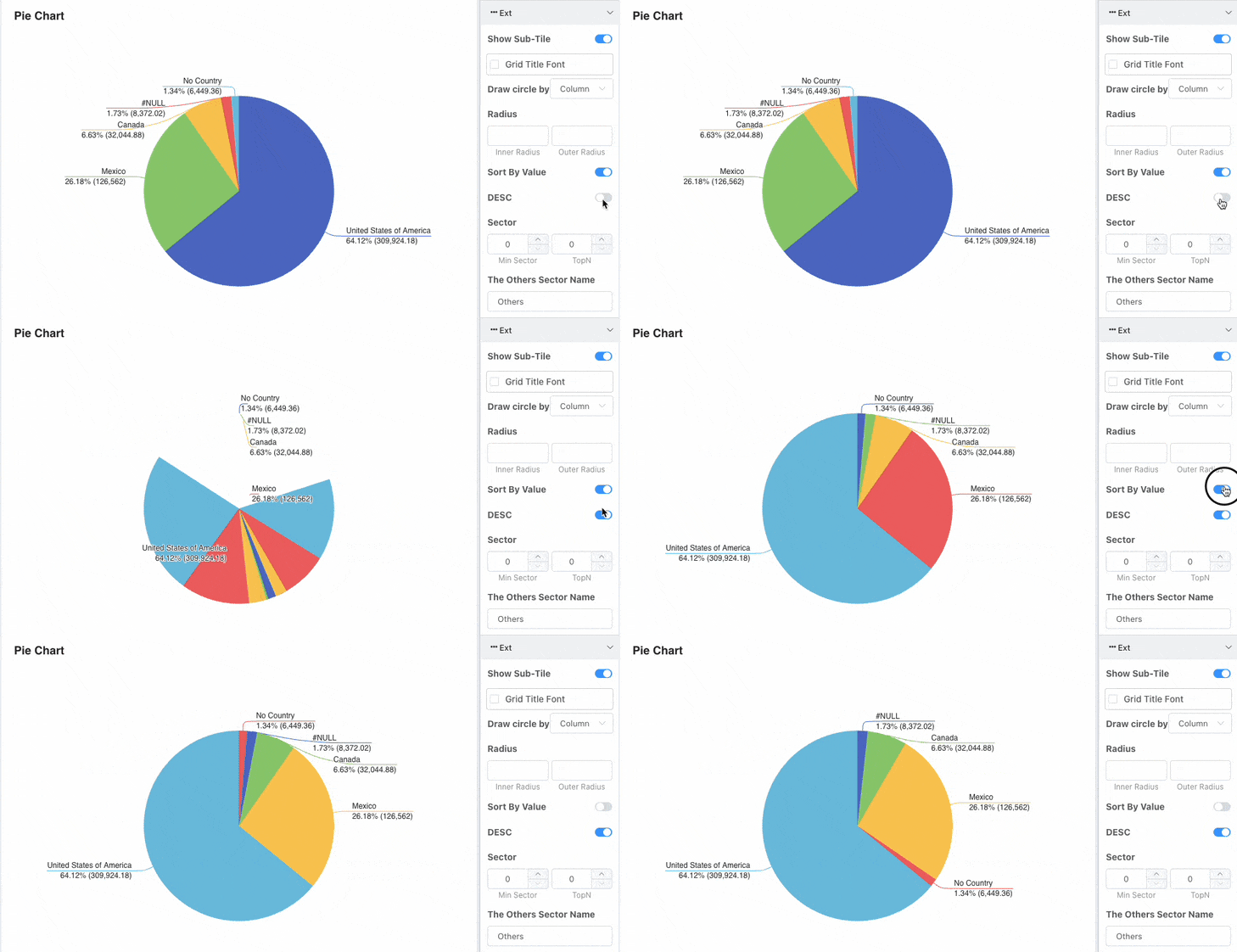
Pie chart sectors are sorted by default. You can change the sorting rule or disable sorting. When sorting is disabled, the sector order matches the column order in the cross-tab.
Merging Long-Tail Sectors
There are two common methods for merging long-tail sectors:
- Hide sectors below a certain proportion threshold.
- Display only the Top N sectors.
Minimum Sector
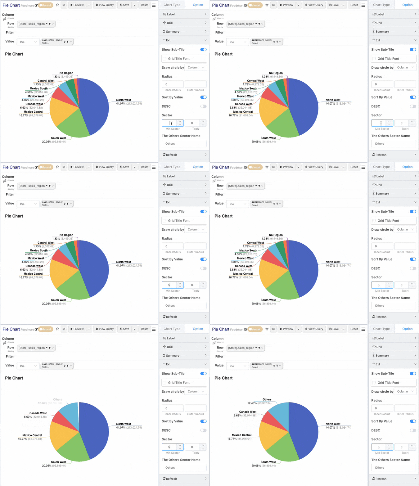
When long-tail data appears in a pie chart, you can configure the minimum sector size. Categories with proportions less than the minimum sector size will be merged into a single sector. This allows users to focus on key categories with larger proportions.
Top N
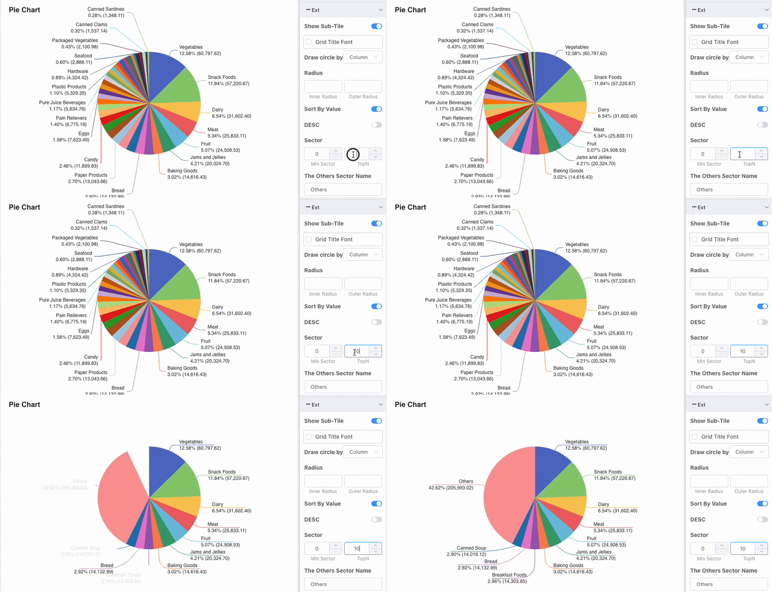
Pie chart sectors support Top N display control. Other sectors are placed last.
Pie Chart Drawn by Row
By default, pie charts are drawn by column. If you wish to draw by row, you can change this setting in the configuration.
Sector Spacing
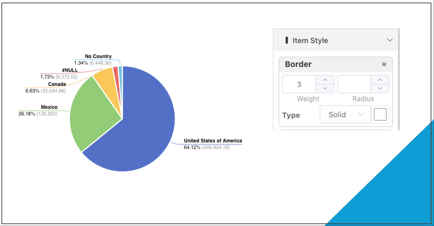
ECharts pie charts do not have a concept of spacing between sectors. To achieve an effect similar to sector spacing, you can add a border in the Individual Style settings, with the border color set to match the background color.