
Boxplot
Boxplot
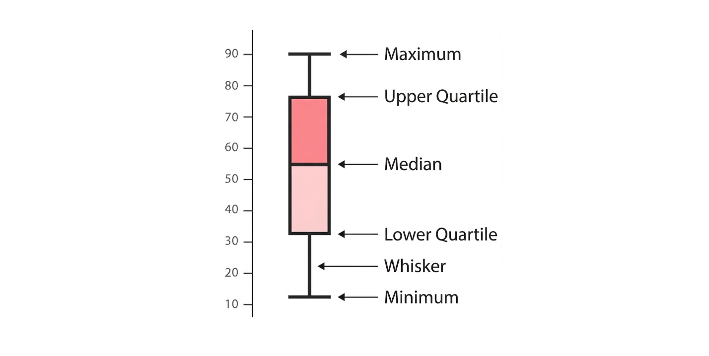
A Boxplot (also known as a "box-and-whisker plot" or "box-and-whisker diagram") conveniently displays the quartiles of a numerical dataset.
The lines extending from the ends of the box are called "whiskers" and represent the variability outside the upper and lower quartiles. Outliers are sometimes shown as single data points at the same level as the whiskers. This type of boxplot can appear in vertical or horizontal form.
Boxplots are commonly used in descriptive statistics and are a good way to quickly visualize the distribution of one or more datasets. Although they may seem somewhat primitive compared to histograms or density plots, they take up less space and are very useful when comparing distributions between many groups or datasets.
Observations that can be made from a boxplot include:
- Key values such as mean, median, and upper/lower quartiles.
- Any outliers (and their values).
- Whether the data distribution is symmetric.
- How tightly the data is grouped.
- Whether the data distribution is skewed (and if so, in which direction).
The two most commonly used boxplot types: variable width and notched boxplots.
Configuration
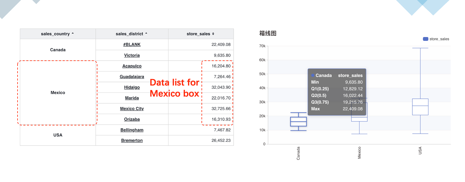
A boxplot requires 2 or more row dimensions. The first row dimension serves as the horizontal axis (category axis). The subsequent row dimensions group the data split by the first dimension to draw each box.
| Configuration Item | Description |
|---|---|
| Number of Grouping Row Dimensions | Number of row dimensions used for grouping. Default uses one row dimension. |
| Show Minimum | Whether to show the minimum value. |
| Show Maximum | Whether to show the maximum value. |
| Quantile - q1 | Default is the 25th percentile. |
| Quantile - q2 | Default is the 50th percentile. |
| Quantile - q3 | Default is the 75th percentile. |