
Metric Card
Metric Card
Metric cards play a very important role in data dashboards. This chapter will learn how to design various styles of metric cards through BI.
Metric card configuration requires at least one metric. Let's start with the simplest single metric.
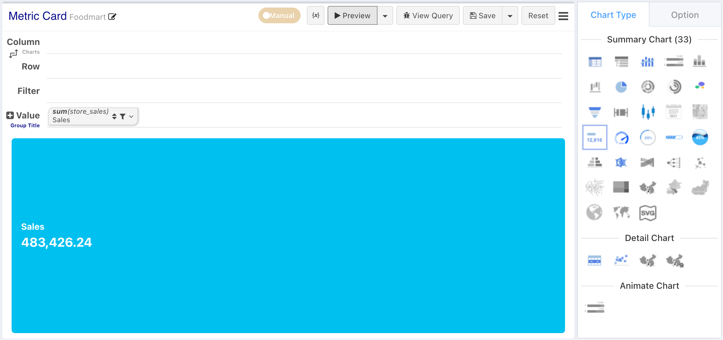
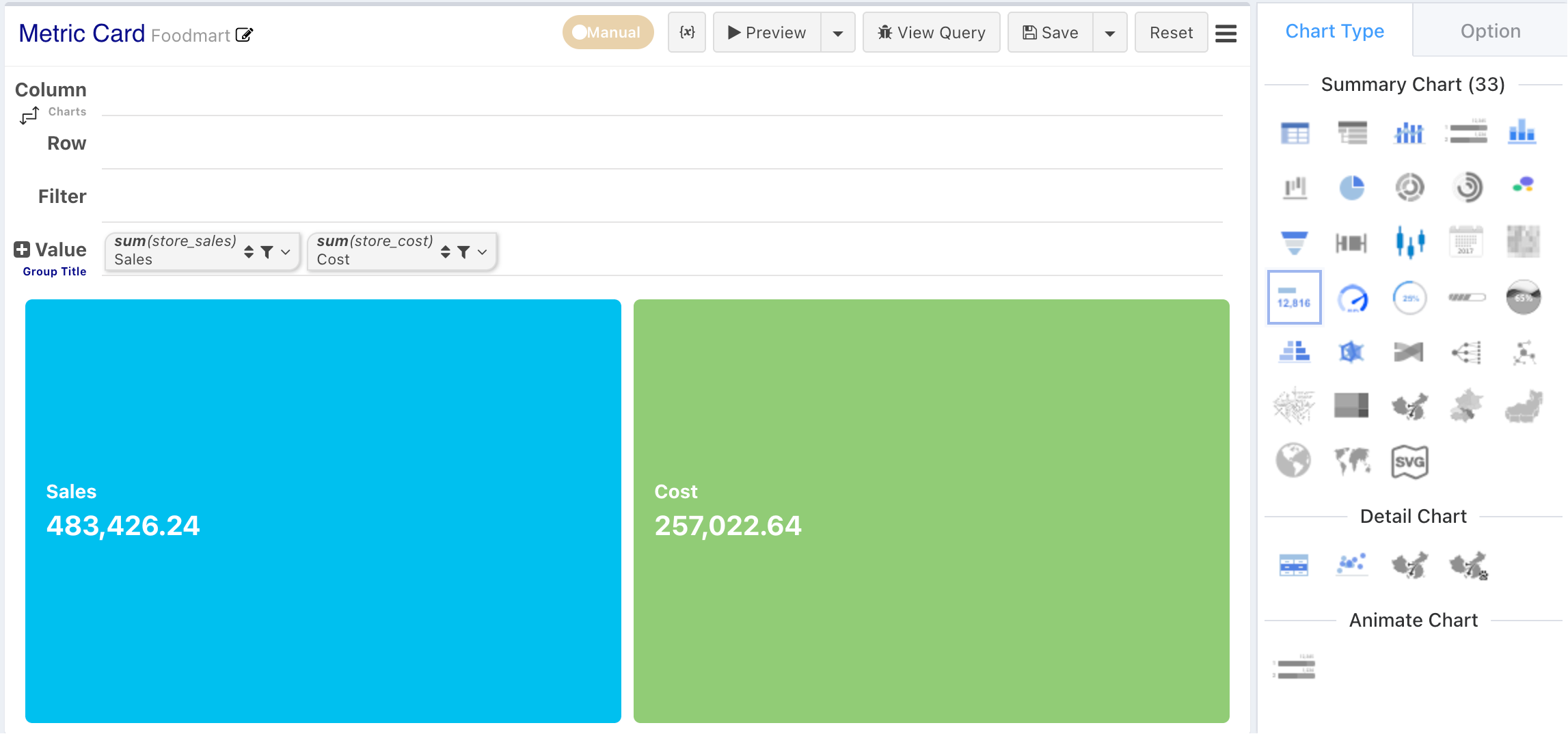
When configuring multiple metrics or adding column dimensions, the metric card component can display multiple metrics at once in a grid form.
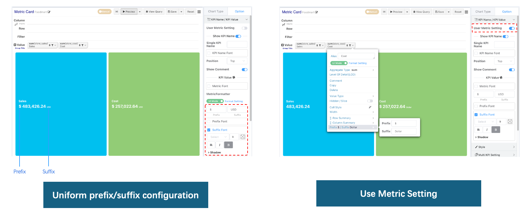
Metric Formatting, Prefix, Suffix
Metrics support unified configuration of prefixes and suffixes, or individual prefix/suffix configuration for each metric.
The difference between prefix/suffix configuration for metric cards and formatting prefixes/suffixes is that prefix/suffix configuration can independently configure the font style of the prefix and suffix.
Metric Comment
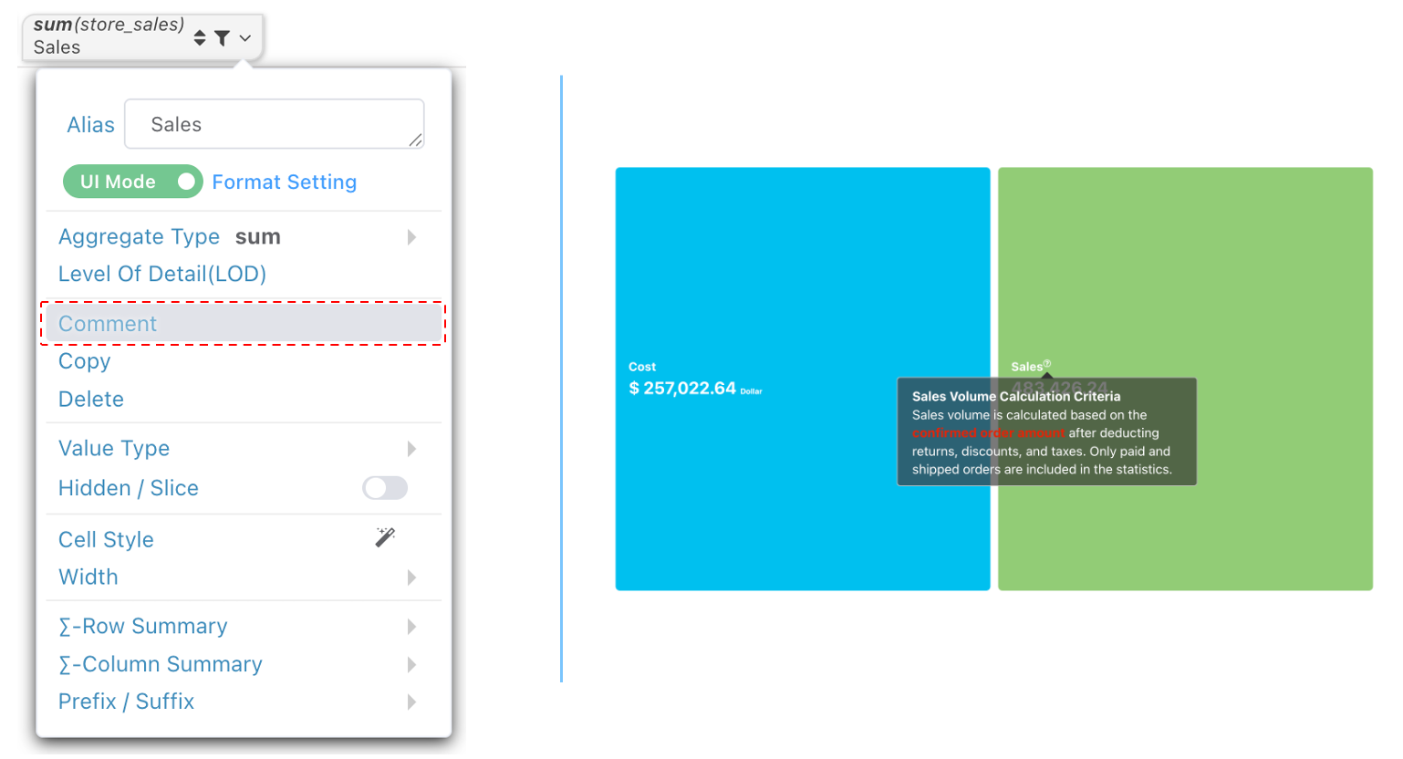
You can configure annotations for metrics in the chart configuration, or uniformly configure annotations for metric fields in the dataset. If you do not wish to display annotations, you can turn off annotation display in the Metric Name / Metric Value configuration bar.
Style Switching
Metric cards are displayed in a card style by default. You can switch between different display styles via Style ➡️ Genre.
Background Image
Configure a background image for the metric card. The background image can be a web image or an uploaded image.
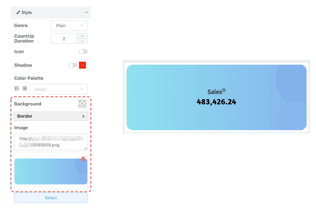
Card Style
Metric card background color configuration. From v2.1 onwards, multiple metric cards can be batch-controlled via the color palette.
Plain style
Plain style metric cards are often used for Data Cockpit metric displays. The original Plain style metric cards only have metric names and values, and in most scenarios, they are even used without displaying the metric name (the metric name is displayed separately using a text component).
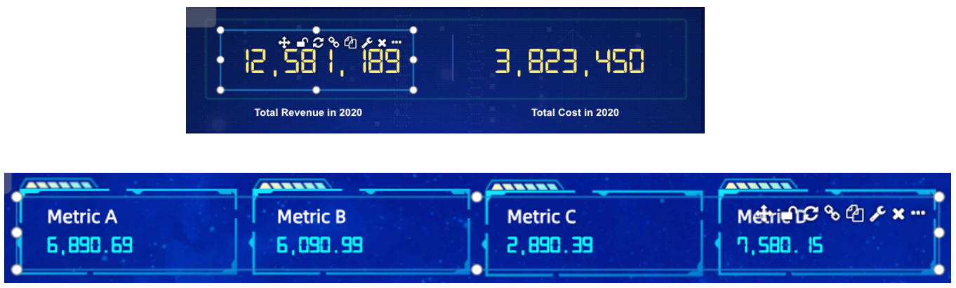
Bricks Style
In the Bricks Style, each digit display position is a separate digit card.
- After setting the style to Bricks, a set of Bricks specific style properties will appear in the chart configuration bar.
- If the font you configured cannot be vertically or horizontally centered within the brick, you can use inner padding to adjust the font's vertical offset.
- Horizontal Margin is used to control the distance between cards.
- Top Margin is used to control the distance between the metric name and the number cards.
- Bottom Margin is used to control the distance between the number cards and the YoY/MoM comparison.
- Bricks Background Image is the background image for each digit card.
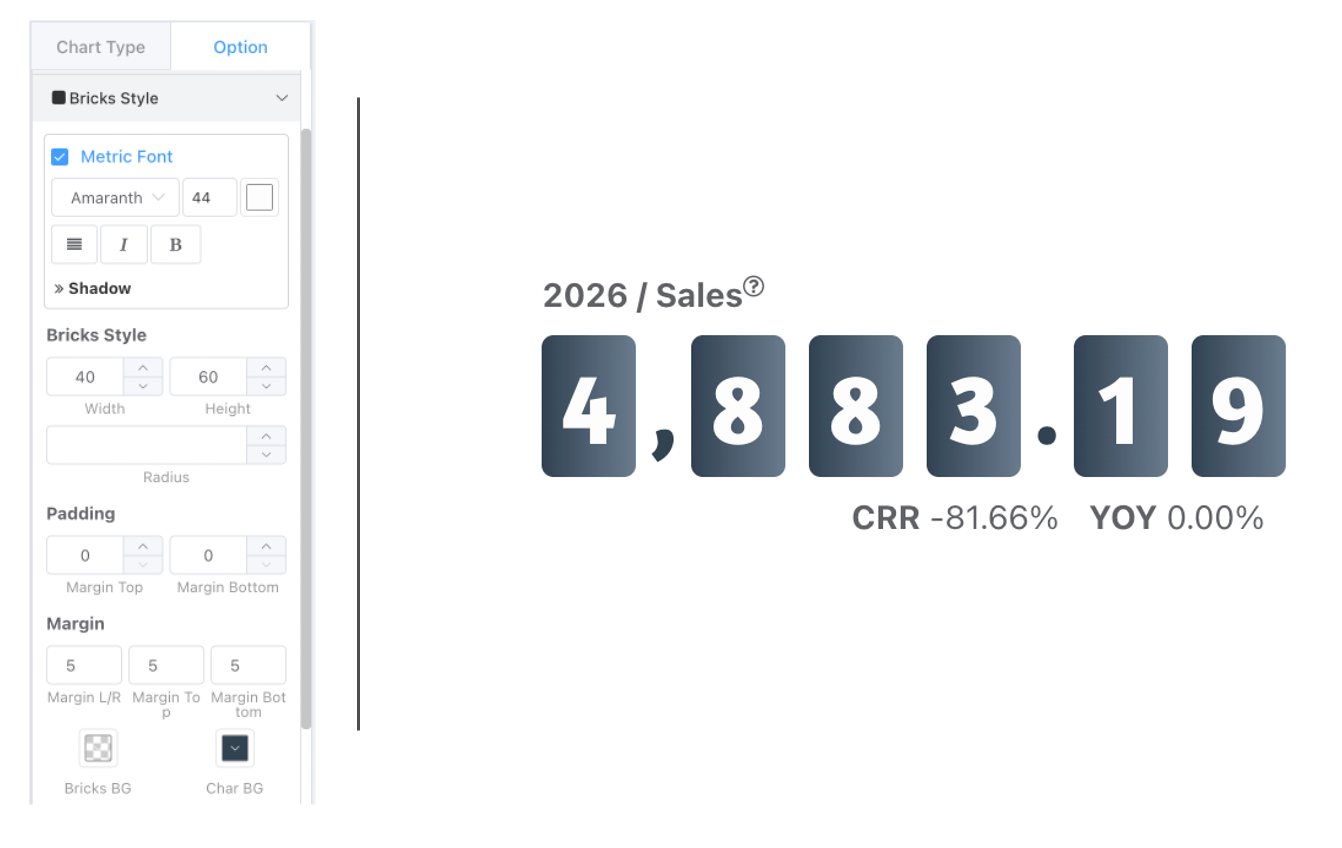
Table Style
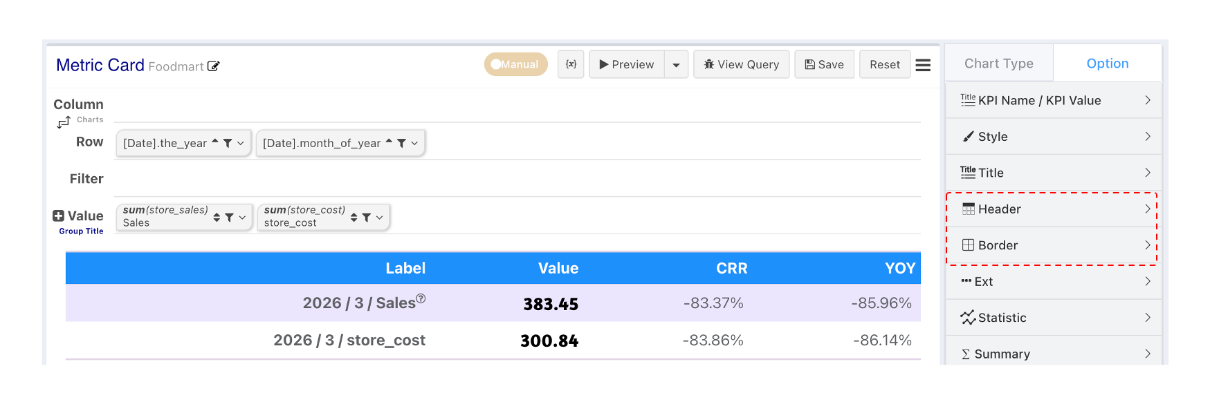
Table style metric cards are used to display multiple metrics in a table format.
- Header Configuration allows configuring not to show the header, header row height, header font, etc.
- Border Configuration: If borders are not enabled, the default is a three-line table. If you need to completely hide borders, set the border width to 0.
- Other Configuration Items:
- Zebra Stripes
- Metric Data Row Height
- Column Widths: Widths can be percentages or pure numbers (px).
Multi-Metric Grid
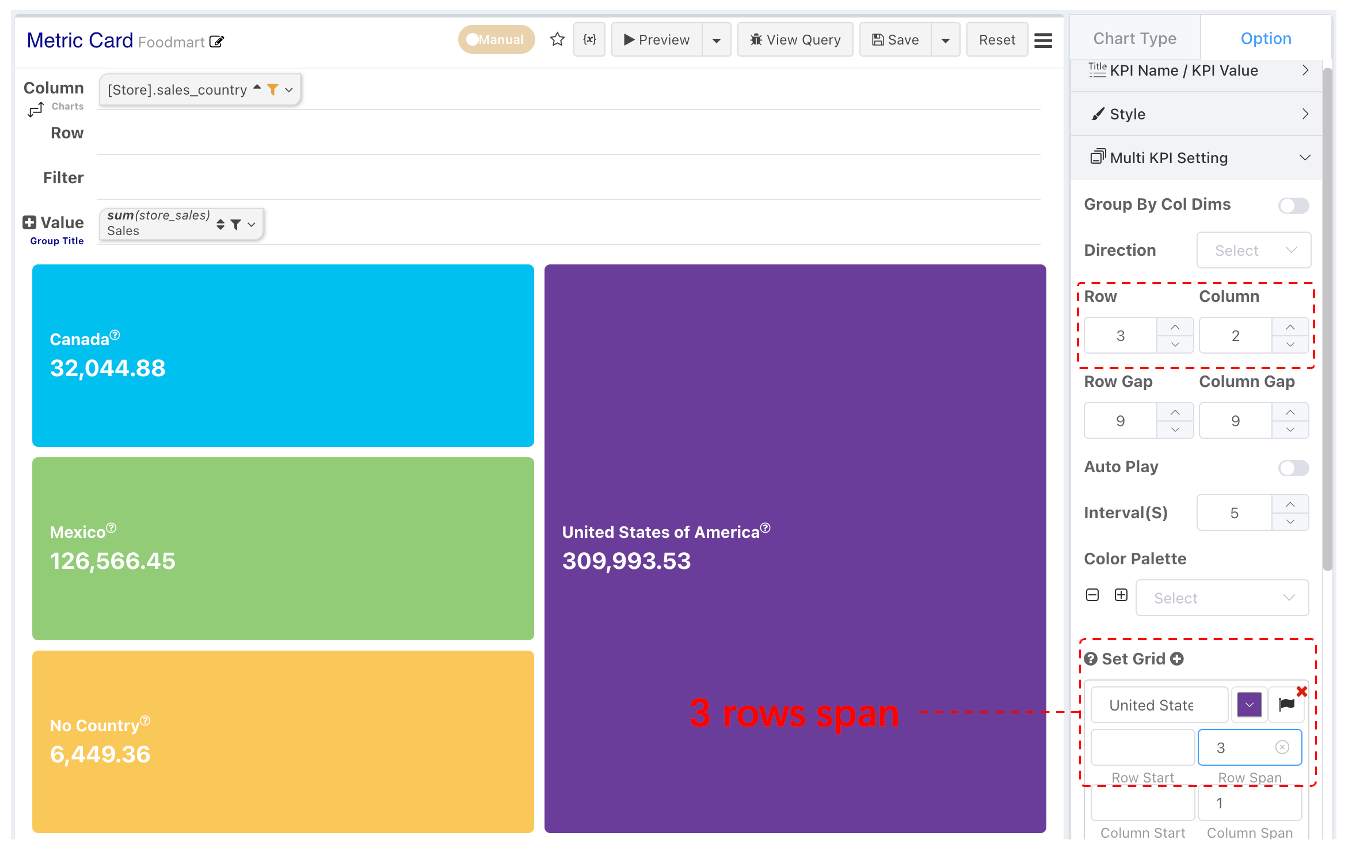
Multiple metrics use a grid layout. By default, one metric card occupies one grid cell. You can set the number of rows and columns for grid division, and also set the starting row/column and row/column span for specific metrics.
Metric Pagination
- Set grid rows and columns in multi-metric configuration.
- When the total number of metric cards exceeds the grid cells per page, metrics automatically paginate.
- Supports configuring auto-play and playback time interval.
Multi-Metric Combination
- Switch style to Simple.
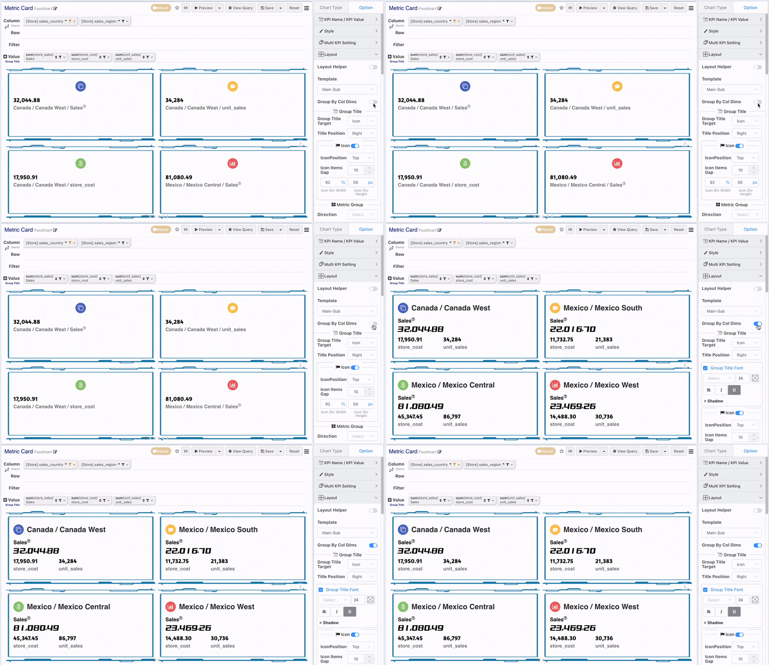
- Without metric combination configuration, each metric occupies its own metric card. After enabling combination by column dimension, metrics with the same column dimension value can be combined and displayed in one metric card.
Group by Metric Bar
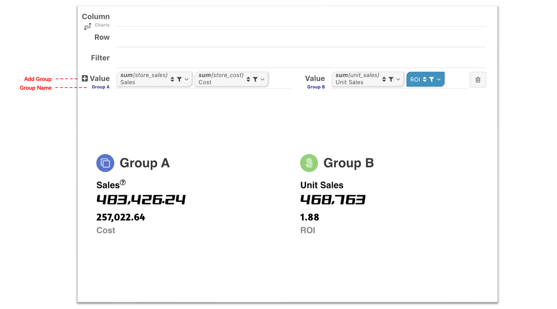
If there are no column dimensions, you can also group metrics by adding metric bars.
Multi-Metric Card Layout
Before starting multi-metric combination layout, first understand the elements of a combined metric card.
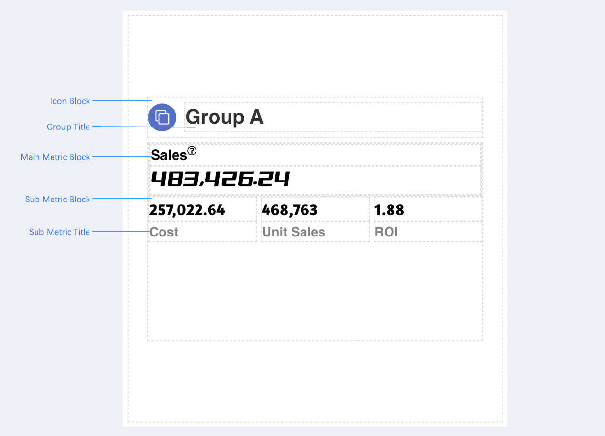
- Icon Block
- Main Metric Block
- Metric Group Block
- Elements within each block can also have row/column layout settings.
Layout Guidelines
Combined metric elements are numerous. To facilitate layout adjustments, we provide layout guidelines. After enabling guidelines, you can clearly observe the position and size of each block and element.
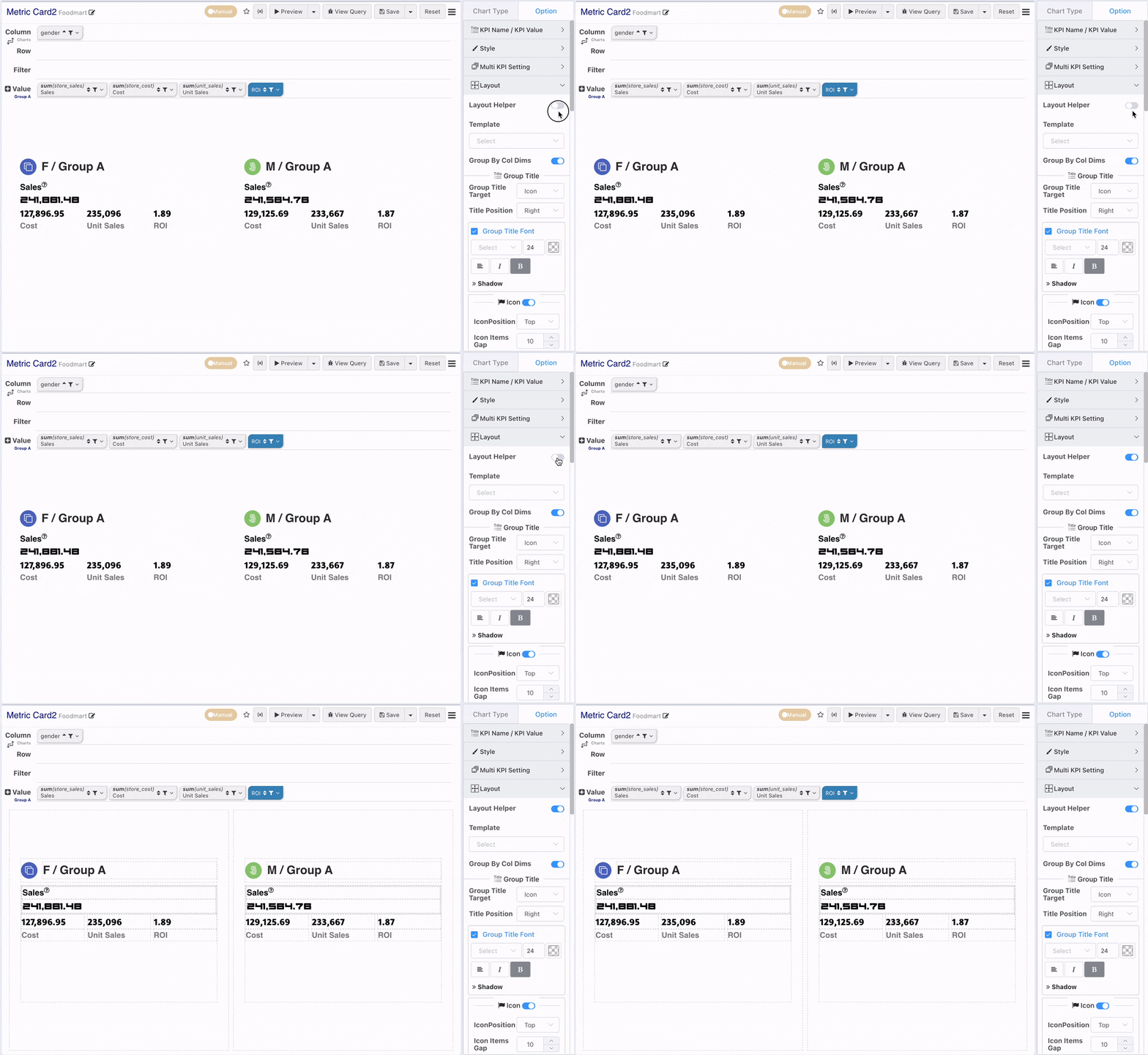
Group Title Configuration
- Group Title Association: The group title can be set to associate with the icon or the metric.
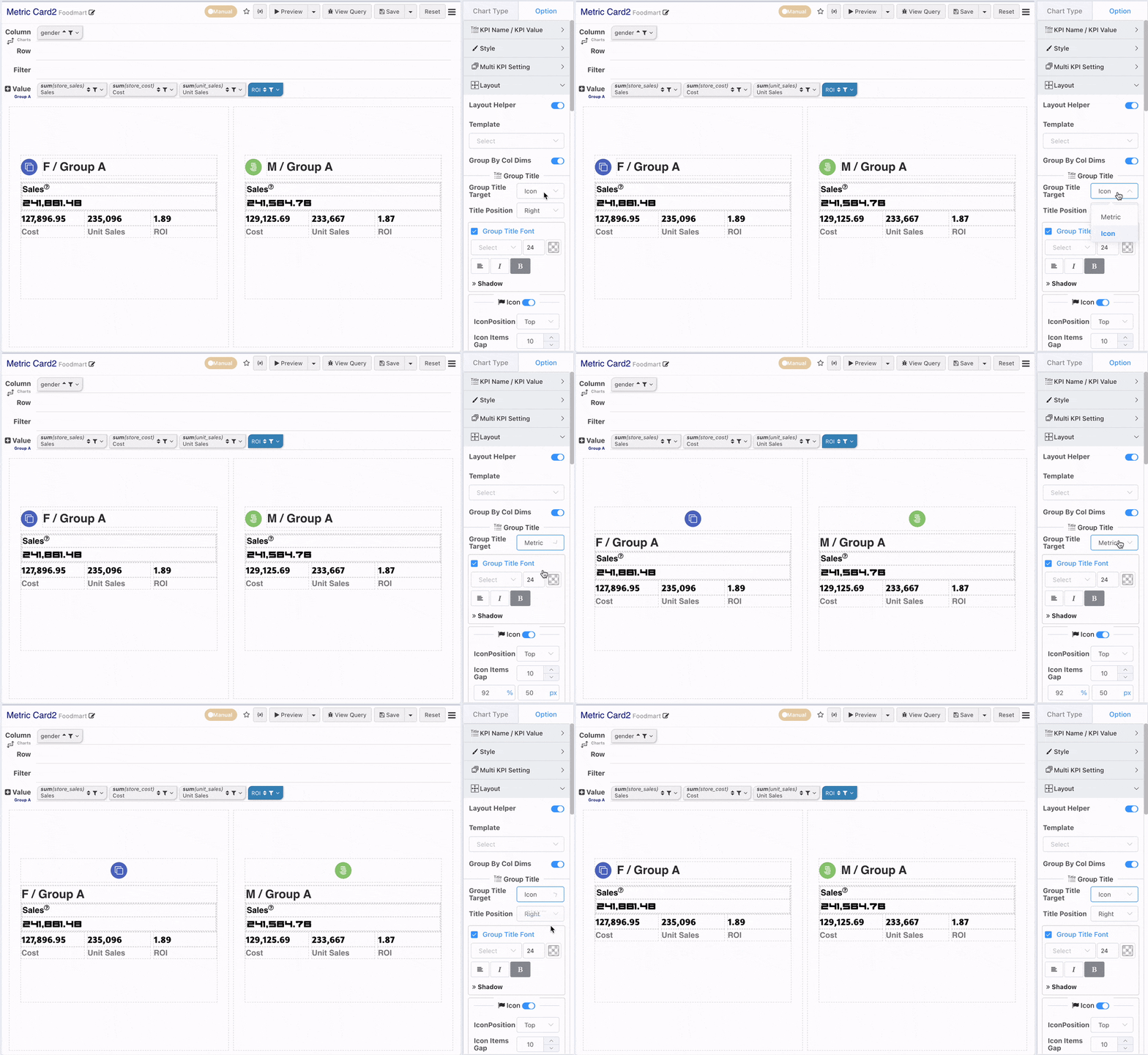
- Group Title Position: When the title associates with the icon, you can configure the position around the icon.
- Group Title Font: Configure the group title font. Don't forget font alignment configuration when the title is above or below the icon.
Icon Block Configuration
- Icon Block Position Configuration
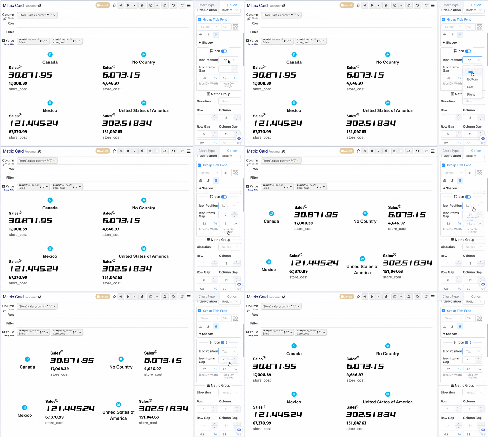
You can also configure:
- Whether to Show Icon: To facilitate group title layout, if the group title is associated with the icon, the icon block will still exist even if the icon is not displayed.
- Icon Block Width and Height: When the icon block is located above, configure the height; when located on the sides, configure the width.
- Icon and Content Spacing: Used to configure the spacing between the icon and the group title.
- Icon selection, icon size, and rounded corners: Configured in the Style bar.
Metric Group
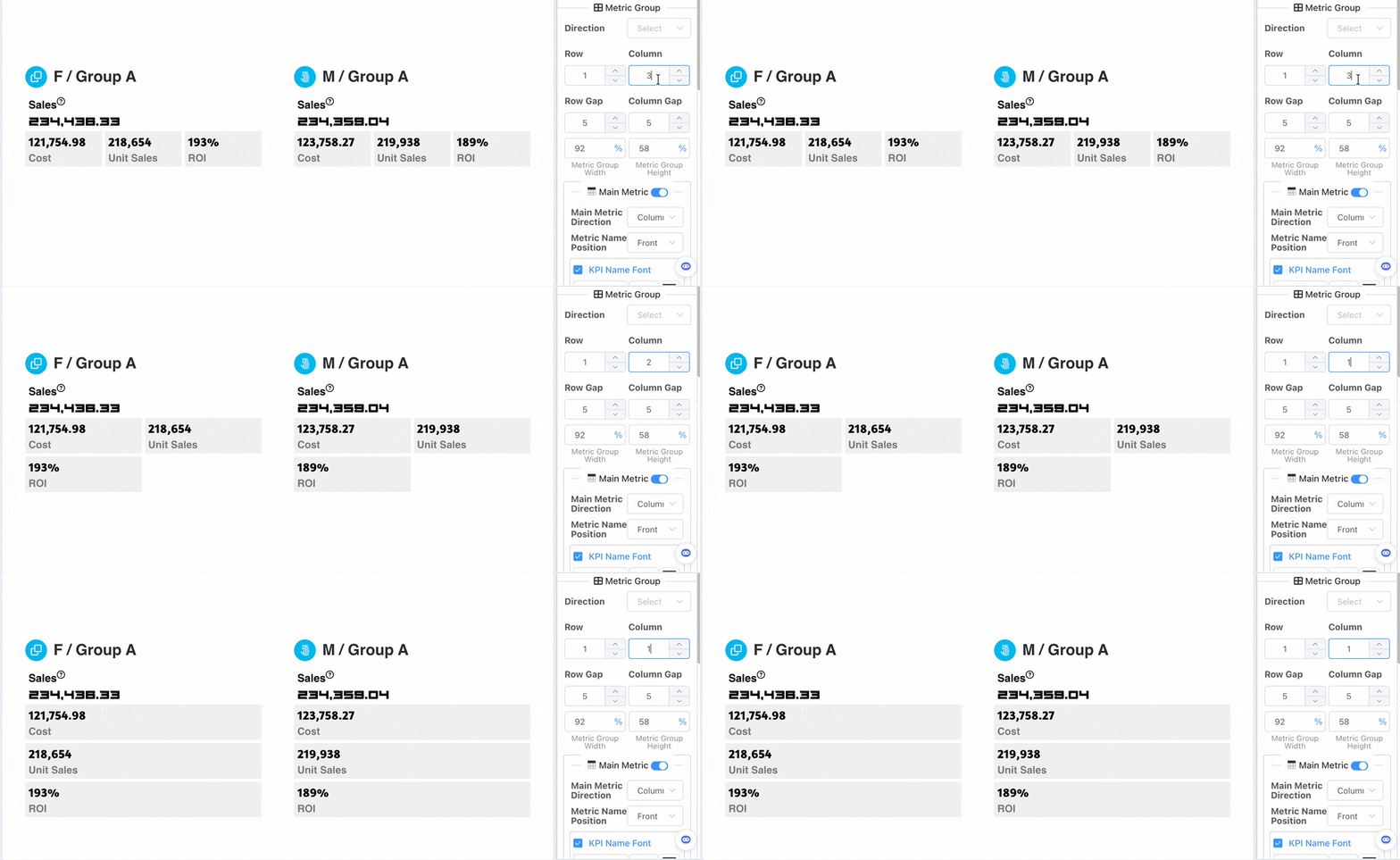
The metric group uses a grid layout. You can configure:
- Number of grid rows and columns
- Grid row and column spacing
- The overall width and height of the metric group block relative to the card
Metric Item
Uniform configuration for metric items within the metric group.
You can configure for metric items:
- Arrangement
- Metric name position
- Spacing between metric name and value
- Metric item inner padding
- Background color
- Border, rounded corners
- Metric name, metric value font
- When arranged by column, you can configure the width of the metric name and metric value.
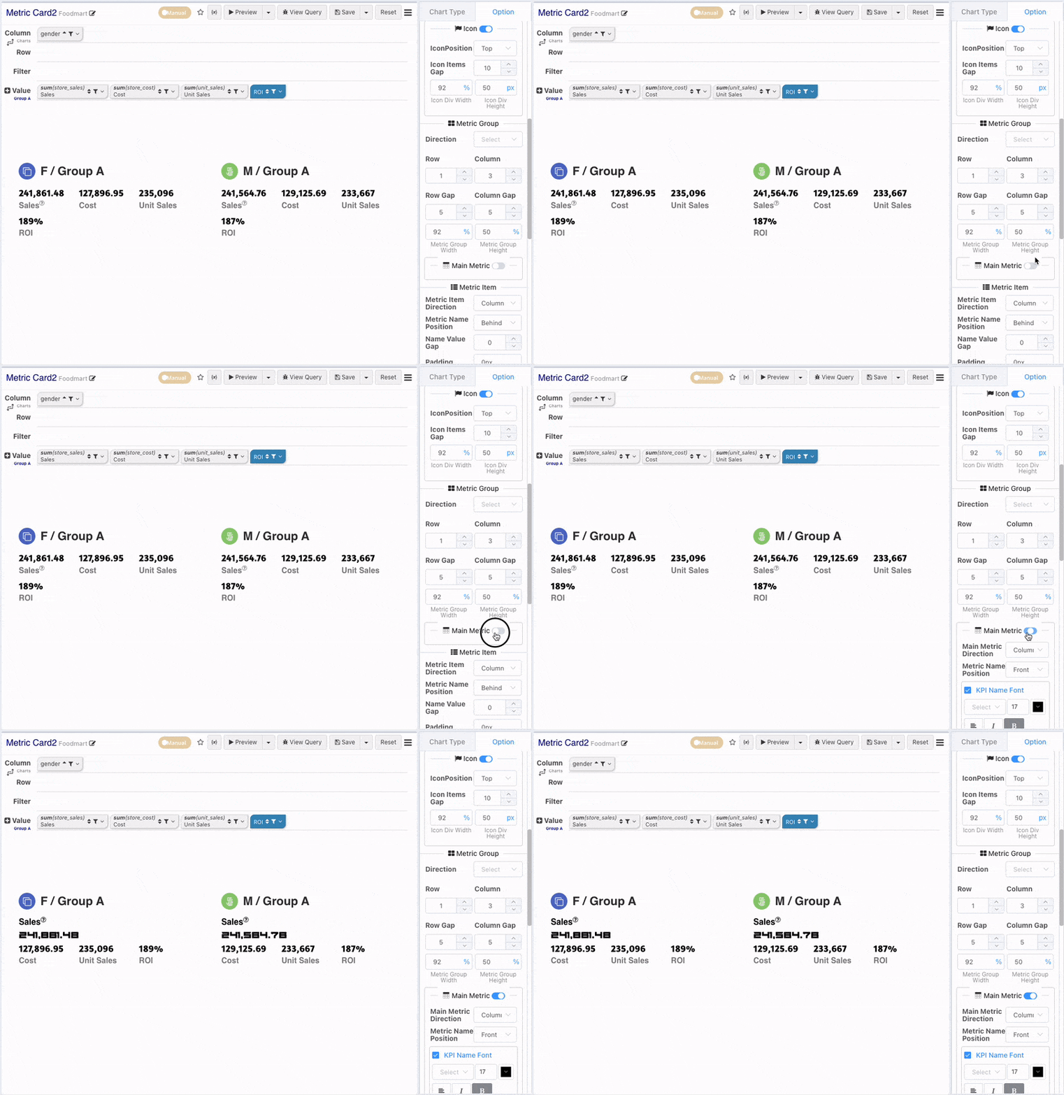
Emphasize Main Metric
Enable Main-Sub metrics. The first metric within the metric group will serve as the main metric. The main metric item can be configured independently.
Year-on-Year (YoY) / Month-on-Month (MoM) Comparison
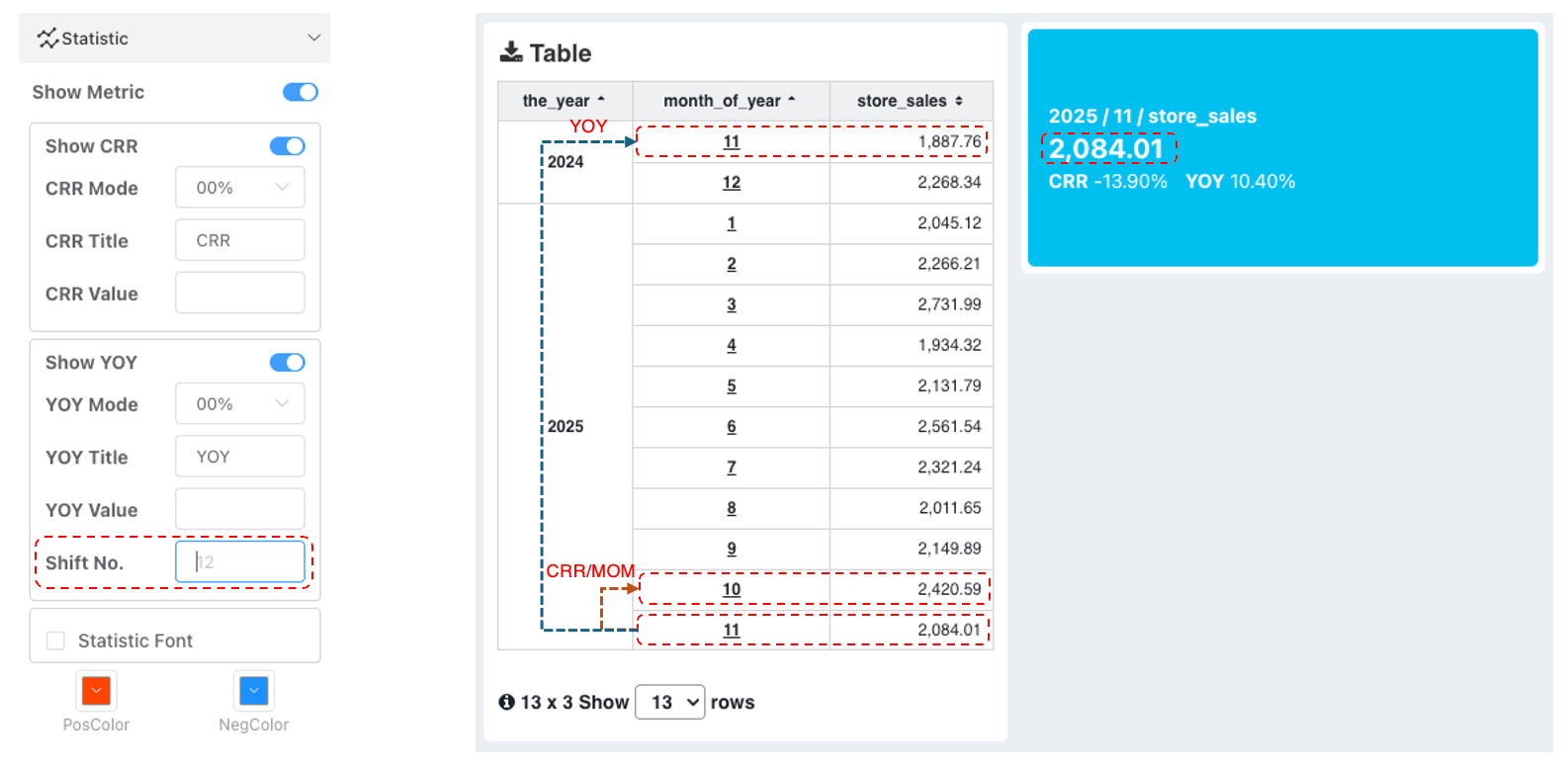
When an metric card has only one metric value without row dimension information, if YoY/MoM comparison calculation is needed, you need to add a row dimension to turn a single value into a series. Then the engine will perform comparison calculations based on default offsets.
By default, the MoM comparison offset is 1 (compare with the previous value), and the YoY comparison offset is 12. This can be modified via fine-tuning in the project.
Push YoY/MoM calculation down to Data Source
From the quick calculation logic above, if the data filters out the comparison date's surface data, then YoY/MoM values cannot be calculated. If you wish to calculate at the data source level and want the dashboard parameters to specify the filtering period, you can refer to the following logic.
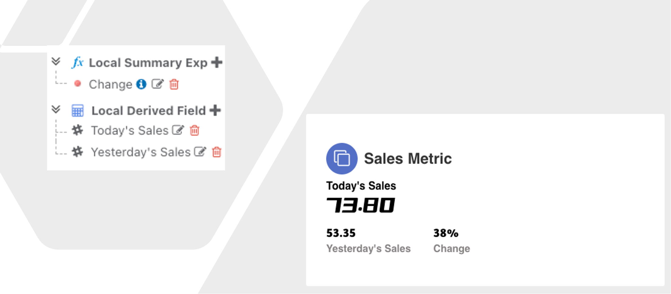
Daily MoM
- Add a calculated field Today's Sales:
IF(`r_date` = '${dt!cdt.now("yyyy-MM-dd")}', `store_sales`, 0)- Add a calculated field Yesterday's Sales:
IF(addDay(`r_date`, 1) = '${dt!cdt.now("yyyy-MM-dd")}', `store_sales`, 0)- Add an aggregation expression Daily MoM:
CHGRATE(sum(`Yesterday's Sales`), sum(`Today's Sales`))- Drag Today's Sales and Yesterday's Sales to the metric bar, select sum as the aggregation type, and drag the aggregation expression Daily MoM to the metrics.
Monthly MoM
- Add a calculated field This Month's Sales:
IF(
  DATETRUNC('month', `r_date`) = '${cdt.startOfMonth(dt, "yyyy-MM-dd")}',
`store_sales`, 0)- Add a calculated field Last Month's Sales:
IF(
  DATETRUNC('month', addMonth(`r_date`, 1)) = '${cdt.startOfMonth(dt, "yyyy-MM-dd")}',
`store_sales`, 0)- Add an aggregation expression Monthly MoM:
CHGRATE(sum(`Last Month's Sales`), sum(`This Month's Sales`), 0)- Drag This Month's Sales and Last Month's Sales to the metric bar, select sum as the aggregation type, and drag the aggregation expression Monthly MoM to the metrics.
Summary for Monthly MoM:
- In This Month's Sales, the date field is processed to the first day of the month using the DATETRUNC('month',
r_date) function. Then, the environment variable function is used to adjust the input date to the first day of the month${cdt.startOfMonth(dt, "yyyy-MM-dd")}. - For Last Month's Sales, the sales date
r_dateis increased by one month using addMonth, with other processing consistent with This Month's Sales. - Note: In the example above, the format of the input
dtenvironment variable must be 'yyyy-MM-dd'.