
Radar Chart
Radar Chart
A radar chart is a graphical method for displaying multivariate data. Typically, three or more axes are evenly spaced out from the same center point, with each axis representing a quantitative variable. Points on each axis are sequentially connected to form lines or geometric shapes.
Radar charts can be used to compare variables or to identify outliers within variables. Additionally, comparisons of overall numerical conditions can be made between multiple radar charts or between multiple data lines within a single radar chart.
The relative positions and angles of the axes are generally not informative. Each variable has its own axis, equally spaced from the others, and all axes share the same scale. When mapping data to these axes, it is important to standardize the values in advance to ensure that the numerical proportions across axes can be compared at the same level.
Chart Introduction
Element Composition
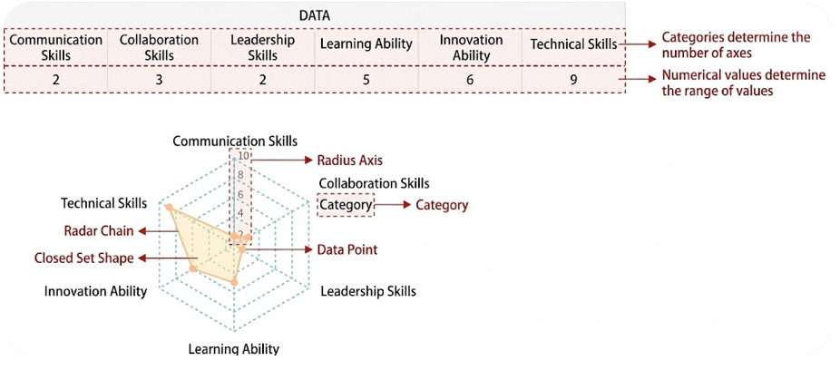
Xiao Ming uses a radar chart to self-assess his abilities. The abilities are categorized into: Communication Skills, Collaboration Skills, Leadership Skills, Learning Ability, Innovation Ability, and Technical Ability, each scored from 0 to 10.
Applicable Scenarios
Use a radar chart to depict a data object composed of multiple feature categories. For example:
- Basketball player abilities (scoring ability, rebounding ability, stealing ability, assisting ability, blocking ability)
- Nutritional components of food (sugar, vitamins, minerals, fat, water)
The requirement is that the feature categories are limited in number and can all be normalized or standardized according to a uniform standard. For instance, height and weight, although with different units and value distributions, can both be converted into scores (or indices) ranging from minimum to maximum (or 0 to 1), or simply discretized into categories (poor, average, excellent).
Inapplicable Scenarios
Situations with too many categories or where standardization to a uniform degree is not possible.
Configuration
| Design Area | Chart Element | Requirement |
|---|---|---|
| Row Dimension | Category | Can only place one or more dimension nodes |
| Column Dimension | Series | Can only place one or more dimension nodes |
| Metric | Series Value | Can only place two metric nodes |
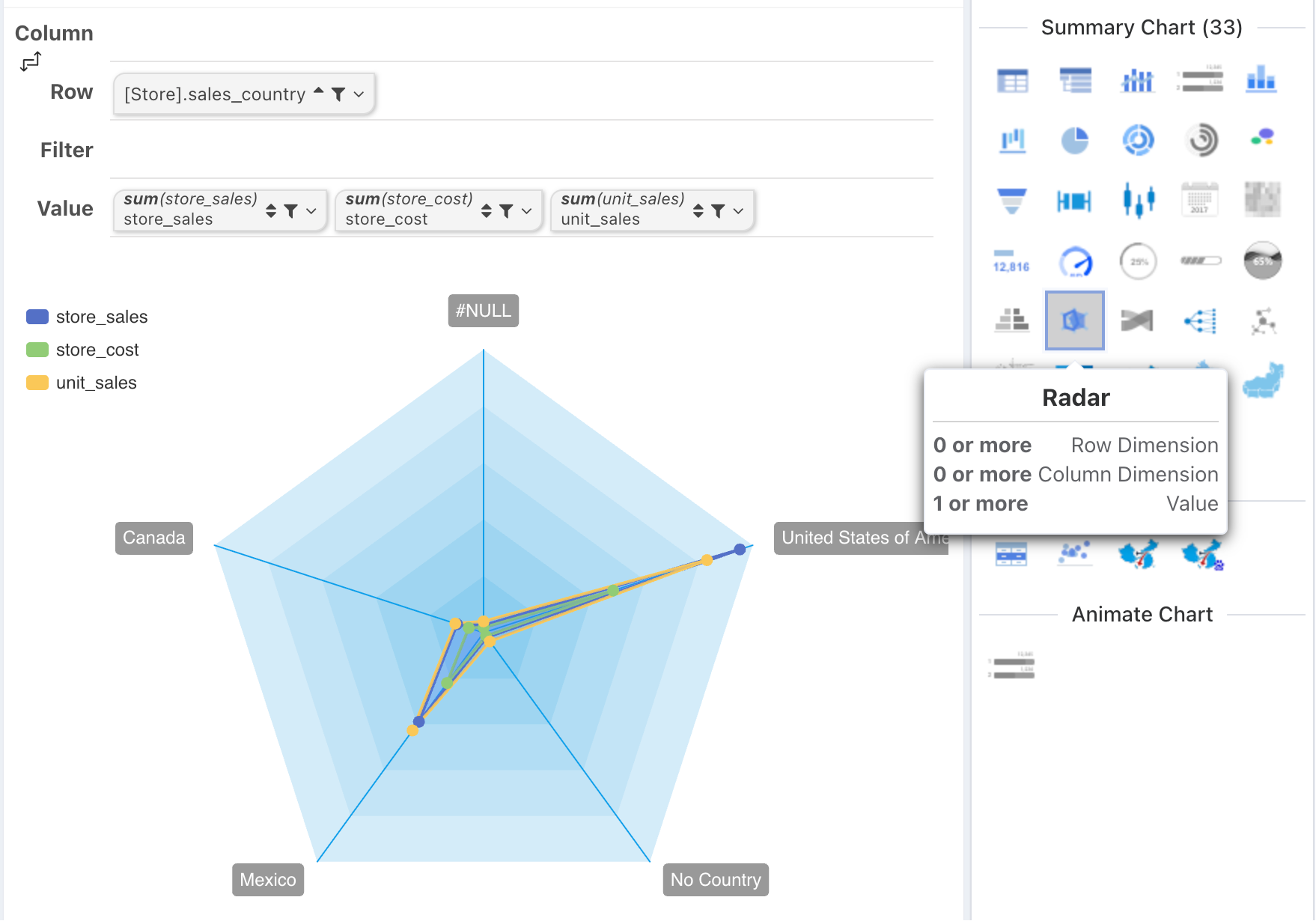
Drawn by Column
By default, the relationship between a radar chart and a cross-tab is that a set of radar lines is drawn by column, with the category being the row dimension.
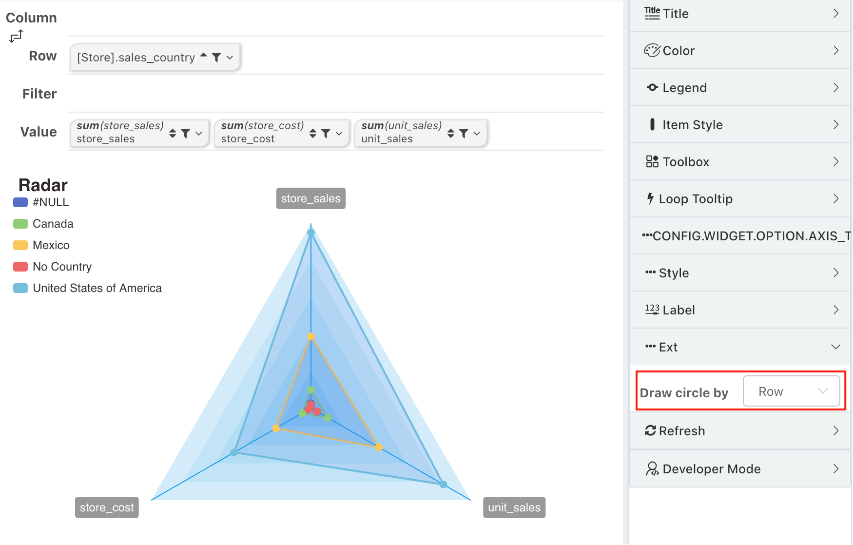
Drawn by Row
Radar charts can be switched to draw by row. In this case, the category becomes the metric.
Style Configuration
Metric Item Names
Metric item names can be configured for:
- Item font
- Background color
- Padding
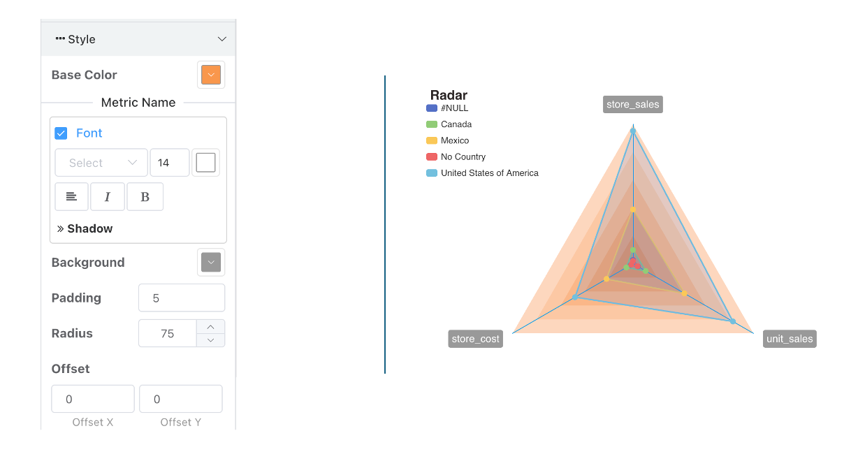
Position and Size
The size and position configuration for radar charts is similar to that of pie charts, controlled by:
- Radius to control size
- Offset to control position