
Bubble Chart
Bubble Chart
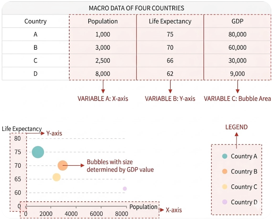
A Bubble Chart is a type of visualization chart used to display three-dimensional data. It plots the position of bubbles on a two-dimensional plane (X-axis and Y-axis) and uses bubble size and color to represent additional data dimensions, helping users analyze data distribution, relationships, and trends more intuitively.
Characteristics
- Two-dimensional coordinate system: Bubbles are positioned on X and Y axes.
- Bubble size: Represents the numerical value of a third data dimension.
- Color coding (optional): Can be used to distinguish categories or represent a fourth dimension.
| Design Area | Chart | Requirement |
|---|---|---|
| Row Dimensions | Defaults to X-axis. If a measure is set as X-axis, row dimensions are only used for category labels. | Place one or more dimension nodes |
| Column Dimensions | Color classification | Place 0 or more dimension nodes |
| Measures | Y-axis, bubble size, color intensity | Each measure node corresponds to one property. |
Typical Use Cases
- Market Analysis
- Show product market share (bubble size), sales revenue (Y-axis), customer satisfaction (X-axis).
- Compare performance differences across multiple products.
- Performance Evaluation
- Analyze department or employee efficiency (X-axis), cost (Y-axis), project completion volume (bubble size).
- Use color to mark different departments or job categories.
- Correlation Studies
- Explore correlations between variables, e.g., education level (X-axis), household income (Y-axis), and population size (bubble size).
- Financial Analysis
- Compare risk (X-axis), return (Y-axis), and asset size (bubble size) of different asset classes.
- Resource Allocation
- Analyze resource demand (bubble size), economic level (Y-axis), and population distribution (X-axis) across different regions.
- Scientific Research
- Show relationships between experimental variables, e.g., temperature (X-axis), pressure (Y-axis), significance of experimental results (bubble size).
Applicable Conditions
- Data contains 3 or more dimensions.
- Need for intuitive analysis of data distribution characteristics, correlations, or classifications.

X-Axis as Measure
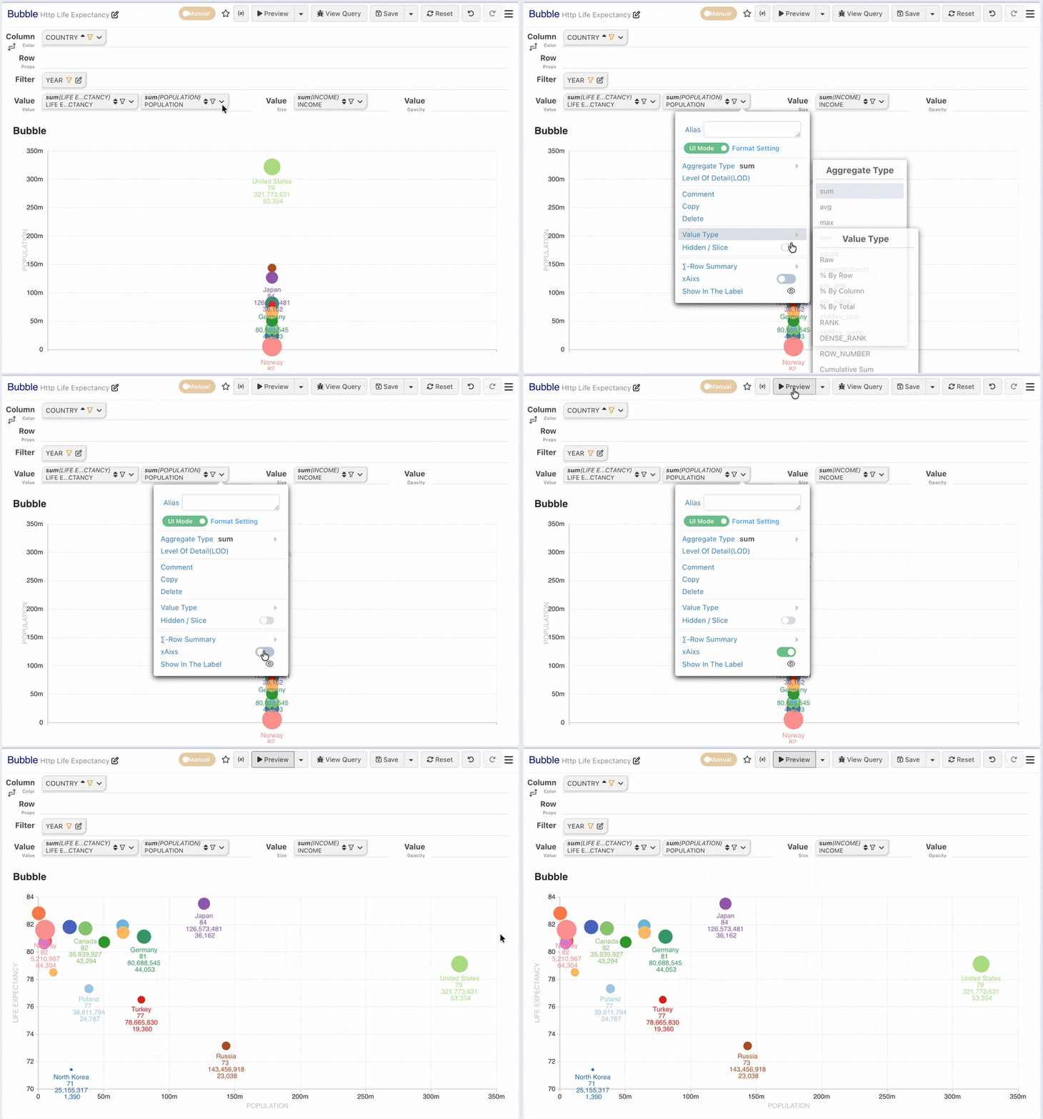
By default, the X-axis uses row dimensions. In a Bubble Chart, the X-axis can be set to a measure through measure configuration, allowing the X-axis to display a measure.
- Alternatively, you can place two measures in the measure panel, with the second measure set as the X-axis.
Tip
If bubbles overlap, you can add a border effect by setting the border in Single Item Style.
No Value Axis
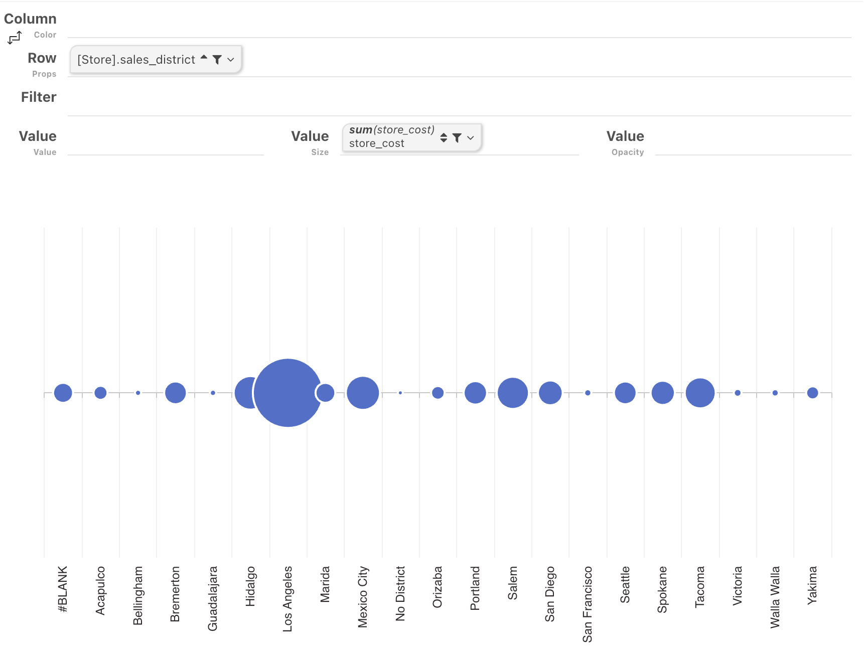
Not configuring any measure in the measure panel can achieve the effect where all bubbles align on a single line.
Timeline Configuration
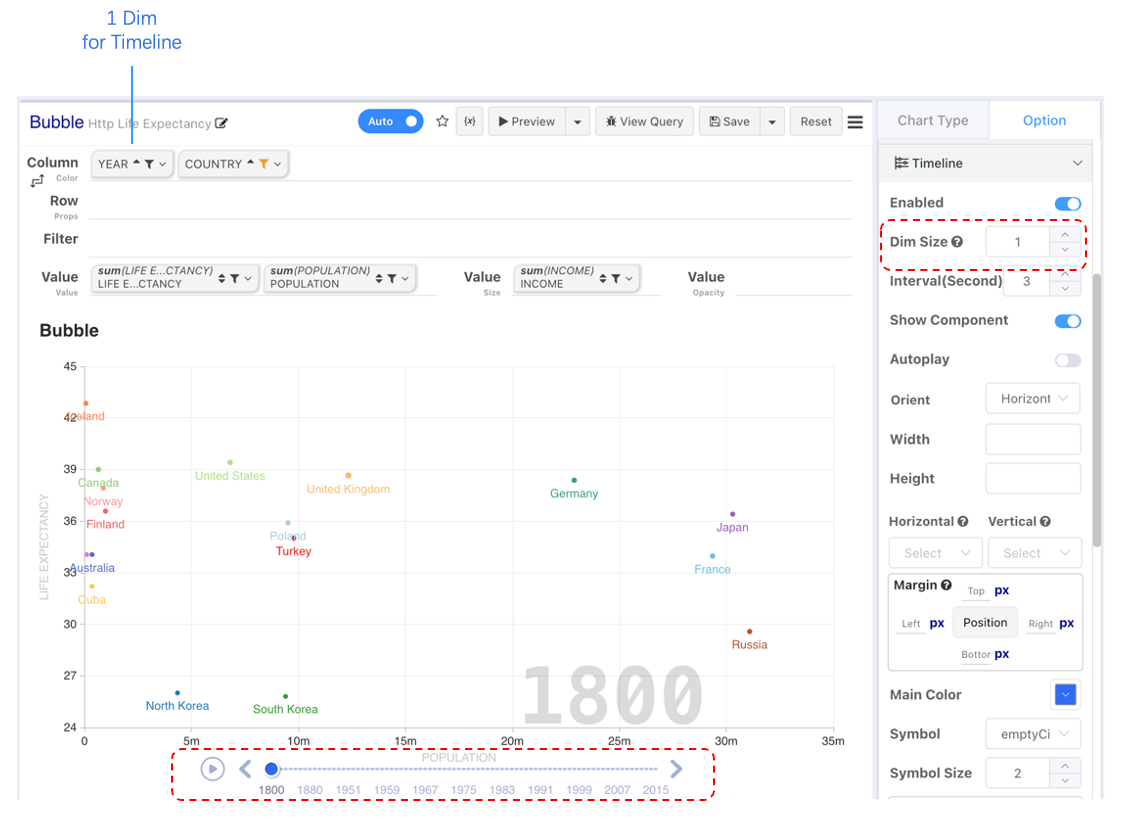
Enable timeline configuration and select the number of column dimensions to use for timeline classification. The default (0) means all column dimensions.
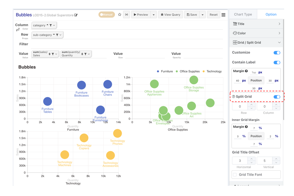
Split into Multiple Charts
Note: Enabling timeline and split logic cannot currently coexist.
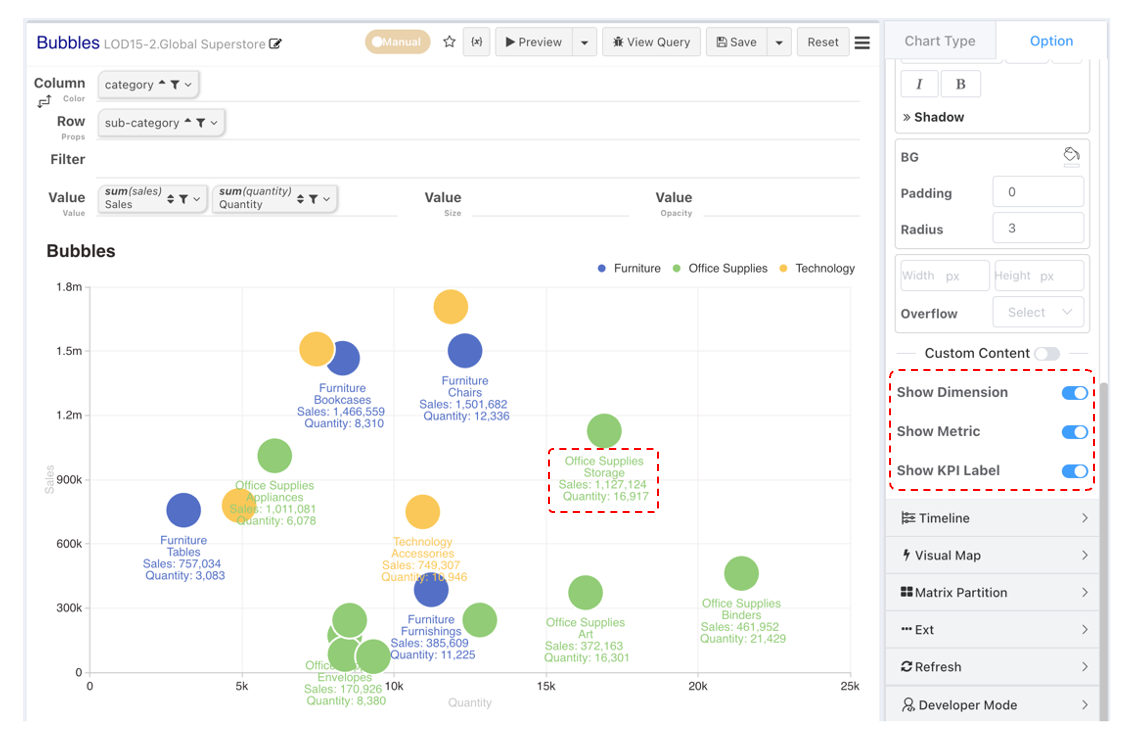
Data Labels
Enabling numeric labels supports displaying all dimension and measure information. You can configure to hide unnecessary information.
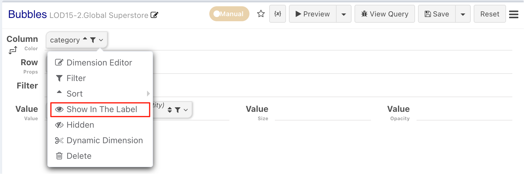
Disable Specific Labels
If you only need to disable the display of labels for specific configurations within a category, you can configure this in the numeric label display settings during configuration editing.
Axis Style
Please refer to Axis Style Configuration